(If this is a composite, etc. please be honest with your techniques to help others learn)
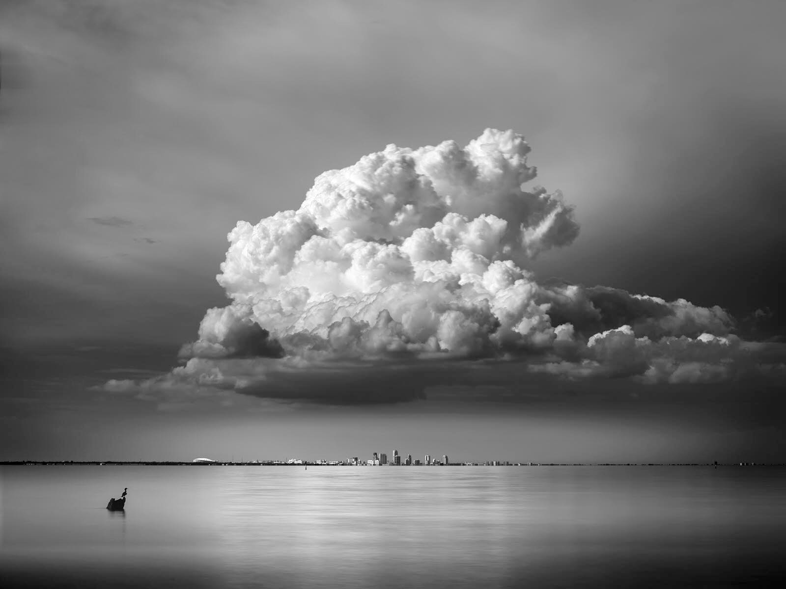
single 5 second exposure 80mm
If you would like your image to be eligible for a feature on the NPN Instagram (@NaturePhotoNet), add the tag ‘ig’ and leave your Instagram username below.
Hi Matt, I really like this composition. It has a great sense of scale and how small the city is compared to the cloud. I like the silhouette of the bird on the stump as well.
There are a couple things I would mention, and first is this reads very muddy to me. I thought the whites could be a lot brighter, so I brought this into Photoshop and saw that the histogram was really compressed.
I added a Levels adjustment layer and brought the white and black point in to where the histogram shows the darkest and lightest values. I put a mask on the adjustment layer and toned down the adjustment over the water just about 20% to put more emphasis on that awesome cloud.
Lastly, I cloned a couple dark spots in the upper right sky that I found distracting.
As for the two crops, I’m torn as to which I prefer. I generally don’t like panoramas so much, but it works here, and I certainly see why you made that crop. I’m wondering if starting with the pano crop and adding a little bit back top and bottom and taking a little off the right would be good?
Thanks for the advice. Here is a bit of a rework. The problem is that the background is high cloud with little detail and it starts to band as soon as you try to bump the contrast. I attempted a levels adjustment in photoshop and it banded up right away. I used a luminoisty mask as well and that didn’t really help. I did what I could in this edit, trying to maintain decent contrast without too much banding.
I strongly prefer the second crop, which lets the cloud mostly trail off before the frame. I really like the contrast /exposure boost as the cloud is so dramatic. I wouldn’t expect banding problems if the initial raw file was adjusted in Lightroom or ACR, where you have a lot of tonal overhead. Then go to PS as a 16 bit file. But if you went to PS with an 8 bit file, posterization could become an issue much more quickly.
Thanks. It could also be an issue with the 10 stop nd and the polarizer. Should have probably taken some shots without the polarizer and blended it in if needed.
I just now saw that this is the Fujifilm GFX 50! I don’t know the specs on the camera but I’d think there is no way its bit depth should be giving banding. My powers are somewhat under a cloud just now – a literal cloud of thick smoke from the Glass Fire in CA. We have camera and computer gear in the vehicles ready for a possible evacuation and I’m on an ageing laptop using ACR instead of my accustomed Lightroom. Not sure how I can see the polarizer and ND filter could be doing anything but helping. Posterization is in the sky above the clouds? What was your raw converter and what settings?
Here’s where I got working in ACR which is a strange environment to me. Converted to B/W in ACR. Exposure to +.85, Clarity to +100 – something I almost never do but it made the water very pretty; with the dynamic range you have it worked well instead of Contrast. (It’s more of a mid-range Contrast.) No Contrast change. In PS I did a gradient filter from the top and used Curves to increase drama in the clouds – shown in the screenshot. (In B/W, the adjustments are backwards to color. Raising the middle darkened the mid tones.) The dark parts of the sky and water are still not dealt with – could mask off the adjustment in those areas but I find the darker sky areas distracting and would crop them out. That’s as far as I can go now but I’m not seeing any hint of posterization no matter how far I go with the Curves.
If you’re judging posterization by the histogram, click on the triangle with exclamation point in the UR of the adjustment layer and it will recalculate to an accurate representation and the comb effect will go away. When you make an adjustment, it does a rough calculation but that will show an approximation with the comb effect. A JPEG will also show posterization when you darken areas with a small number of tonal levels, before you see them in a PS file.
I brushed over the darker areas of the sky on the Curves mask and was able to lighten the darkest sky areas quite a bit.
Maybe it’s not really banding that I’m seeing. It happens mainly in the area to the right of the main cloud. It shows up as bands, but may just be the way the clouds are in this photo.
I work in lightroom mainly but I see it in photoshop as well. But maybe it’s not real banding. Either way it bothers me a bit. I don’t work in 8 bit and I don’t edit jpgs. I can just touch the contrast slider in lightroom and see the bands showing up.
LR rocks! If I push contrast I see some detail in the clouds there that is a little unexpected, but not posteriztion. Two conversions layered with masking could be an answer. This is an awesome image that deserves being bent to your vision!
A great image of this giant cloud. A lot has been said about banding already; I can only add that I opened the RAW image in a different RAW converter and the only bands I can see are the vertical ones in the reflection in the water. Certainly no posterization. As you said, maybe the bands are introduced by the polarizer, as they appear in the reflection.
I like the boosted contrast, as demonstrated e.g. by @Craig_Moreau. The cormorant on the rock(?) is a bonus.
What I like less, are the cloudless dark areas close to the left edge of the image. They are a bit distracting for me. I worked a bit on the first image and got this result.