Critique Style Requested: Standard
The photographer is looking for generalized feedback about the aesthetic and technical qualities of their image.
Description
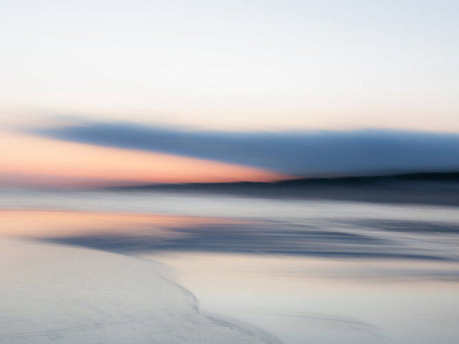
Colorful sunrise and reflections in a riptide made a n abstraction with icm.
Specific Feedback
Any suggestions about the composition are most welcome.
Technical Details
F16 - 50mm Sigma art - 1.3 “” - ISO 100 - No filters - ICM
Critique Template
Use of the template is optional, but it can help spark ideas.
- Vision and Purpose:
- Conceptual:
- Emotional Impact and Mood:
- Composition:
- Balance and Visual Weight:
- Depth and Dimension:
- Color:
- Lighting:
- Processing:
- Technical:
1 Like
I like this! It is simple and unique, giving the viewer a glimpse into a hidden world. The colors and composition are lovely. I wonder about removing about half the sky. For me that leaves an even more powerful composition.
2 Likes
Welcome to NPN Ulbe! Thanks for being here.
Wonderful reflection and ICM image! That diagonal line at the bottom leads my eye into the frame and then travels across to the right. Nice zig-zag lines created with the clouds and mountains.
There is a bit too much empty space up top in the sky. The horizon line lands in the center of the frame. I would recommend cropping some of the sky out so the balance of the image is on the reflection and clouds. Thanks for posting!
2 Likes
I like it! I like the simplicity of it and I like the colour palette and I’m going to echo the others by saying that maybe a crop from the top wouldn’t be a bad idea to strengthen the composition even more. 
1 Like
Welcome to NPN, Ulbe. A delightful post. I really like the shapes and color scheme in the lower part of the image. Here’s another vote for losing part of the sky which is pretty featureless for a large part of the frame.
1 Like
Thanks a lot for your feedback. Much appreciated.
I certainly look at the crop suggestions.
Thank you so much for your insides. I certainly try some cropping to see how it works for the balance.
Thank you for the comment on the color palette and cropping suggestions.
I dont’like much saturation so i am glad you like it.
I try some cropping possibillties.
Thank you so much for your insides. I certainly try some cropping to see how it works for the balance.
The subtle colors are beautiful. I’m with you on liking less saturation, especially for these kinds of calming images. As others said, I think a crop off the top would work well. Maybe a 2:3 ratio? Making it more panoramic also would enhance the calming feel. It’s lovely.
1 Like
I like this one. I agree about cropping the sky, although dampening the highlights in the sky a little might be an alternative.
1 Like
This has a wonderful painterly feeling to me Ulbe. I agree with others about taking a bit off the top, but this is a clean, simple and wonderfully colored image.
1 Like
