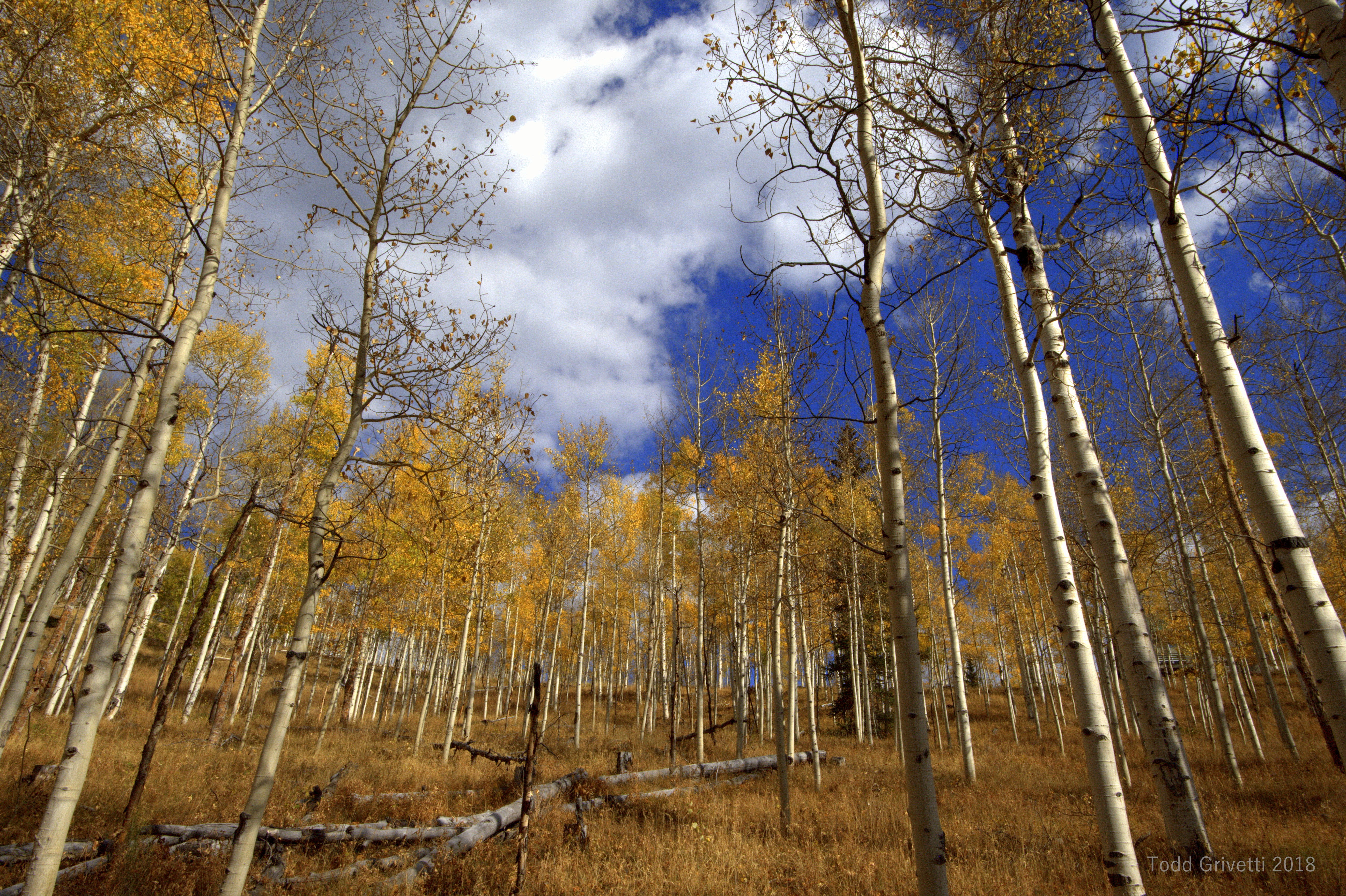
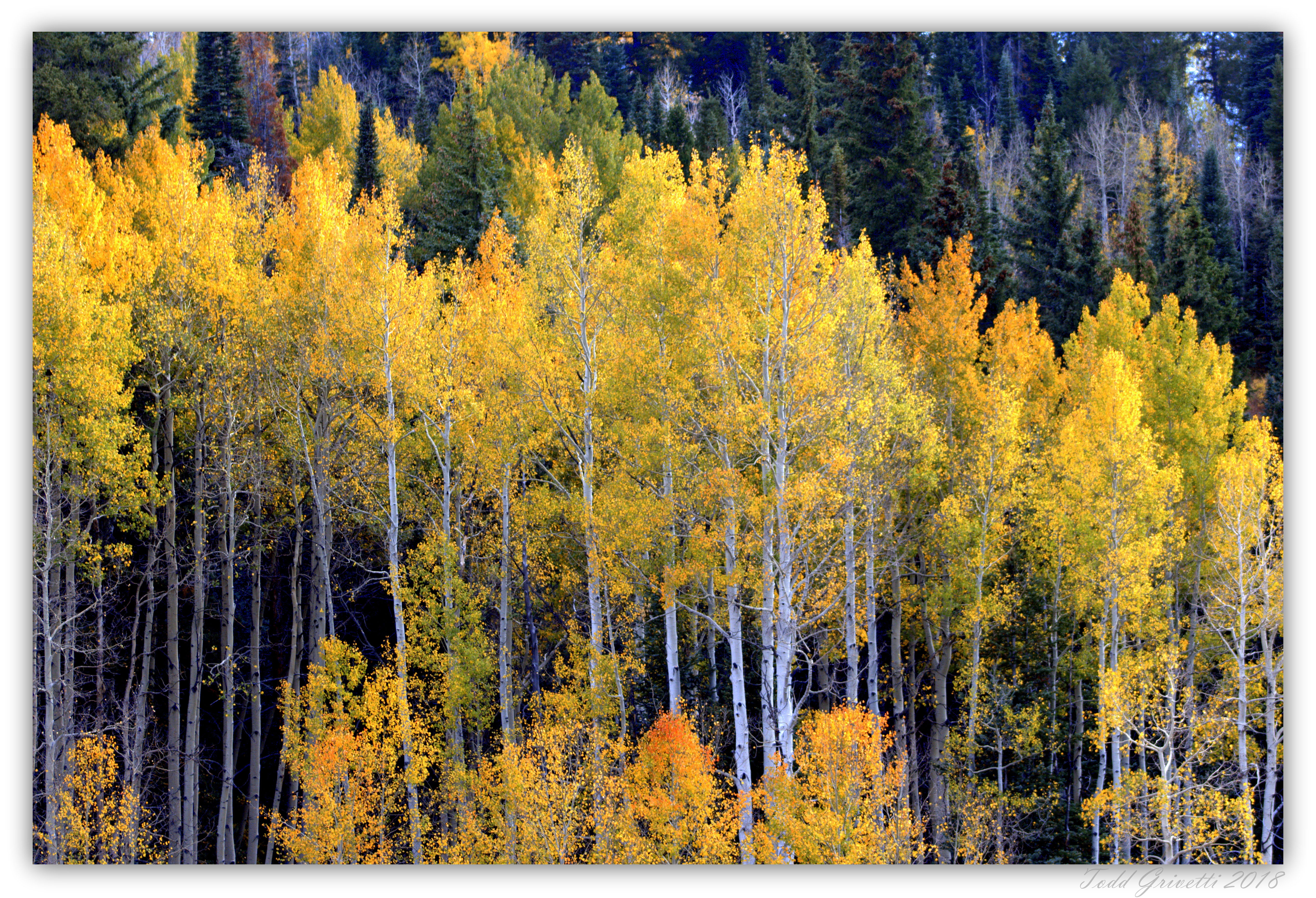
You have some very nice fall images here. The first two seem a little blue to me and you might consider adjusting the white balance to warm them up a bit.
Thank you Rudy. I definitely see some blue tinge in the trunks of the aspens in the second photo. I tried warming the first one up a bit more, but it just seemed unrealistic as this was around 9 am and the sun was breaking throught the clouds.
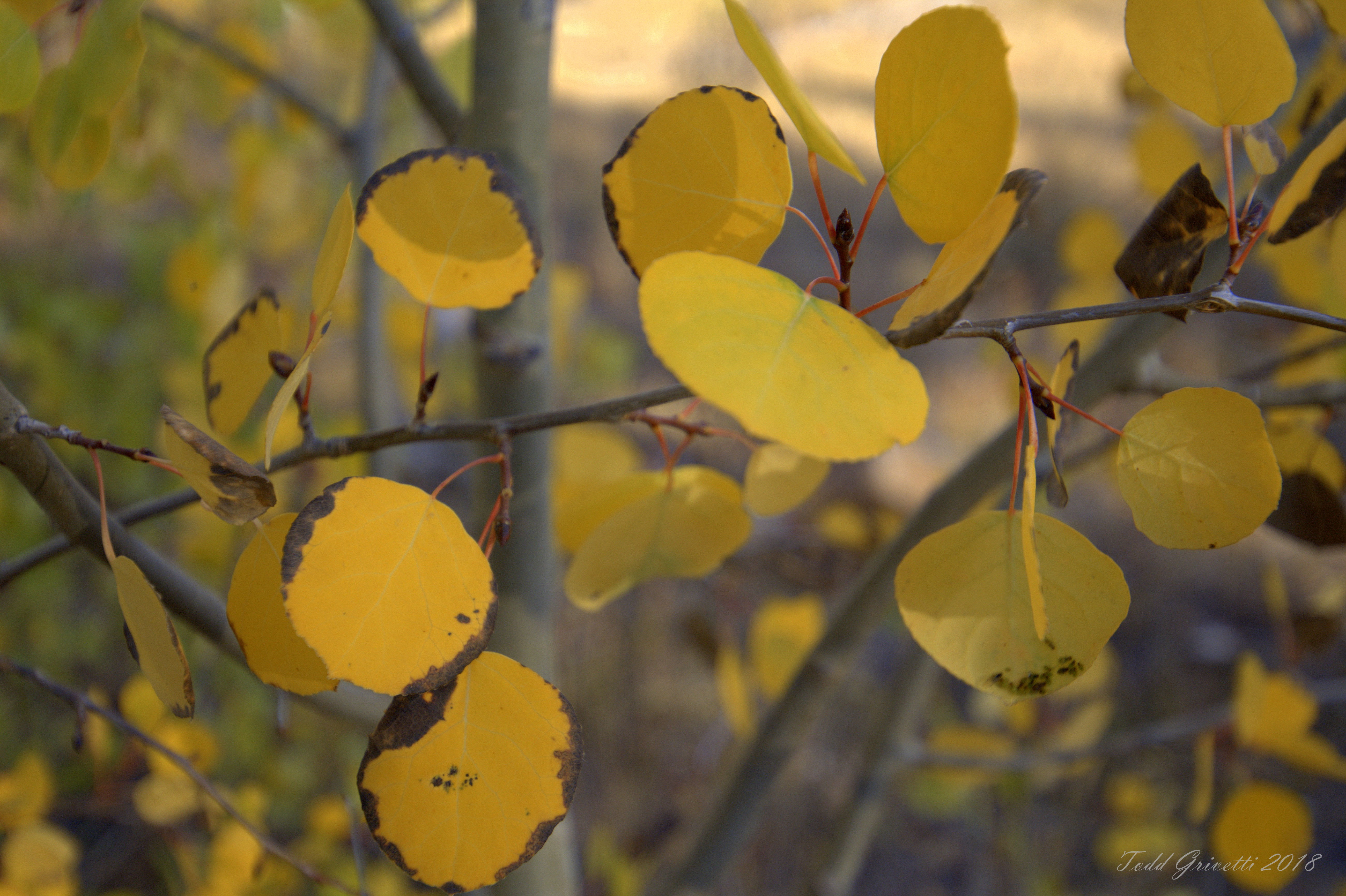
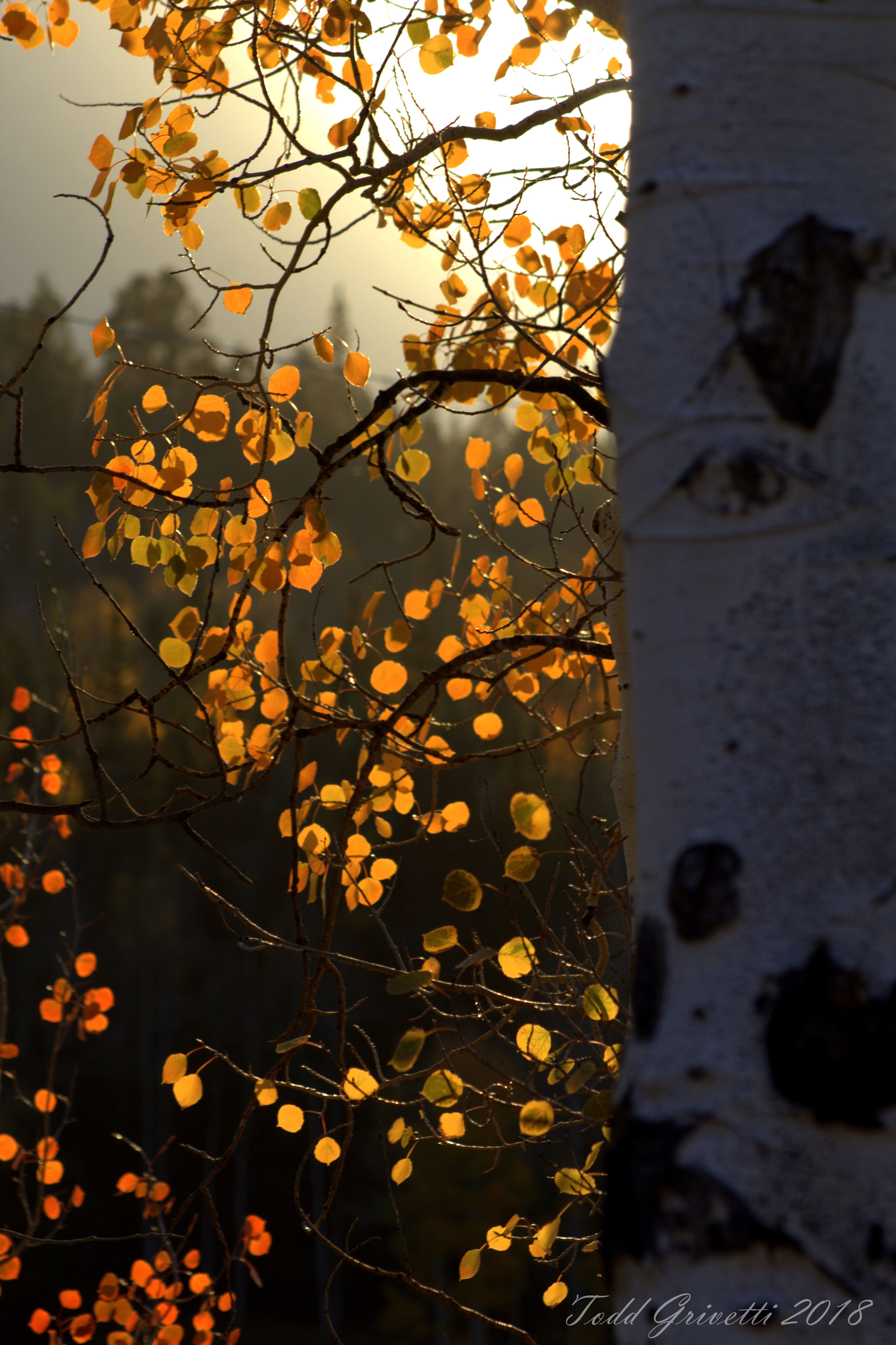
Todd, you have a nice collection of Aspen images here. My favorites are #1 (neat perspective with the wide lens) and #4 (love that backlighting and glow in the sky). The white balance of of #1 looks perfectly fine to me, the sky should be blue, and the clouds are a neutral white. The second image you could make a case for reducing the blue cast in the deepest shadows, but I wouldn’t go too far with that because I’d want to retain a little cool/warm color contrast. In the third image I am bothered by the one out of focus leaf (with the others in focus more or less), and it is my least favorite of the group.