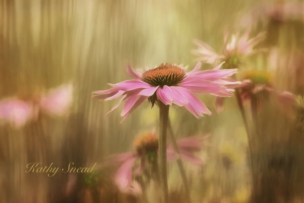
The original photo was shot with a d800 and 300 mm at f5 , 1.320 sec, ISO 400, handheld. It was a good shot (if I say so) and very colorful but I never really felt hugely comfortable with it because the color seemed to dominate the form. The green lines are grasses and were very bright.
A couple of months ago , I started tinkering. First I converted to black and white. Hmmm. Not happy there I painted some of the color back in , mainly on the flowers. The picture sat there awhile. Then I used a paintbrush in PS and started painting my own color on the other parts. It still didn’t look right. Then I started adding some of my overlays to give it more depth . Then I tinkered again in LR, making it darker, having a more compressed histogram. I think its there, although tomorrow I may decide I need to tinker more.
Any comment is fair game. Interested to hear what this group thinks.
Hi Kathy! I agree with Gigi. It is beautiful as is! His word romantic is a good fit. The soft lighting gives it a delicate beauty. I wouldn’t change a thing!