I bought three gardenia plants in spring. And here it is six months later and they are still going strong. A profusion of blossoms, each sporting identical symmetrical petals evenly arranged around a perfectly circular center. Eye candy, every one.
But here and there a blossom pops up that has the courage and determination to buck the trend and take a different path. And whenever I encounter one of these, my heart initiates a virtual “fist pump” as I take a break to relish/appreciate nature’s diversity.
Feedback Requests
First/general impressions.
Pertinent Technical Details
Focus stacked. 19 images. Camera on a tripod.
Each image 1/8 sec at f / 8.0, ISO 64, 105 mm.
Lightroom’s “Select Subject/Invert/Darken/Blur” background mask applied.
I opted for a 4:5 crop since I did not want a symmetrical 1:1 crop to compete with the asymmetrical blossom.
Excellent Franz. I love the asymmetry in this blossom. I don’t know what makes it happen, but my late blanket flowers are putting our strange looking blooms that create more interest than the perfect ones. The light and straightforward composition really work nicely in this image. I do notice some areas around the petals, particularly where they form interior angles that look like the selection didn’t reach all the way in-a very common problem in LR and PS until the last iteration or two, and even then, the some of the selection methods work better than others. In PS the new Object Selection tool seems to work the best for this. It’s a minor item that only the pixel peepers on this site would notice.
Franz: It’s been a little while but we have had these little beauties in our garden on several occasions and like you I like catching them in various stages of opening. I find it interesting that even though the BG is in fact a uniform gray the color of the flower makes it look blue which for whatever reason bugs me a bit. I don’t think I would take this all the way to black but a touch darker would work better for me. >=))>
The stacking worked well and the suggestions of Bill and Dennis will improve the comp. I do finf the blue much too intense for my taste and feel that a more neutral gray may work even better. Just my opinion! Flower is excellent and rge large view is impressive. Well done…Jim
Regarding the colored background on my zinnia image, it does have a slightly blue color cast (RGB: 45, 47, 64). So your eyes are not deceiving you.
Since the cooler background and warmer zinnia colors are on opposite sides of the RGB color wheel (complementary colors), I interpret your “finding the blue background a slight distraction” as meaning that the addition of a color contrast on top of the brightness contrast is a bit “over the top”, and that it would not hurt to throttle it back a bit.
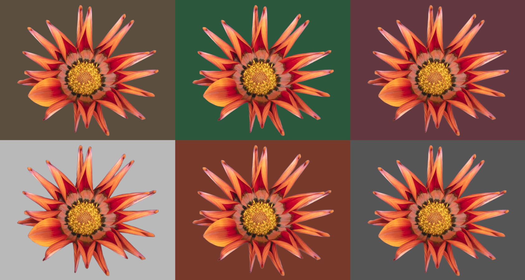
Just out of curiosity, I imported the image into PS, extracted the zinnia, added a blank background and played around with other colored backgrounds at different brightness levels. Warmer analogous colors, less luminosity contrast, as well as more neutral shades of grey, etc.. It’ s surprising how changes in background color/brightness levels can significantly alter the overall feel of the image.
I’ll have to start keeping tabs on the on the mood I am in when post-processing images from now on…
Franz: Your RBG numbers are interesting because when I imported it into PS they were almost identical with no blue shift. Thanks for posting the various BGs to demonstrate how a simple monochrome BG can influence the overall feel of the finished image. >=))>