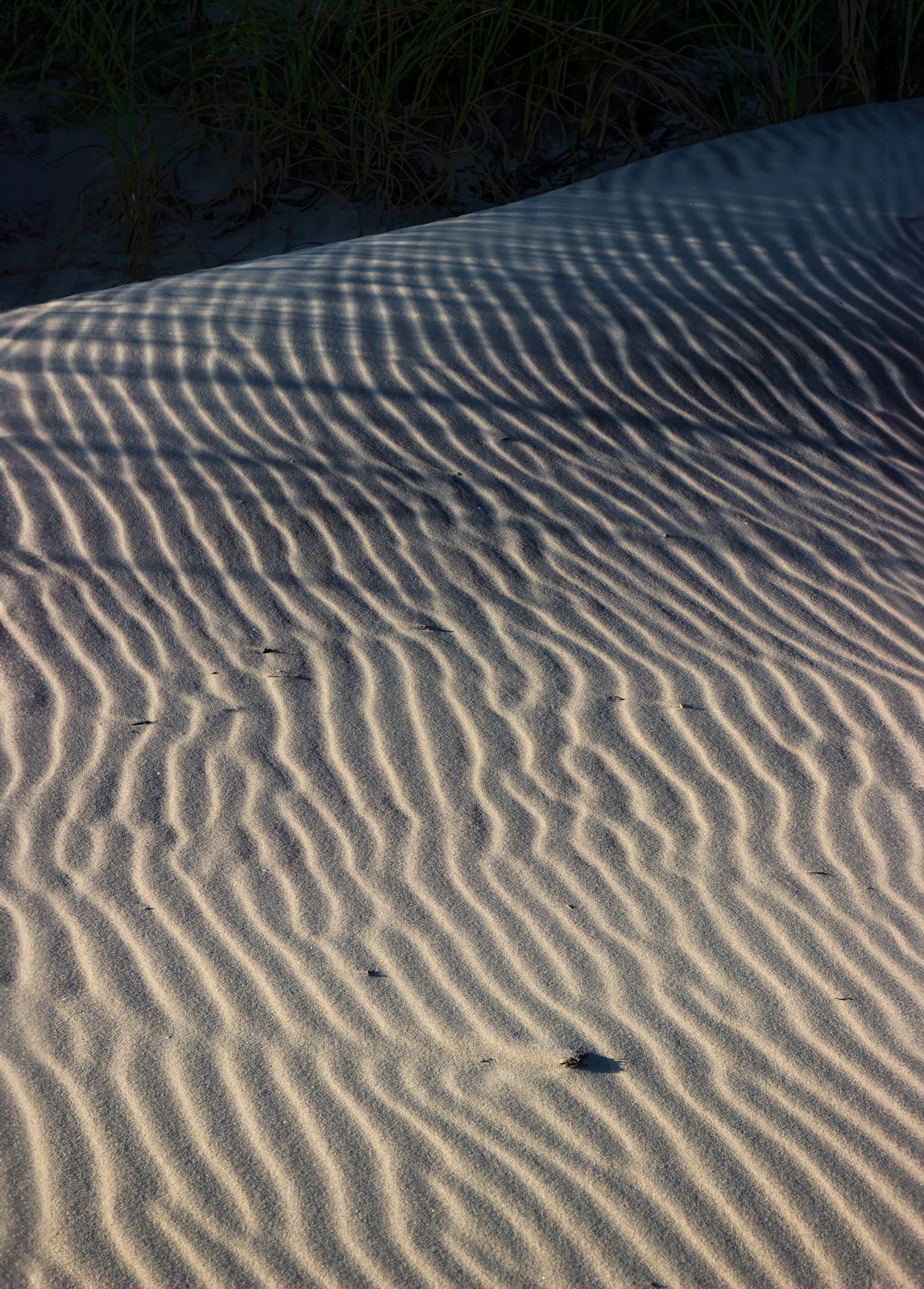
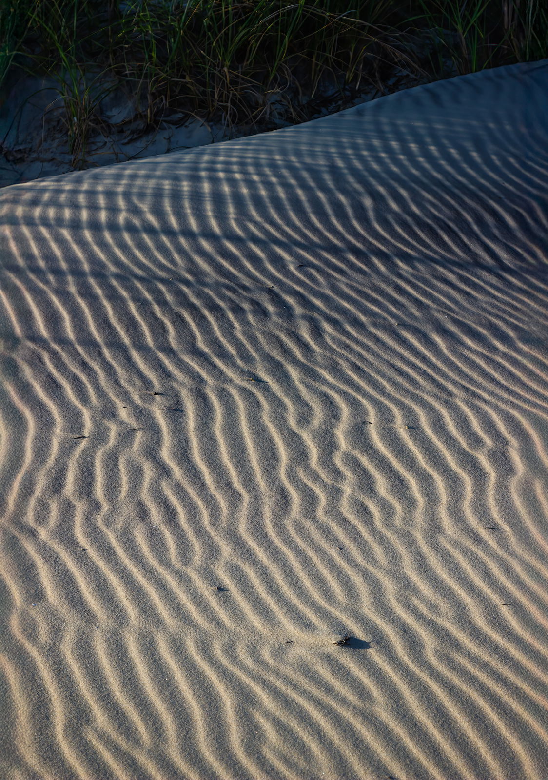
Ron: Wonderful light and shadow play. I’m a little undecided about the dark BG area. Looks like a dune hill in shadow and I think I would like the shadows boosted just a touch or taken all the way to black. I think you would have more sense of place if you bring up the shadows and a more abstract feel if you took the BG to black. Still, well seen and nicely captured and presented. >=))>
Very nice capture of the interesting shadows and shadings. It took me a minute of peering into the dark area to see the grasses. Different monitors can show shadow details differently, but for me, I’d vote for just a bit more visibility of the grasses. Going all black with that area (which I thought it was at first) leaves me wondering what it is. But in any case, the shadows of the grasses carry the day!
Thank you @Bill_Fach and @Diane_Miller for your comments. I generally don’t like totally black backgrounds as they can look a bit unnatural, so I raised the darks there, but it’s rather busy. Maybe I went too far.
Ron, I thoroughly enjoy the wavy pattern of light and dark here and the subtle tonal shift from bottom to top in the sand. The grass shadows near the top are a fine addation. I’m with Bill, that somewhere in between with the shaded dune at the top may be best, but (of course), your the artist here.