For my first request for critique, I thought I’d start with an image that is representative of the type of scenes I like to shoot.
I’m very early in my photographic journey, so any feedback would be greatly appreciated, even if it’s to tell me there’s really nothing worthwhile about the image at all.
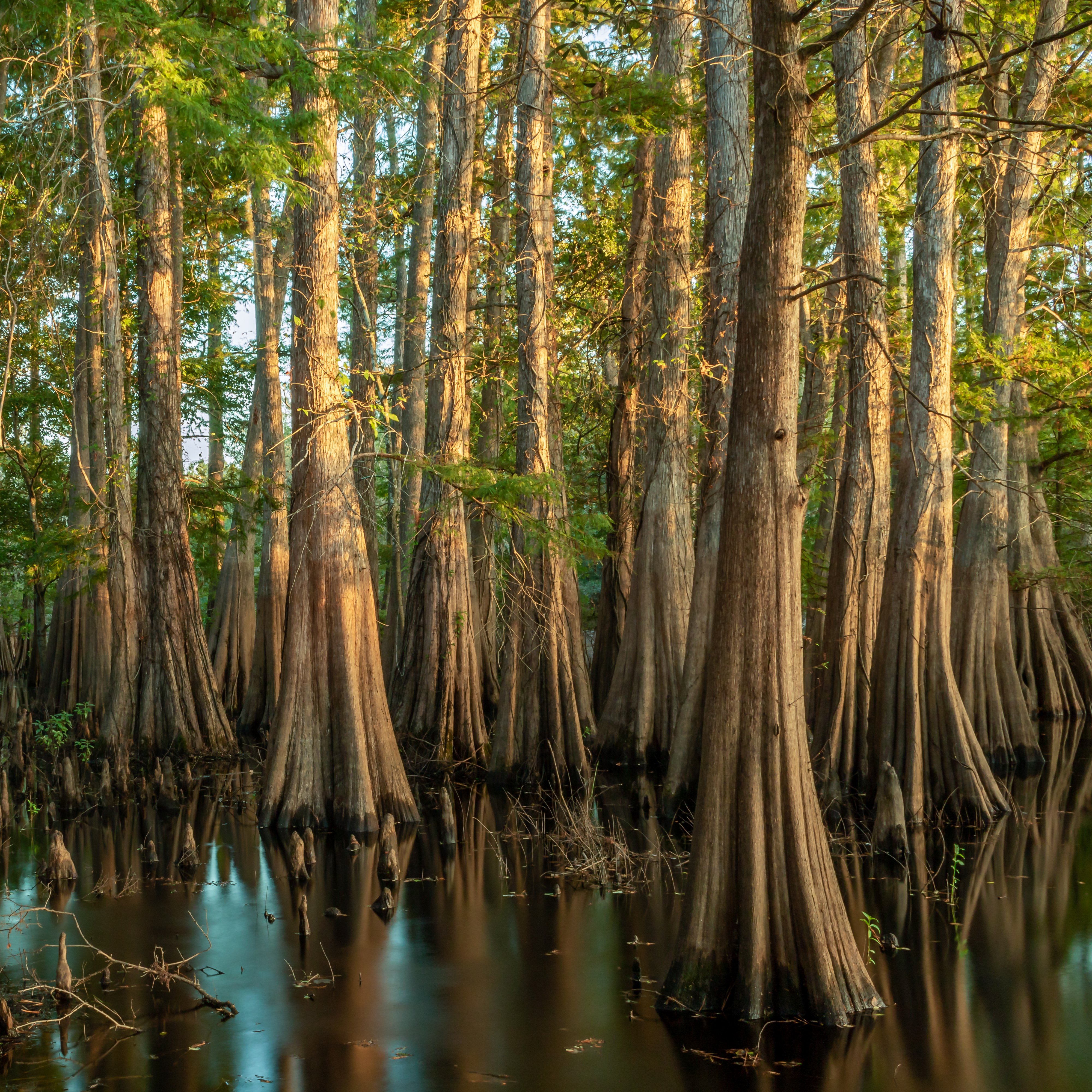
As for the image itself… This was taken at a small local lake here in North Central Florida. It’s essentially undeveloped except for a few hiking trails, so the “real Florida” is still available to see.
Most of my photography outings take place in locations like this - wetlands, swampy forests or mosquito infested lakes. I’ve found it difficult to find what I consider “clean” compositions. There’s always a branch sticking into my shot, a vine in the way or I can’t quite get the angle I want without going off trail in a protected environment (not going to do that).
For this shot, I was looking to capture the texture of the cypress trees and how the early morning light was creating a bit of a golden glow on the trees and contrast that against the dark waters often found in this kind of area. I was also trying to convey the character and personality that I see in these trees. To me, it’s almost as if they are a group of people, and the one closest to the lens, on the right, has stepped forward to greet the viewer.
I struggled a bit with the white balance. At first, I had it too warm in my attempt to display the golden quality of the light that I saw when I was there. I cooled it down some, but now I’m a bit unsure.
What artistic feedback would you like if any?
I’m open to anything here. As a beginner, it’s hard to pinpoint specifics. Do you feel that I captured the scene as I described above?
Any pertinent technical details:
Canon T6i
24mm with 18-55 kit lens
4 sec, f/13, ISO 100
Tripod w/manual release
This version was saved as a .tiff but I don’t have any of the other details available right now.
You may only download this image to demonstrate post-processing techniques.
Don, welcome to NPN and a very nice first post! I do like the composition and the story you are trying to tell. For me it does not feel like early morning light, maybe the white balance is a bit cool. I also might try to pull down the highlights a bit and create some deeper shadows at the water and lower levels of the tree trunks. Nice capture!
Dan, I took the liberty of a quick and dirty edit of what I was trying to explain in my comments. Take it for what it is worth. I did end up using a grad filter on the top 2/3 of the image and global adjustments to the mid tones and shadows. I also slightly warmed up the exposure. This may not be what you were trying to convey but I thought I would give it a try.!
I apologize for the error, I will remove my watermark and have already disposed of the image. It was set in my export settings. My first attempt to assist in editing on NPN and I do apologize.
I’ll have to take a closer look at this when I’m at my computer instead of on my phone, but I’m still a little unsure of the colors when it’s warmed up. Maybe an adjustment to the tint might sit better, but I AM looking at this currently on phone screen, so I don’t really know what it looks like.
I’m actually having some prints made of this image so that I can see it on some different papers and in different sizes. It will be interesting to see the results.
Dan, what a beautiful first post and welcome to NPN! You’re off to a great start.
I like this very much and also appreciate you describing what you were after. I would say you accomplished what you were after and I especially like and can see the analogy of a group of people… well said.
I’d say the colors/WB look pretty good on my monitor. I can see where Alan is heading with his edits, although maybe somewhere between the two. I like the white balance and warmth, but I think overall it went too dark.
I’m really fascinated with the reflection and the trunks at the water’s edge. Did you take any images that have more water? If not, next time out maybe try incorporating the water and reflections more.
Overall I think you did a great job both technically (exposure, handling of the light, etc.) and with the composition. Well done. Look forward to more images.
Welcome, and nice first post. I think you d quite well here.
I think one reason for the apparent coolness is the brightness and saturation of the greens and cyans in both trees and, especially, the reflected sky. I think the warmth of the trees in your OP works well. If you think it’s too warm, try reducing saturation in the yellows and reds–not by much, though.
I like Lon’s idea regarding showing more of the reflected trees if you have an image that does so.
Keep after it! We are looking forward to seeing your images, and to help in way we can.
-P
Real nice first post. The colors look good to my eye. So much of color can be personal preference, so a wide range can work well. I don’t have any suggestions, look darn good to me.
Thank you all for taking the time to offer a critique. I already feel very welcome here. As far as more water… I’ll have to go back through my files for that day and check. As I’ve worked on this image, I’ve been so focused on the trees themselves, I honestly hadn’t been looking at the reflections. The water level in this spot had been dropping precipitously in the days leading up to my visit, so I think there may just be bracken and twig-like clutter there, like the little bit I left in the lower left corner.
On that note - I often find myself looking at other photographer’s work in different regions and thinking to myself “I wish I had clean looks at my subject like that.” Much of where I choose to shoot - in the marshes and wetlands of Florida - is full of beautiful subjects that are compromised by clutter. I’m coming to terms with the idea that this is just part of what I’m shooting, and that it accurately reflects the nature of the area, but I still wonder sometimes if it takes away from what could be a great shot. On this image, does the bit of clutter in the LLC take away from the shot? Add to it? Or did you even notice it? I know I see it, of course, but I’m still learning how others see my images and what impacts them as a viewer.
I really appreciate the feedback, folks! I’ll certainly be looking for more and offering my own untrained perspective where I feel I jave something to add.
Dan, being from Michigan and shooting in a lot of wetlands and heavily wooded areas I experience the same challenge with respect to “clutter”. I see your point and I did notice the clutter in the LLC of this image. As I view the image longer it just becomes a part of the scene and in not an issue. I am also interested in hearing what others have to say.
Very nice first post, Dan. Looks like my kind of place. And thanks for the detailed introduction. To me the color balance looks pretty good for morning/evening light. At first glance it looks a bit on the warm side (to my eye the reflected sky in parts has a noticeable cyan cast). But color balance can be confusing at times, because so much can depend on the naturally predominant colors of subject matter. And another thing is how the individual viewer interprets it, which can vary a good deal. Also, if it is printed and framed, what are the surrounding colors where it’s shown? As there are too many variables, whatever suits you is what works. Of course other members on this site can give you good advice on post-processing.
As for comp, I think you made a good choice for focal length of 24 with that sensor. I personally would prefer a little more of the lake below, but looks like a confined area, also shortening to 18 may not have been practical, or introduced some wide angle convergence distortion. All that said, it’s nice to know how it’s cropped for comparison. Look forward to more.
@Bill_Leggett Thanks for the feedback. The main reason for the 24mm focal length was cropping out some distracting elements that would have otherwise been in the frame. However, I’m sure I cropped this further in Lr
I’m definitely going to be having a look at the original to see if there’s anything to do for more water.
Dan, you have already gotten a lot of great input here from others, so I’ll comment on what you said about clutter. I live in New England, and like Alan, I shoot a lot in woodlands and wetlands, so I face the clutter challenge all the time too. One way to deal with clutter is to identify and isolate the most interesting parts of the forest, usually by extracting only a part of the scene with a telephoto lens. Usually something between 100mm and 200mm will do the trick. Lon’s comment about the tree trunks and water is an example of trying to isolate only part of the overall scene. When you go with a wide-angle in this type of environment, it’s often difficult to avoid clutter.
i know you took this image to emphasize the warm light, and you did a pretty good job of showcasing that. But approaching the clutter issue from a completely different angle, another way to reduce complexity and simplify an image is to convert it to B&W. This places more emphasis on shape and form. The use of B&W to remove color also helps simplify forest scenes sometimes.
Ed, I also really like Ed’s B&W version, I actually failed to suggest that before. That option works great for ANY image with strong subject matter like yours, and completely nullifies any disputes/opinions about color. I should do more of this with my own swamp scenes.
Welcome to NPN and a great first post. You have captured some beautiful light here. The trees do seem to be marching in step. ‘Keep on truckin’ comes to mind. I find the cyan reflection in the water too strong. I would dial that back. The bottom half of the image forms a nice composition in itself of just the tree bases due to repetition. Also the light on the bottom half is significantly darker.
I like the B&W look in general, and I’ll definitely be considering that in the future. I’ve already found in some of my images that I just didn’t feel right about, once I converted to B&W, they suddenly popped and felt like that was how they were supposed to be.
Here’s a question that should reveal the gaps in a you-tube/self taught person… When you are referring to the cyan in the reflections and the sky… I process primarily in Lr… In the HSL panel, I don’t see cyan at all. Reducing the “aqua” eliminates the “off” color os the sky and the reflections. Is this just a difference in Lr and other processing software?
Also, for those who asked, there is no more water to be seen… I only made two exposures of this particular spot, feeling that I nailed it on the second shot - and they were both horizontal with the bottom of the frame exactly where you see it here. The only cropping I did was to remove some of the clutter I mention above on the left side of the frame. So… there’s reason enough to go and revisit this spot next rainy season. By now, this particular spot is probably completely dry. Once the summer rains stop here in Florida, the ground pretty much sucks the moisture right up.
Thanks again folks! I really appreciate the comments and the welcome!
Dan, many folks here use a combination of Lightroom and Photoshop for processing. Lightroom is fine for editing some images, but Photoshop has more tools to do more complicated or localized editing, which is especially useful for landscape photography processing. Within photoshop there are three adjustment layers commonly used related to color/saturation, 1) Color Balance, 2) Hue Saturation, and 3) Selective Color. “Color Balance” is somewhat similar to the White Balance/Tint sliders in Lightroom, except Photoshop offers sliders for Blue/Yellow, Green/Magenta and Cyan/Red (which LR does not have). “Hue Saturation” allows you to make adjustments similar to what you can do in Lightroom’s HSL, except it offers the above 6 color choices. The other advantage to using PS is that these adjustment layers can have a mask applied, and then by painting on the mask you can localize the adjustment to only specific areas of the image if you desire. Because of masking, PS offers a lot of ability to create localized edits, and is a tool worth using.