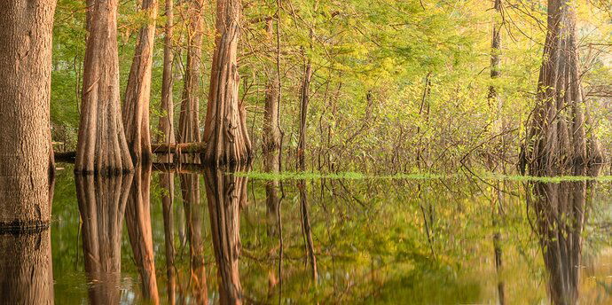
I captured this one evening at a local lake just as the sun was dipping behind a tree line, softening the light. I like how the side lighting accentuates the textured folds of the cypress trees.
What technical feedback would you like if any? Any glaring errors that I missed?
What artistic feedback would you like if any? How does the white balance work for you? I’ve oscillated back and forth on warming and cooling the highlights and sort of settled on where they are now.
Pertinent technical details or techniques:
(If this is a composite, etc. please be honest with your techniques to help others learn)
Simple LR highlight adjustments, some graduated, some brushed in
If you would like your image to be eligible for a feature on the NPN Instagram (@NaturePhotoNet), add the tag ‘ig’ and leave your Instagram username below.
You may only download this image to demonstrate post-processing techniques.
This is a nice swamp scene. The white balance is too warm IMO.
The biggest thing I see is the tree on the left. It’s very heavy and makes the whole image left biased. The image is improved by cropping it off.
I took it to black and white and cropped off the left side just to eliminate the tree.
1 Like
Thanks for the input, @Bradley_Strong . I like the crop. I may run with that.
I’ve been creating a lot of black and white lately and deliberately want to work this one in color just to keep a variety going in my work. It dies lend itself very well to BnW though.
This is a nice swamp image with a fairly warm white balance. Besides the issue of the tree on the left which has been addressed I think the center area between trees lacks enough interest. The trees and their reflections, particularly the left ones, are the stars here but the less interesting central area takes up too much space. That’s my opinion anyway.
I agree with @Igor_Doncov. My first impression looking at this shot is that its strongest elements are about verticality. So, choosing a pano aspect ratio, a ratio that inherently stresses horizontality, in my opinion, undermines the strongest aspects of this image. That’s something to consider in the field when composing but, as it is, I’d consider cropping almost half the image from the left and concentrate on the strong vertical lines of the trees and their reflections.
Awesome reflections Dan; I too favor that left side. As far as the white balance, I downloaded the image and played with the color; I do think the color is improved with a little less red.
Dan,
I’ll go out on a limb (sorry…) and say I like the pano approach - would have been a good entry in last week’s WC - about breaking the rules.
I do agree with others on a few things. the middle is kinda empty, but the large cypress on the right helps. The big tree on the left is pretty heavy - plus it looks like a pine of some sort and not cypress (not that it matters. I think you just might have enough room the gap to make a crop of that tree work. Lastly, I would agree the colors are a little red and yellow - but well within personal choice and certainly not out of bounds any where…
Lon
I like Bradley’s crop here. Love the Cypress and reflection. I do hope you took at least one vertical of the cypress group. Nice work.
Thanks for the input everyone. I definitely will be cropping the big heavy tree on the left, but I actually quite like the empty/negative space in the middle. I feel it helps with the feeling of calm/silence that this place had amd helps bring it to the image.
It’s not supposed to be an overpowering “wow” shot - more of a “pleased sigh”
As for the color, I’m going to tweak it a bit more but I think this image may just end up in B&W. It seems to work best there.
Vertical crops? Yes, I have a couple that I’ve only just looked at a few times. These will be more of the impactful scene, filled with the soft folds of the trees and the contrast of the shadows in those folds and the warm light.
Thanks for the feedback. I appreciate it and it’s helping me grow my work
Dan, the pano view looks good here, with the bracketing trees and lovely reflections. I could see reducing the warmth a bit, the but overall glow is also nicely inviting. My suggestion for the shrubby area, right center, would be to do some burning/dodging for some extra contrast. Then the contrast would match better with the rest of the view. It is a warm, inviting view.

