Critique Style Requested: Standard
The photographer is looking for generalized feedback about the aesthetic and technical qualities of their image.
Description
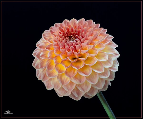
I stopped by the Olympia Farmer’s Market Saturday and picked up 5 assorted stems from Dan’s Dahlias. I spent some time yesterday photographing them, mostly closer than this, but I liked the entire bloom best of the shots.
Specific Feedback
In addition to cleanup of odd spots in the petals, I used a Color Mask from the TK9 panel to pick the yellow centers of the florets and increased the saturation and luminosity of those areas to try to impart a glow to the bloom (it already looked like it to me,but I wanted to enhance what was there a bit). Was I successful? Does it look artificially enhanced?
Technical Details
Sony A7Riv, FE 70-200 f/4 macro @ 120 mm, tripod and cable release, f/22, 1/4 sec, iso 320. Light was indirect illumination from a skylight in the bathroom, background was a sheet of black foam core. Cropped horizontally a bit and canvas added to top.
