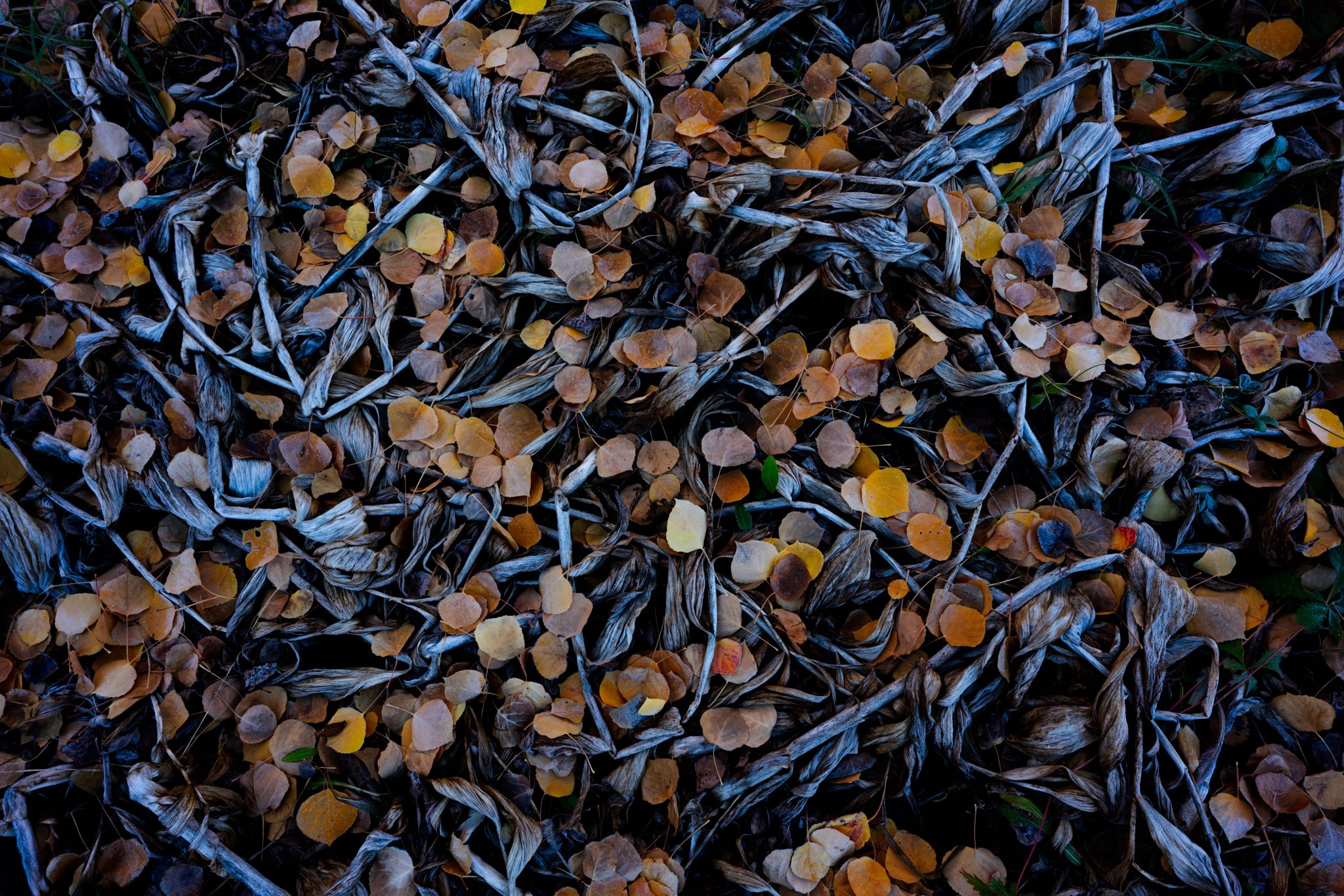
Here is a scene I borrowed from @David_Kingham and @Ron_Coscorrosa on a recent outing with them near Crested Butte Colorado. These are not my typical scenes but I’m trying to expand my repertoire, and watching these masters has helped me a great deal.
What technical feedback would you like if any?
I’d love feedback on composition and processing.
What artistic feedback would you like if any?
Does the scene tell a story or do anything for you as the viewer?
Any pertinent technical details:
Sony a7r2; Zeiss Loxia 21 f/2.8 - f/14; ISO 100
Allow other members to download your photo to demonstrate processing examples only?
I like this a lot. It tells a story of changing seasons and the slow process of decay. On the processing, I am finding the blues/cyans in the stalks distracting, but that is very much a personal preference. I think backing way off the blues pops the colors of the leaves and has a better look to my eye. Either way, excellent image.
Thank you @Harley_Goldman I appreciate that. I’ve been told my processing on most images is blue/cyan heavy so I appreciate the further validation on that front haha.
Hi Matt. I really like the composition and the organisation of the scene in this image.
The thing that bothers me is that I feel the leaves could use some pop and colour to them and make them stand out in the scene.
Hey man, absolutely stonking composition! I really love how balanced it feels and I know that’s not an easy thing to achieve. . I think it tells a nice story of the change of seasons and the passing of time as represented by the layers of newer dropped leaves over old.
I think the coolness of this image holds it back from making the impact it should though. I think the entire image needs to be warmed up quite a bit, and then following that some emphasis added to the contrast in colour between the deader, cooler flora and the new, colourful leaves. Once that contrast and emphasis is added, i think the ‘story’ will come through far more clearly to the viewer.
In terms of luminosity and contrast I think everything is really on point when it comes to the shadows but is lacking a little to on the right hand side of the histogram.
I’m really looking forward to seeing how this image turns out mate! Awesome stuff.
Nice job Matt! I enjoy the contrast in textures, shapes, and colors here. I generally agree with the other posters as far as the postprocessing. I think this could stand to be brighter, more vibrant, and maybe a bit warmer. To me it feels like the decaying corn lillies are what is grabbing the most attention and my preference would be the colorful leaves to be balanced with them.
I agree with warning it up. I also often have a tendency to lean toward too cool at 1st. I often use one thing I took away from a printing class where we would make several tonal shifts and print out a test strip just to see them next to one another. I will do something similar in LR where I will zoom in on a rock or something where I know what I want it to look like, then start warming it up in small increments and go back and forth until I have it right. Often when you are there you will know it, because the scene will just have more depth and pop. Then I will zoom out and reconsider the whole image again. Repeat as necessary or use this as a way to identify where I need to make more local adjustments.
I really dig this shot Matt, and I would be very happy with something like this in my own portfolio. I love the sprinkling of leaves combined with the withered corn lilies. I think it’s because of my film background, but I really love the cool tones in the corn lilies. It helps to build a sense of depth because warm tones of the leaves come forward in the composition, and cool tones retreat. I think it’s the cool tones on the lilies that gives this photo a sort of 3D look. Also, the cool light implies a sense of death and decay, which is important to the story of this photo.
I really like the linear emphasis of the lilies, and how the aspen leaves are mostly brown. That definitely touches on the story telling aspect. It paints the picture of the larger scene you shot this in, and how all that material on the ground will feed future generations of plant and animal life.
If this was mine, I would darken that central yellow leave just a little bit. I appreciate the emphasis of that one leave set against the rest of the scene, but I think this photo is all about the colors, textures, and patterns. That one leaf seems to draw a bit more attention away from the rest of the scene.
I remember you walking by and saying ‘I can’t see that kind of stuff like you guys do’…pffft I’m pretty sure this is better than anything I got! I really like the swirling action going towards the center leaf. Personally I would crop it to accentuate this more, along with dodging the swirling sticks and the center leaf. I also warmed up the highlights, dodged the darkest shadows (all this using luminosity masks), and used selective color to take a lot of cyan out of the cyans, took some magenta out of the blues, and added some midtone contrast. Killer!
This is really excellent. I like your original vision with the blues a bit more than the rework. They’re really hard to compare as they say different things. The original was moodier and more mysterious.
My one suggestion has to do with the bright yellow leaf dead center. I would tame it.
I love this kind of imagery and honestly I think I spend more time looking down than up… There is so much we often miss.
I wouldn’t have guessed the corn lilies, but see them now. Not only does this tell a great story, but just a terrific combination of colors/tones and really almost a flow of patterns and detail.
The very small detail that first struck me actually is the small green leaf just off center. It has a much bigger impact than it’s size. Of course in exploring I see other little bits of green like a blade of grass; all these little details contributing to this nature story.
Dave’s edits pretty much take care of any color/sat issues. Looks great!
I really like your composition–good eye to see this.
I do like the blue in the original because it gives the scene a more melancholy feel. I also like David’s tweak for the blues, and I agree with Ben about working on that single, bright leaf.

 There is so much we often miss.