Critique Style Requested: Standard
The photographer is looking for generalized feedback about the aesthetic and technical qualities of their image.
Description
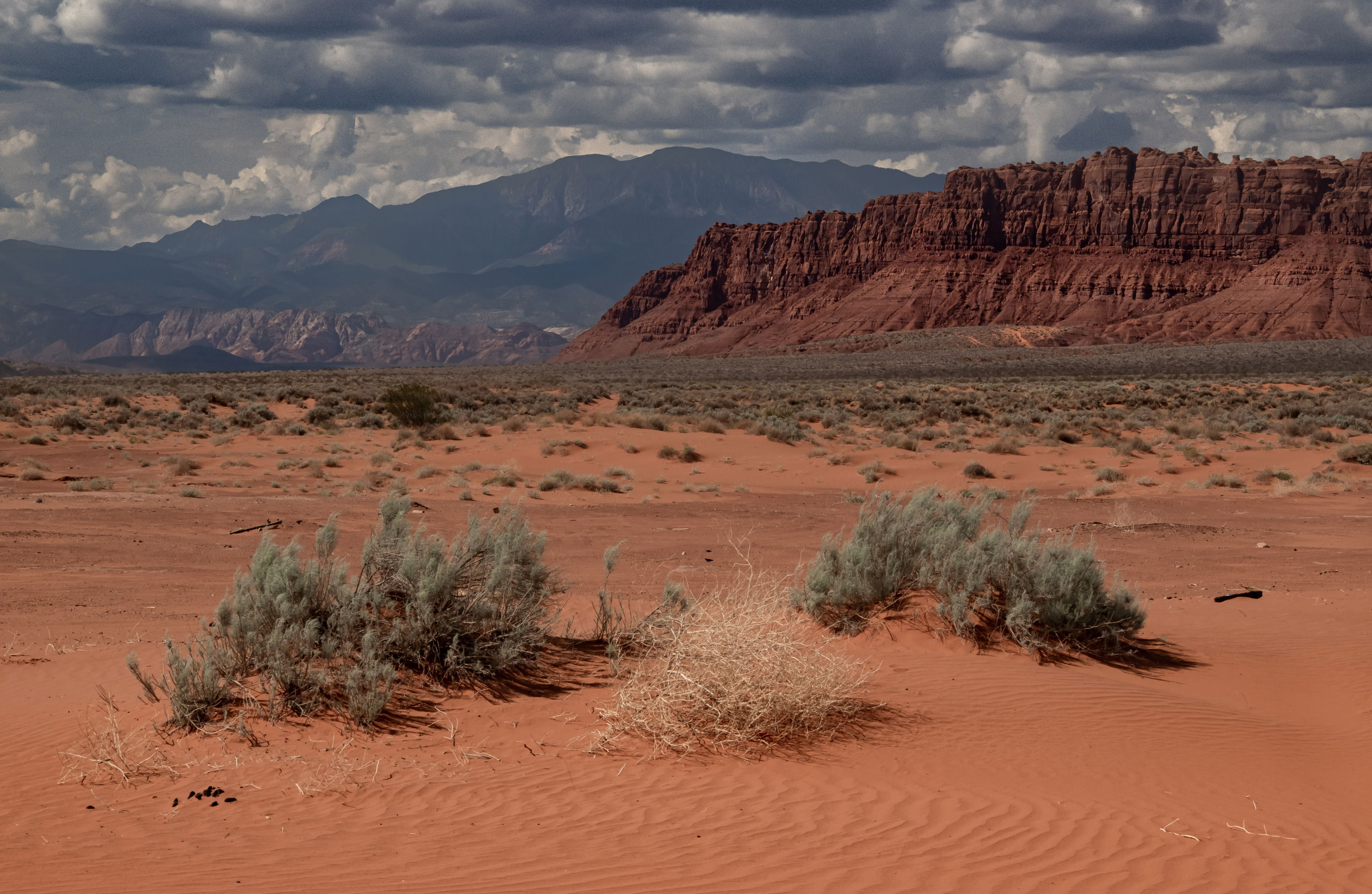
This image was taken in the afternoon at Warner Valley Utah. I just loved the vastness and the different levels of interest in this image.
Specific Feedback
I love this image, but my fear is that it seems over saturation, but this is what I experienced when I was there.
Technical Details
Nikon D5600 Nikon 55-200 @68mm, F14 at 1/30 sec
with Manfrotto Tripod
Critique Template
Use of the template is optional, but it can help spark ideas.
Vision and Purpose:
Conceptual:
Emotional Impact and Mood:
Composition:
Balance and Visual Weight:
Depth and Dimension:
Color:
Lighting:
Processing:
Technical:
Nice country! I like the composition, but I do have a couple of suggestions.
- Consider bumping up the exposure about 1/3 to 1/2 stop. the entire image could use a tad more light.
- There are bits of debris in the sand that you might clone out.
The saturation of the reds may change a bit after you adjust the exposure, so I’d leave that alone for now. I really like the clouds and the soft light.
-P
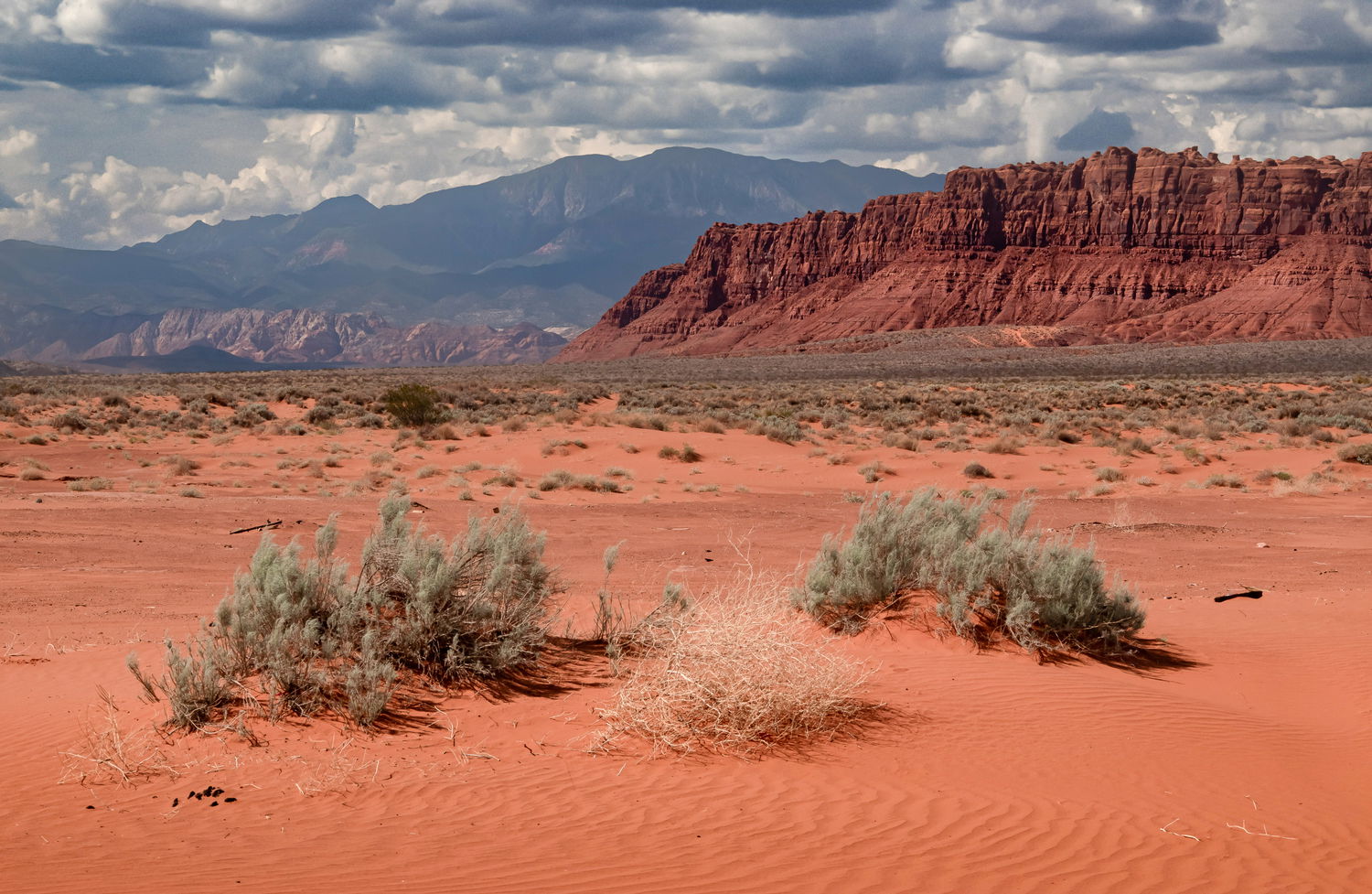
I think you had great vision with image, Mike. I like the three shrubs (2 green and one dead) in the foreground that are well spaced and perfectly balanced. I also like the contrast between the red rock cliffs and the muted mountain behind it. I think @Preston_Birdwell called it right when he mentioned that this could use some more light. It’s just a little bit flat. I hope you don’t mind but I took this into LR for a quick spin. I added a bit more than a half stop globally, I selected the sky and reduced the purple cast and also increased the contrast and the whites making the sky, which is beautiful, pop a little bit more. I added a linear gradient on the bottom of the image and burned the sand in the bottom portion of the image. That’s it.
Mike, the colors look good to me. The heavy clouds are a nice touch. I do like David’s brightening and cloud sculpting, they make the view more inviting.
Others have already mentioned increasing the exposure here. I agree with them and there’s really no point in me rehashing what they said so I’ll move on from that.
Composition wise, I think you did a nice job. The three shrubs in the foreground anchor the whole scene nicely and add a nice sense of balance to the composition. They’re just the right size in the frame to make them important without being so big that one might feel the image is about them and not the landscape as a whole and which I find to be quite mesmerising.
When I pull this into Photoshop, it has a Display P3 profile. That looks very different than if I assign it an sRGB colorspace. You might try converting this to sRGB prior to posting, as some browsers may not display the Display P3 the way you intended.
John
Thanks for the feedback , I only use Lightroom.
Mike Lindeman
David
That is good advice. I wanted to have the texture of the sand included so I had it a little dark. Lightening it up looks better.
Thanks
Mike Lindeman
@Mike_Lindeman You should be able to convert the color profile to sRGB in Lightroom.
A quick search found this…
- Convert Existing Images :
-
Select the images you want to convert in the Library or Develop module.
-
Go to the Develop module, and from the menu, select Edit > Convert to Profile .
-
Choose sRGB from the list of profiles. This will convert the selected images to sRGB.
I hope this helps,
-P
1 Like