Use of the template is optional, but it can help spark ideas.
Vision and Purpose:
Conceptual:
Emotional Impact and Mood:
Composition:
Balance and Visual Weight:
Depth and Dimension:
Color:
Lighting:
Processing:
Technical:
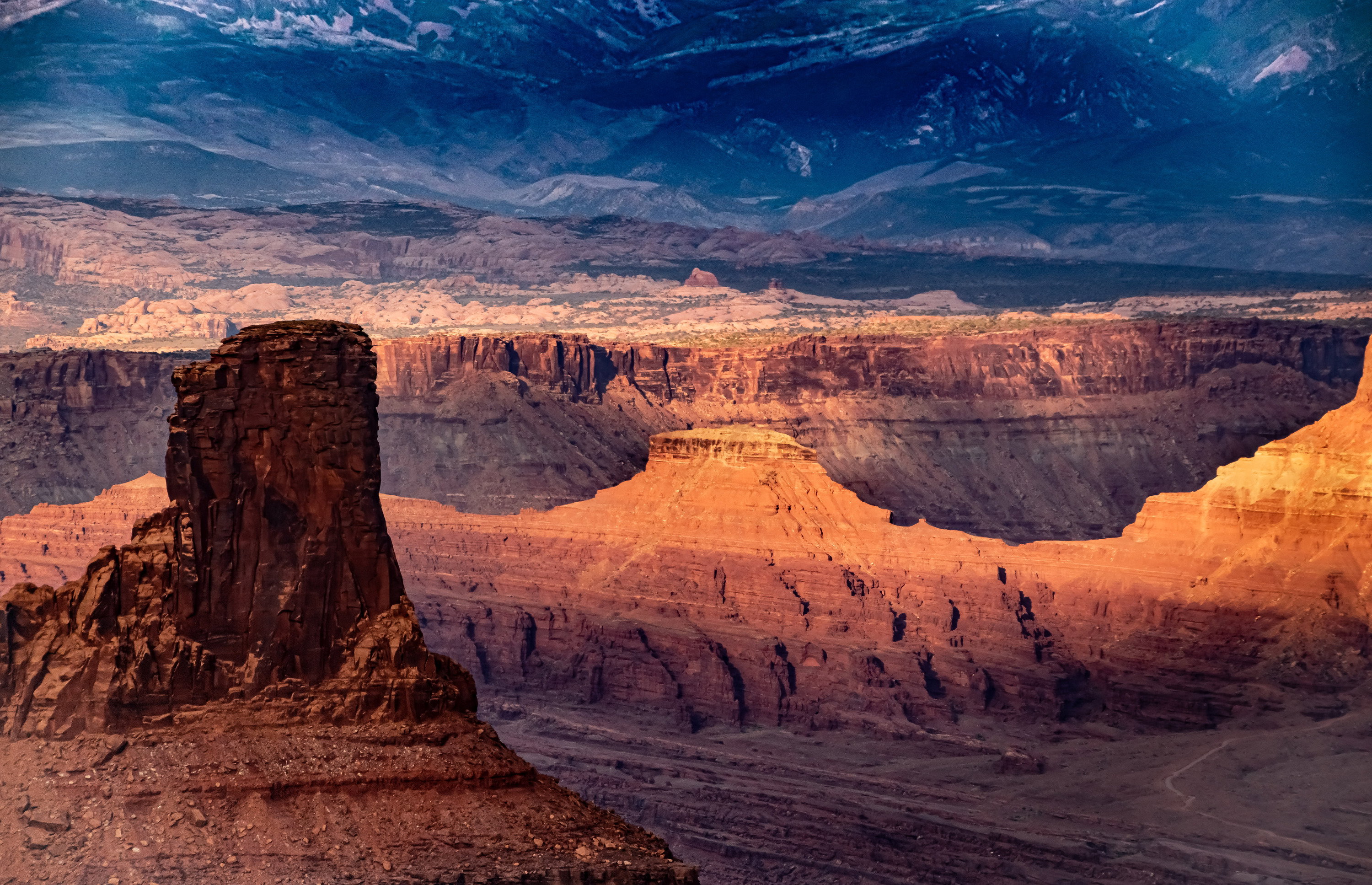
The color contrasts are interesting in this photo and the orange/blue combination is a nice one. I am wondering why the blue BG is so uneven in luminosity as you move horizontally across the frame? Other than that I like what you have.
Hi Mike,
The light on this desert landscape is exquisite. For my own personal tastes I too find the colors oversaturated, especially the blues. I think if you lowered the saturation it would elevate this scene another notch. That is just my opinion of course as saturation is a personal choice. This looks like a very beautiful location.
I like this Mike. With a little work it could be made even better. I think the FG looks good. The saturation looks natural to me with the strong sidelight on these rock formations. They often take on thgis amazing glow. But I agree with the others about the BG. It’s a little too strong a blue and uneven as @Youssef_Ismail says.
I pretty much agree with @Tony_Siciliano’s assessment. But it could be a matter of taste. Some buyers I’m sure will like this look. Usually contrast drops as objects are further away.
I really like the layering of elements in the image, it gives it real depth. I think the foreground elements in the light look great. I think the background looks a little off with the uneven dark blue mountains and the lighter rocks right in front of them that don’t seem to be getting the same sunset colors.