The photographer is looking for generalized feedback about the aesthetic and technical qualities of their image.
Description
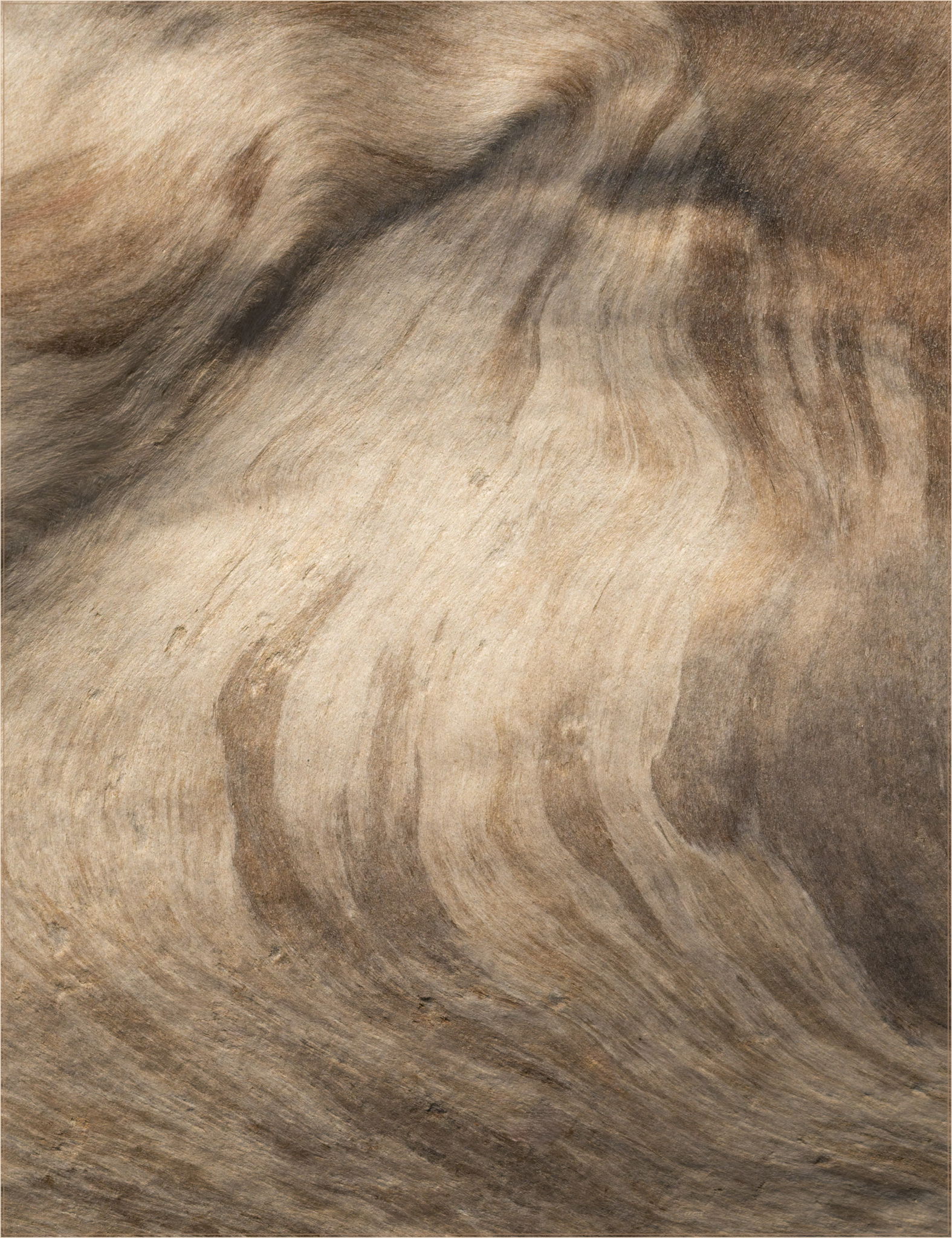
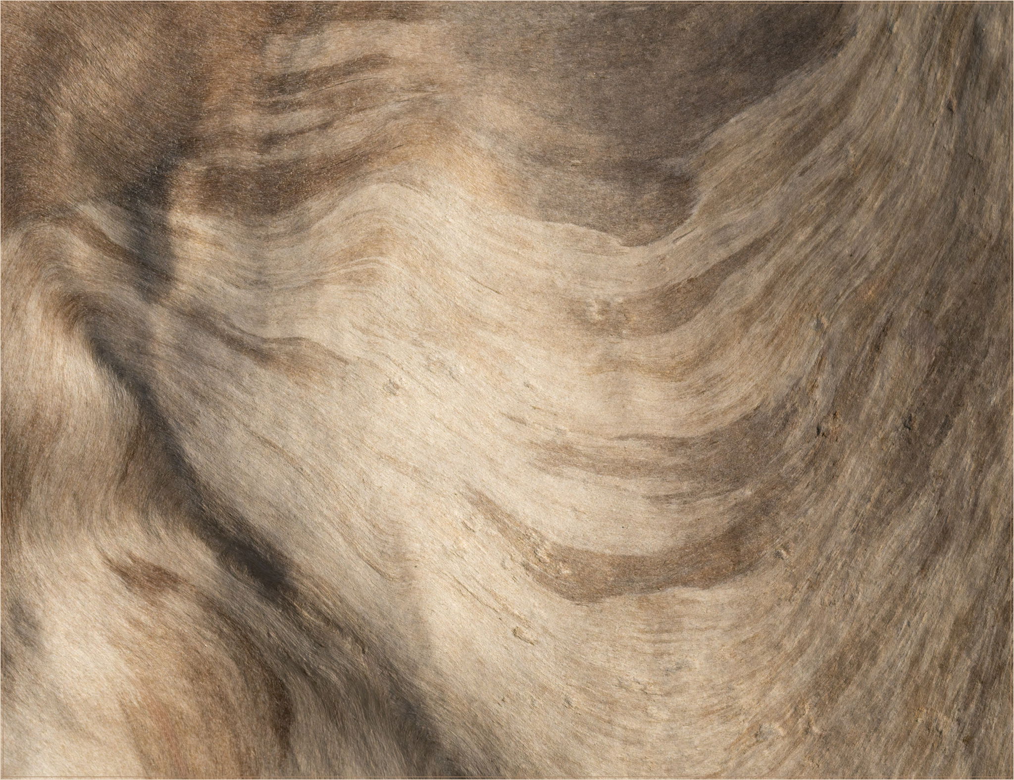
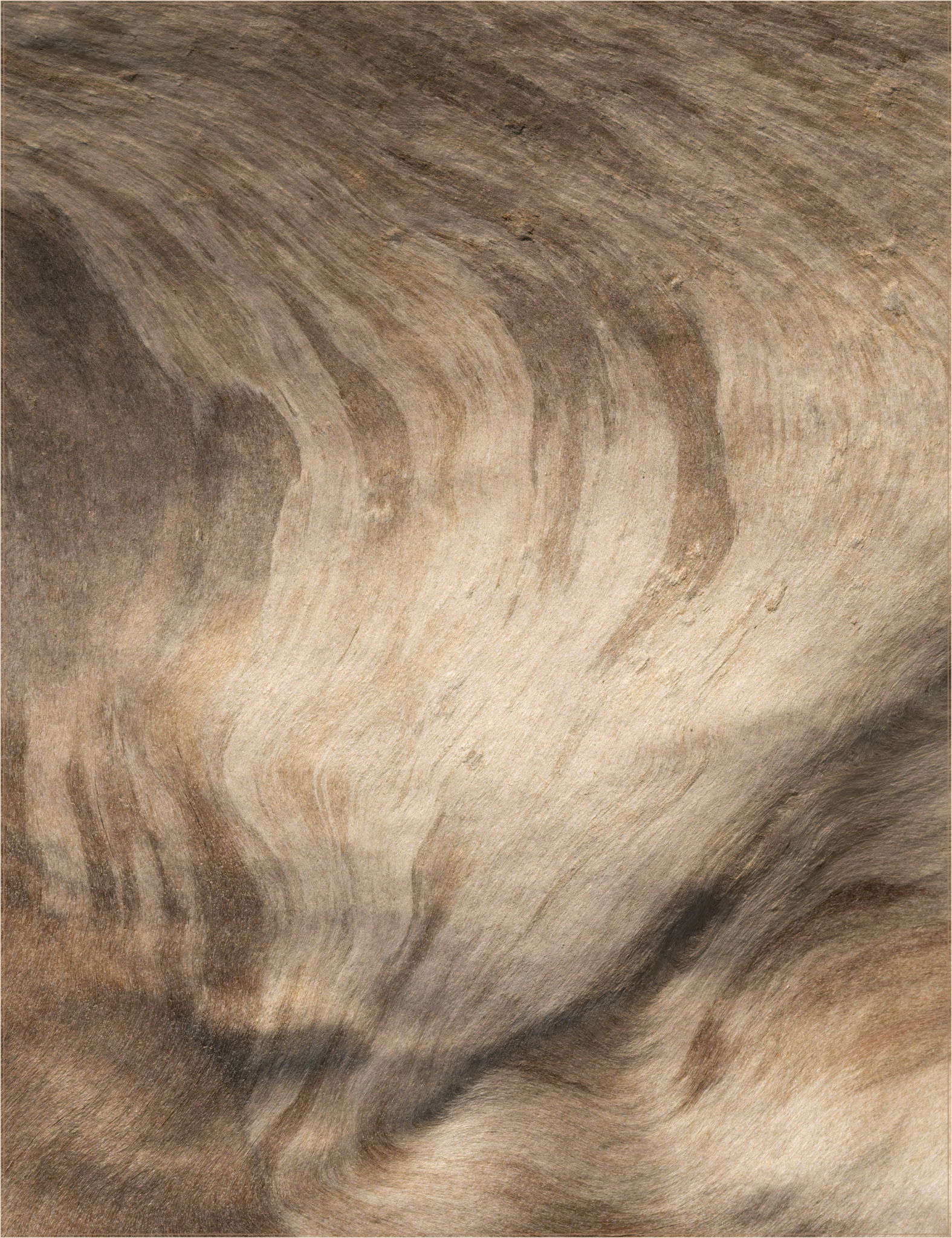
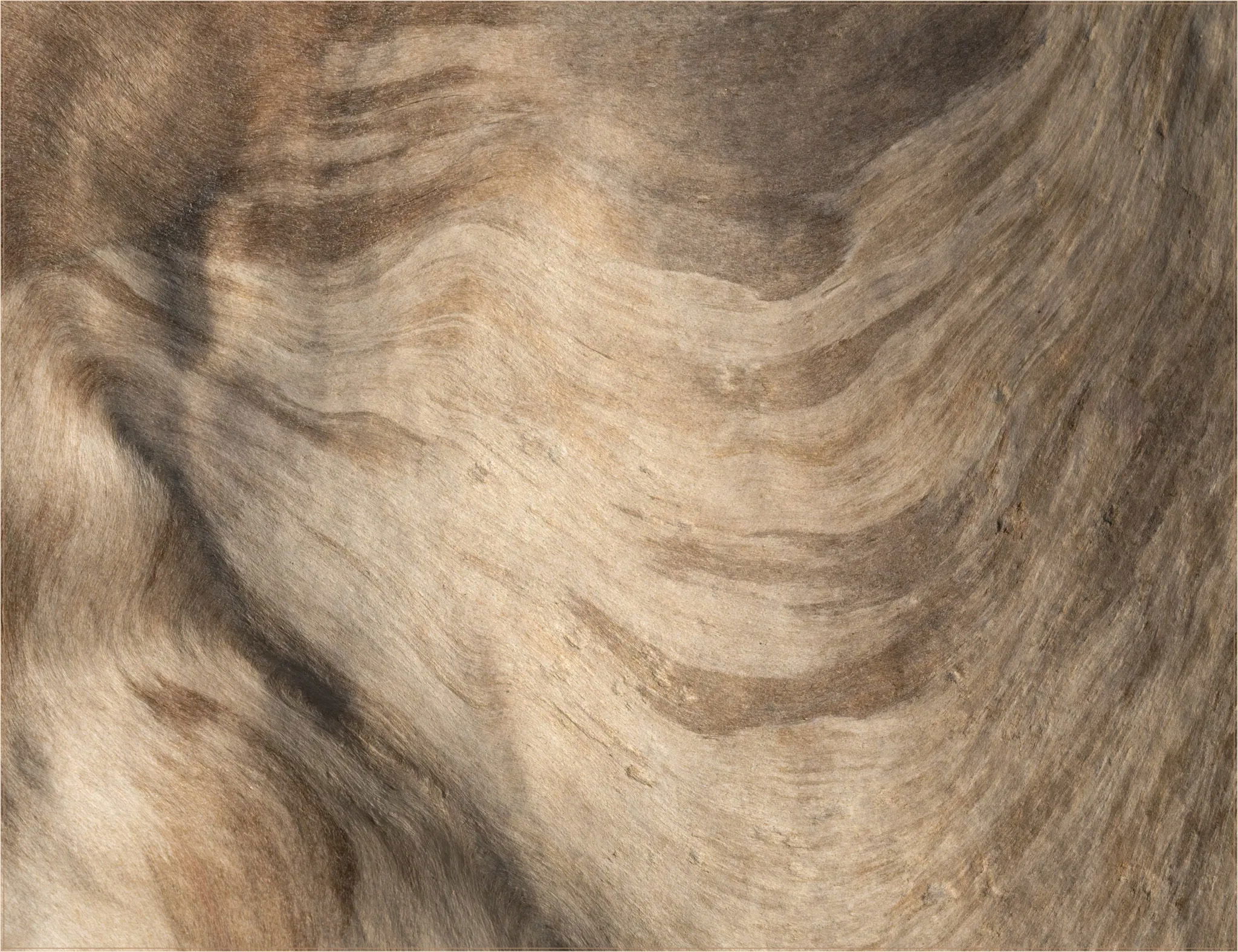
I spent a couple of days this past weekend near Forks, Washington and did most of my photography at nearby Rialto Beach probably best know for sea stacks, but covered with huge amounts of driftwood, much of it left over from the days of old growth. With blue skies and relatively calm water, I was looking for other things to photograph than seascapes and spent quite a bit of time looking for textures and patterns in the driftwood-a very easy and pleasant task.
Specific Feedback
These are just three orientations of the same image mainly because I can’t figure out which one, if any, works better than the other two. Oddly, the orientation I processed this in, isn’t one of the choices I liked after I started rotating it.
Technical Details
Sony A7Rv, FE 70-200 f/4 macro @ 141 mm, hand held, f/22, 1/500, iso 2500. Noise reduction with DxO PureRaw 5, processed in LR & PS CC. A slight crop from one edge to 6336x8240, a few minor adjustments and a touch of cleanup.
Critique Template
Use of the template is optional, but it can help spark ideas.
Vision and Purpose:
Conceptual:
Emotional Impact and Mood:
Composition:
Balance and Visual Weight:
Depth and Dimension:
Color:
Lighting:
Processing:
Technical:
Dennis, all three have their own impression for sure. I thought the first was my favorite but I settled on the third one. It gives me the feeling or look of a inbound wave congregating or ending at one’s feet. Again, all three have their own story or feeling and all work as presented…
I like all three, Dennis, but the first is my least favorite. Here’s why: When I read the first one, my eyes go down to the less “active” bottom and then back up to the more active upper left and out of the frame.
When the more active whorl is further into the frame or at the bottom, I stay in the image longer. It’s a heavier part of the image, and having the heaviness lower (as in the third) works better.
I wouldn’t mind seeing #1 rotated 180 degrees to place the heavier whorl in the bottom right. I can also imagine a triptych of this somehow, but not exactly sure how. I can’t decide whether more texture would be a welcome addition or whether it would make is less flowing. I’ll be curious to see what others say.
What I like most about these images is the treatment of driftwood. Driftwood is usually presented sharply with an emphasis on texture (and contrast). This is a gentler look at it and it evokes different emotions than the usual.