The photographer is looking for generalized feedback about the aesthetic and technical qualities of their image.
Description
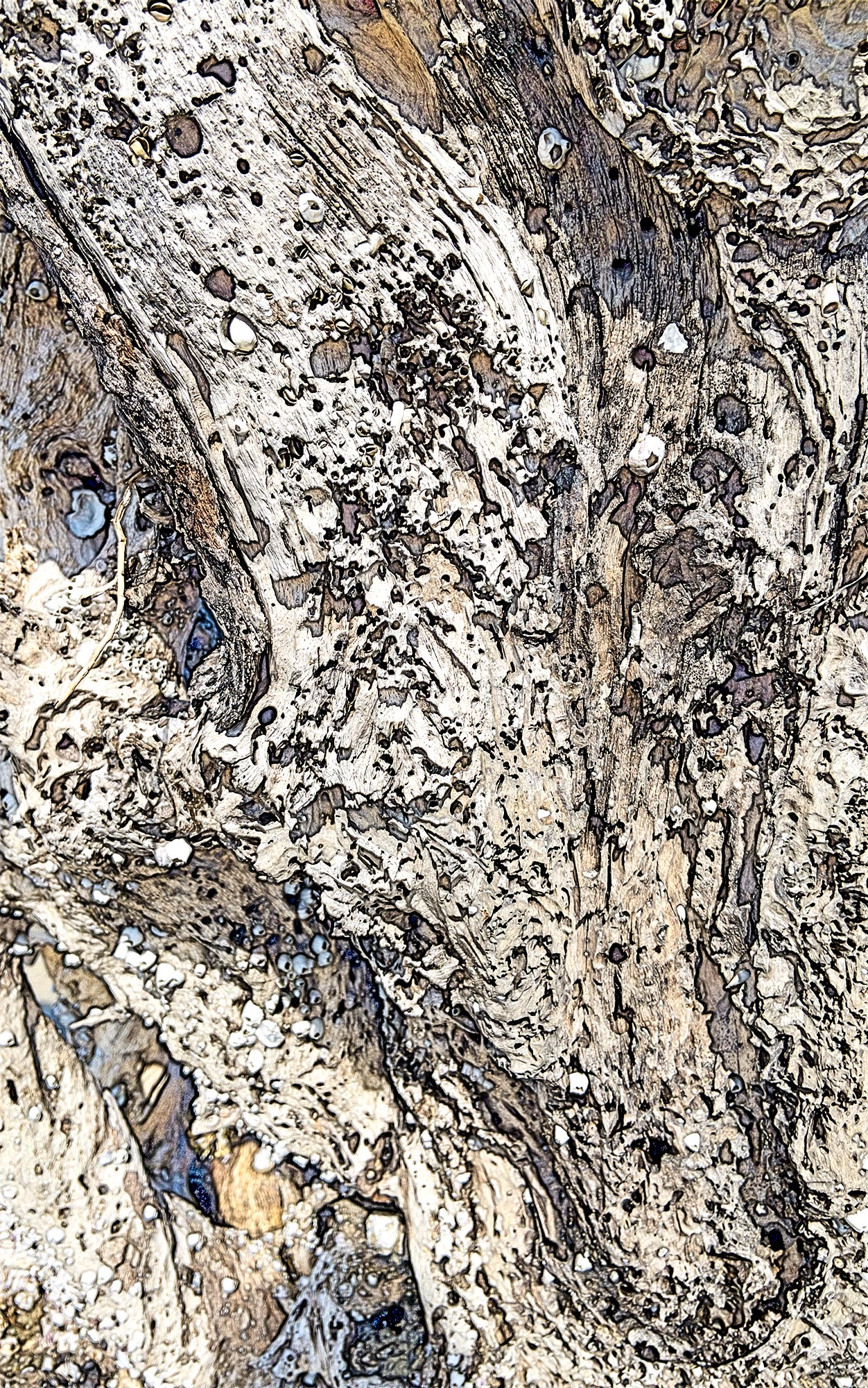
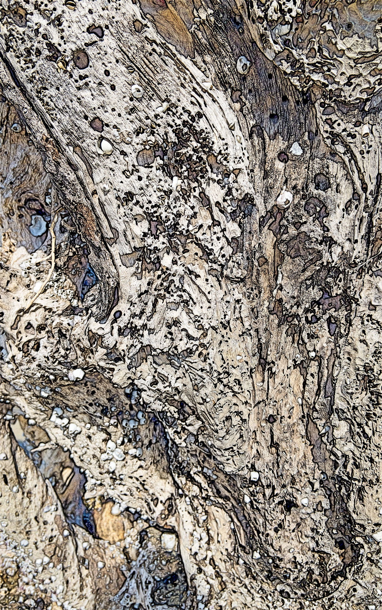
This is an abstract on a driftwood tree made at Jekyll Island, Georgia in mid-day. I had finished photographing and had put away my tripod, camera, and lenses and was walking off the beach. This is an afterthought made with my iPhone. I was impressed by texture and pattern here.
Specific Feedback
General feedback, but I would also like to know how to sharpen the LLC more without it looking weird. How does the image work as an abstract?
Technical Details
This is a color sketch made from the Workflow Extras panel in the TK9 plgugin for Photoshop. It was shot in mid-day. I was an afterthought made with an iPhone as I was leaving Driftwood Beach on Jekyll Island, Georgia. It was made a f8. I consider it an abstract.
Critique Template
Use of the template is optional, but it can help spark ideas.
Vision and Purpose:
Conceptual:
Emotional Impact and Mood:
Composition:
Balance and Visual Weight:
Depth and Dimension:
Color:
Lighting:
Processing:
Technical:
Interesting pattern that could easily be an aerial shot. The ‘color sketch’ in workflow extras is something I’ve yet to play with. I think it would be interesting to see the image without the color sketch.
A very cool result, Larry. That lower left corner did catch my eye. Unfortunately, I don’t know of any way to repair lack of focus that’s available yet. AI should be getting there soon (you’d think a simple prompt like “duplicate this area but make it look in focus” should work). An alternative, of course, is simply to crop the image. Nicely seen and I do like the processing.
What a delightful find!! An excellent abstract and the processing is very interesting – I have yet to play with that but definitely should. This piques my interest.
Like Dennis, I hope AI can find a way to improve sharpening. For now, I would try some mix of High Pass Sharpening and the Topaz tools. There are probably others I’m not even familiar with. But the rest of the image is so compelling that I would hardly have noticed the softness in the corner.
One idea – if the lighter area there was darkened a bit, that area would be even less noticeable.
Thanks for your visits: @Steve_Zimic , @Dennis_Plank , @Diane_Miller . I think I fixed the LLC adequately. I carefully burned in the corner with a 5% opacity brush. I appreciate all of your responses that validate my vision of the image. Photoshop with TK9 has amazing tools and simplifies learning and using Photoshop.
Larry, I love this image, and it works so well as an abstract. The textures and the spots of blue and brown within the gray are very compelling. Nice followup editing on that LLC.