The photographer is looking for generalized feedback about the aesthetic and technical qualities of their image.
Description
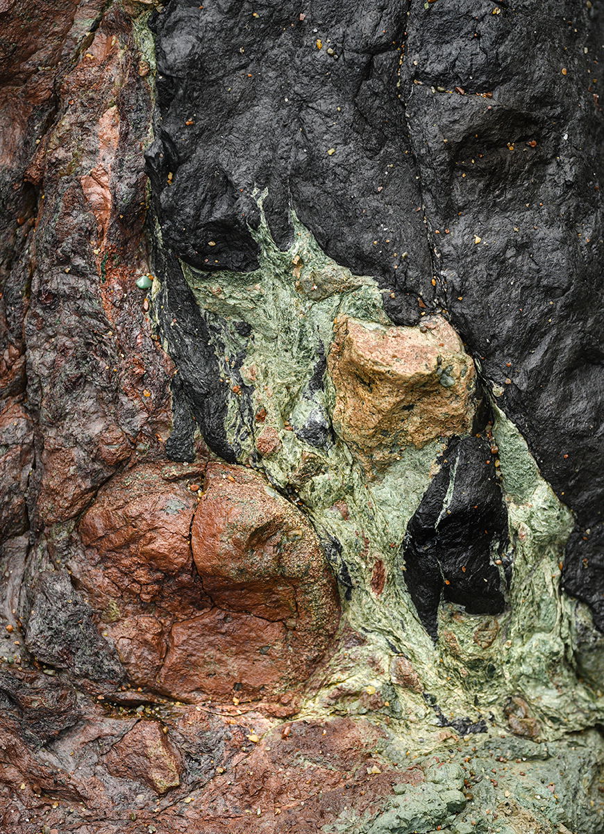
During lower tides in parts of the Northern California Pacific coast, there are areas of old sea bottom, which was disturbed by Basalt lava (Black). The colors are from various layers of Chert created 100-200 million years ago. I explore faces in the abstract nature of this geology.
Specific Feedback
Is it abstract enough, without knowing what it is?
Technical Details
Nikon Z6II with 100-400 lens. 1/80s at f/11.0, -0.67EV, ISO 640 @260mm
Critique Template
Use of the template is optional, but it can help spark ideas.
Vision and Purpose:
Conceptual:
Emotional Impact and Mood:
Composition:
Balance and Visual Weight:
Depth and Dimension:
Color:
Lighting:
Processing:
Technical:
I do see what looks like the face of a dog, but it took a while to see it. That makes the image very abstract. I like the various colors of the chert which are likely due the presence of impurities, since chert is primarily pure silica. I like the contrast between the basaltic lava and the chert.
The composition works well, and the color looks fine to me. The chert appears a tad bright on my monitor, though. If others notice the same, you might consider dropping the lights a bit. Otherwise, no nits.
-P
Thanks, Preston! The atmosphere 100-200 mya was quite toxic and the colors or the silica shells varied depending on how much oxygen and impurities were in the atmosphere during the settlement of the silica shells on the ocean floor. Other than the black, the other colors are from the chert variations. There are other colors in the area, besides what is shown in this image.
I appreciate the comment about the brightness of the chert, particularly the rock slightly right of center. I will play with this some more.
Interesting formation and geology, Harvey. I can pick out a couple of faces after staring for awhile, which is part of the fun in things like this. I could see playing with tones as Preston mentioned. You can probably bring out even more features that way, though it might not be what you were aiming for.
Abstract enough for me Harvey. I think this is one of those intimate landscape vs. abstract images where there really is an overlap. This one is hard to tell scale, and I really have to look close to be sure what the green is.
I’m not seeing faces, but I love the three main colors and all those textures. You’ve isolated a well-balanced composition here. The only part I might tone down is the top of that fairly rectangular raised beige piece protruding in the right center. But overall, super!
I too am missing the faces, but thoroughly enjoying the mix of colors and how well balanced they are throughout the frame. I could see a slight burning-in of the brightest part of the whitish rock.
Thanks Dennis, I suppose it is my nature to explore the intricate patterns in geology, seeing faces fairly often. I actually have a 9-image portfolio of faces in geology.