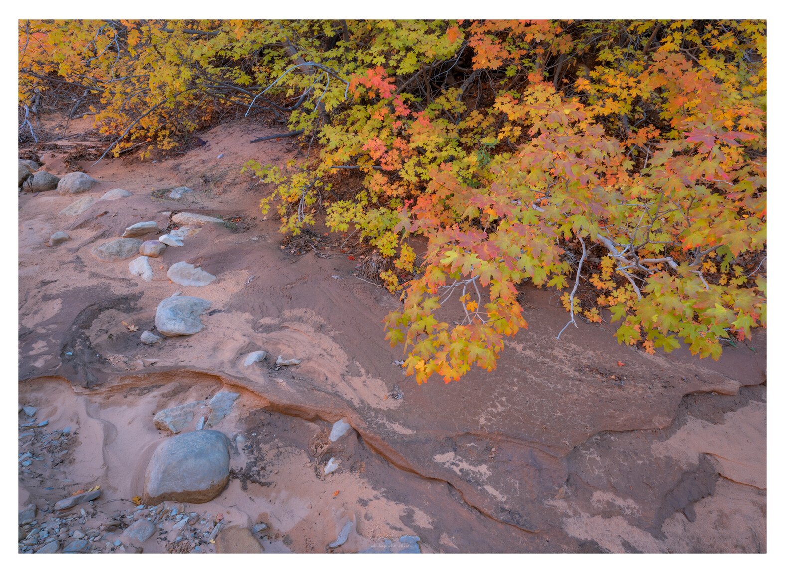
In the few years that I have been shooting Fall colors in Zion, I find it quite difficult to incorporate the dry creek in my images. I gave up trying at some point. But I came across this section this year that I am quite fond of. The leaves are not at their peak but I find the color contrast to be quite pleasing. As usual, all feedbacks are most welcome.
Adhika, this works nicely for me. I like the split view with a bit of diagonal to the image.
The only change for me is to bring down the highlights overall. It has a tendency of being quite bright.
Having shot autumn in Zion three times myself, I understand and agree with what you are saying about he stream bed, especially when there hasn’t been much leaf drop in the stream bed. My only strong shots including the streambed were taken when there was lots of leaf drop. But I think the light/dark patterns in the sand/rock add a nice amount of visual interest here. The composition feels pretty balanced to me as well.
I could perhaps see adding a very slight increase in midtone contrast to the stream bed to enhance the patterns. But that is a matter of personal taste, I think your image works well as presented.
@Paul_Breitkreuz , @Ed_McGuirk , and @DeanRoyer thanks so much! I have posted a revision above on the OP after reviewing your inputs. Much appreciated!
Paul, good inputs. I look at it again and I look at the image again and I see your point.
Thanks, Ed. I experimented with this a little bit and I like this direction.
This one works well. Good job on the rework, too. I like the changing leaves and the comp is nicely balanced with the color, rocks and colors in the stream bed. No nits here.
I find that the streambed is nicely incorporated in this image Adhika. I agree with you that it is pretty difficult to incorporate the stream beds but this is nicely balanced with good lines and good color variation. The repost is better IMHO. No nits at all for me on this. Well seen.