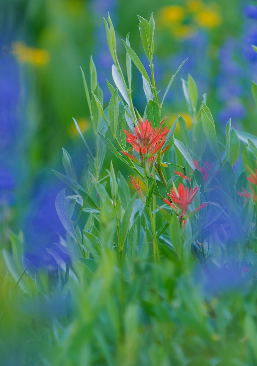
Edit: Adding re-worked image. Comments below in thread
Another wide open, shallow dof wildflower image from last weekend’s trip with Preston to Sonora Pass. Wildflowers were especially prolific (and late) this year given the tremendous amount of snow this past winter.
Focused on the few red paintbrush, which made the only red in the scene. If I were to critique this I would say the paintbrush don’t particularly stand out except for one, but still I see this image as a whole rather than an image of paintbrush or lupine, etc. Square crop from full frame to try and draw more attention to the color and flower separation. In the end, not so compelling I think. But thought I would post anyway.
You may only download this image to demonstrate post-processing techniques.
What technical feedback would you like if any?
Processing, color/sat, etc.
What artistic feedback would you like if any?
does this work at any level?
Pertinent technical details or techniques:
(If the background has been replaced, etc. please be honest with your techniques to help others learn)
Single frame, cropped. Nikon D800E, Tamron 70-200/2.8 @200mm and f/2.8 1/160th iso 400, tripod. LAB Color layer to punch color/contrast, some dodging/burning and color burning as well (lupine color wash areas). Some blurring in bottom of frame where some greenery was in same plane as paintbrush.
Lon, I would say there is enough of the paintbrush in focus to make this work very nicely. Hard to really say without seeing a good sized print, but I like it a lot. The term painterly used often I know, but this one would fit that genre I’d say…
An additional thought on the image would be without taking a bit of a chance and experimentation at times it might not have had the same impact at all. One never knows…it works for me just fine…
It works for me as well, Lon. I like that you singled out the red flowers for the focus, and the rest are just a nice blur of colors. I like the square framing. It is fun to experiment like this though. I have only tried doing the blurred flowers in close up flower images. I need to try this again. Maybe if I get out to the Botanical Gardens again soon.
This was a neat experiment, Lon. I do think the blue of the Lupine overwhelms the Paintbrush. You might also consider a slight crop from the top to bring the left-most red flowers up in the frame. Aside from blues, the processing looks good to me.
–P
Lon: Reminds me of Texas in the Spring with paintbrush and bluebonnets. My first impression was to crop tighter on the unobstructed paintbrush and I think that impression is sticking with me. I also find the yellow on the bottom more of a distraction than a complement. This is a quick and dirty take on what I would do with this. Your mileage may vary. >=))>
Lon, I looked at your image several times today . At first I found it to much colorful. Now I find that it’s almost painted. I don’t know if this is a compliment, but I like the image very much as it is.
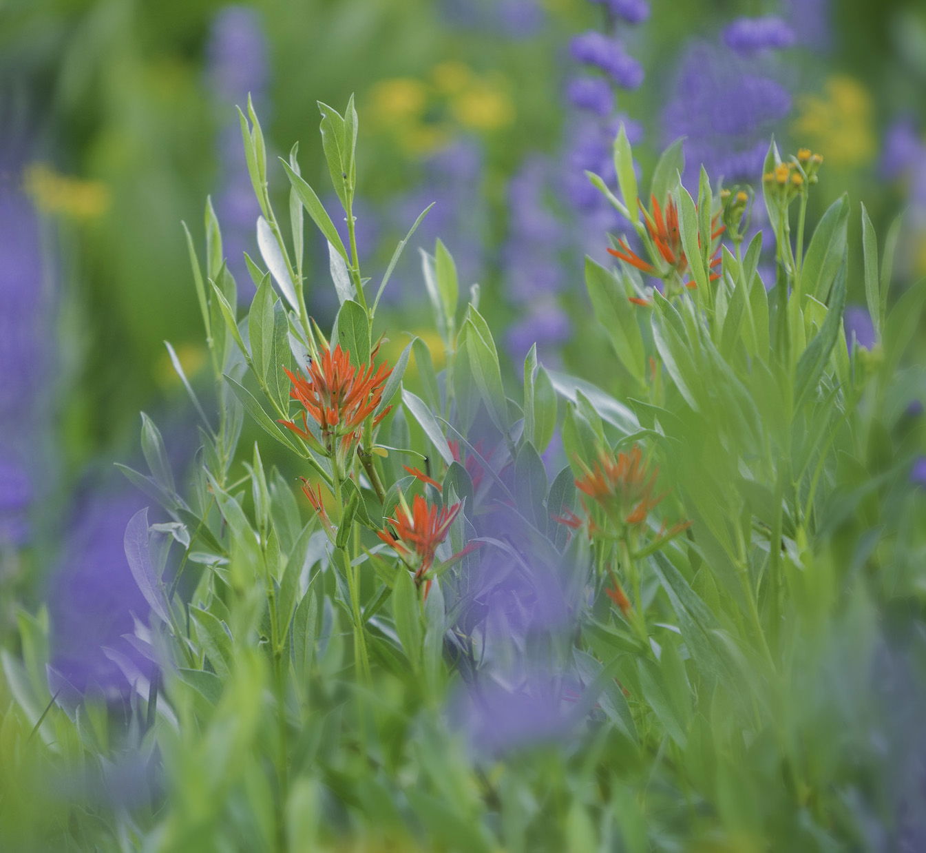
thanks so much for the comments and suggestions. I’ve posted a rework taking consideration much of what’s been commented on.
@Preston_Birdwell, I agree that the lupine color is a bit overwhelming, and coincides with @Ben_van_der_Sande 's comments about too much color. I think you’re both right in that the other colors are competing too much with the main subject, the RED paintbrush. I toned down the colors including lightening and desaturating the blue/purple in the lupine as well as toning down the yellow and green. At the same time, boosting the red just a tad more.
And Ben - I consider this all “constructive criticism” and it’s all welcome and appreciated.
Thank you @Paul_Breitkreuz, @Shirley_Freeman and @Bill_Fach. Bill, your crop works. I think would work even better if I had the paintbrush more isolated to be featured better. Instead I chose to go with color, but ended up overwhelming the paintbrush.
A great exercise and learning experience for me. Thanks everyone!
Preston’s right. I’m not experienced in this genre of photography but decided to give it a try. Warming the image seemed to diminish the blues. Then I desaturated the blues and purple while saturating the reds and oranges. I also lightened it a tad.
Thanks Igor. I’m thinking this is the direction most comments were leading to. At this point, it’s a matter of personal choice and taste on color/sat and luminosity, but the emphasis all points to giving the red and paintbrush it’s due. Thanks for adding in.
Lon, the re-work looks much better to me. My only concern, at this point, is the yellow blur at the bottom directly below the main Paintbrush. It’s not a deal-breaker–just mildly distracting. The crop and color tweaks work much better.
-P