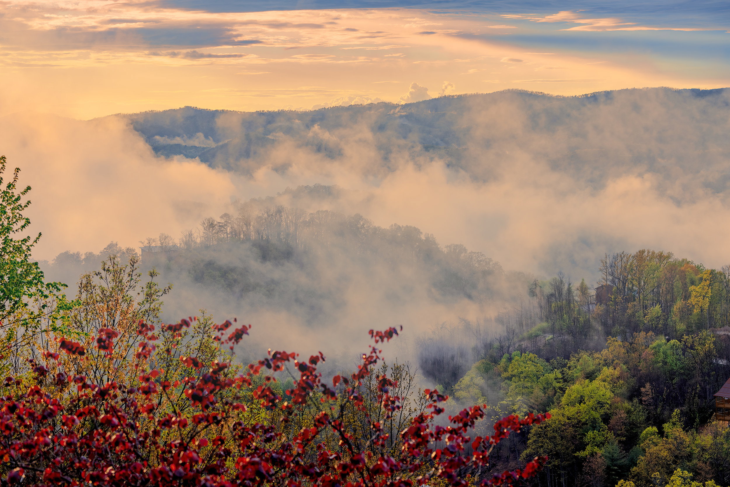
Fog Eludes me

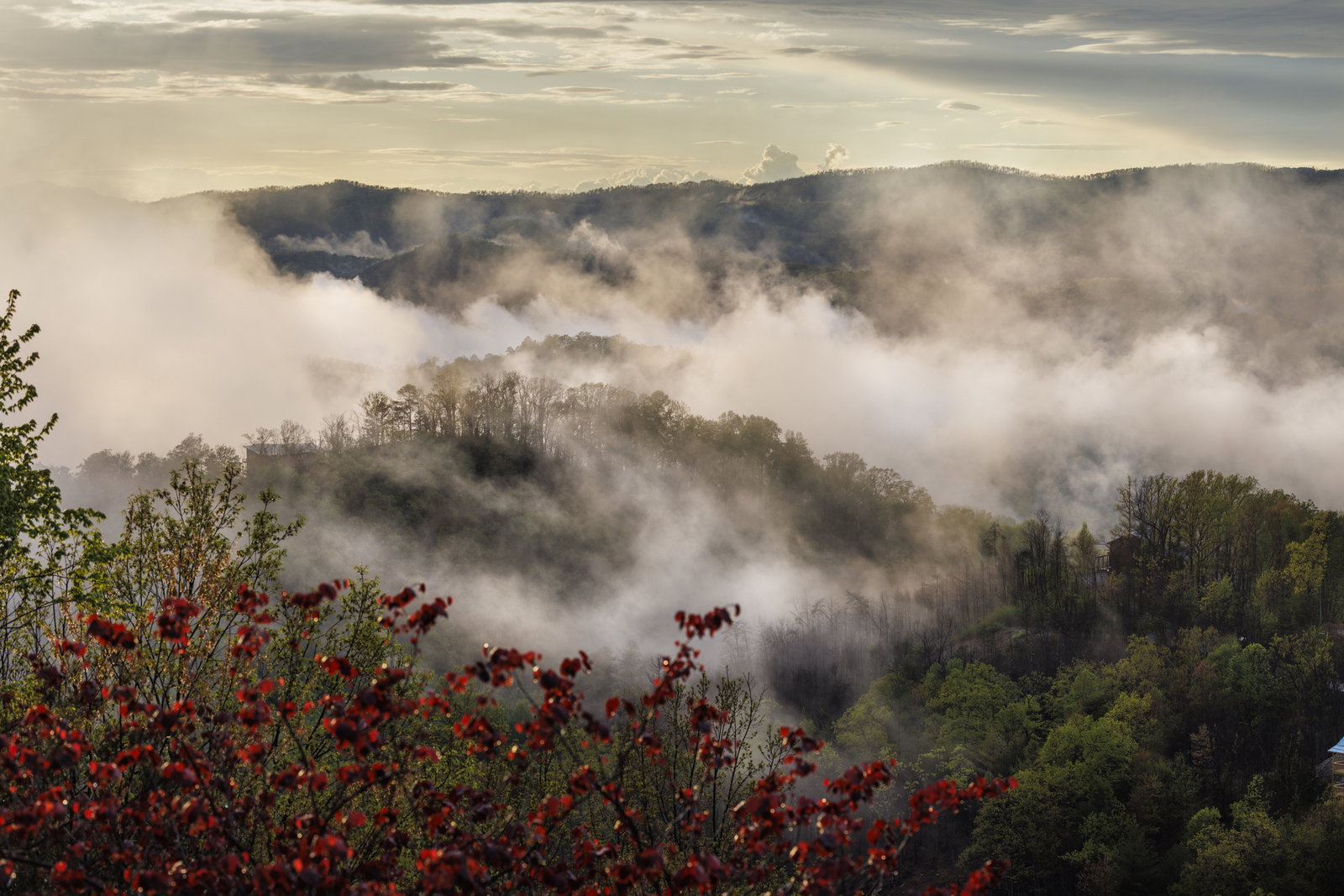
So I don’t even know where to start with Fog. I have a few that I want to process, but a few things happen. I lose the texture and delicate lace in the Fog, and the images quickly start looking over HDRish, which I do not like. If anyone wants to show me what can be done, I would appreciate it greatly. (I have a different composition that has much more fog that I want help with @seanbagshaw Hint Hint) but put the one I edited here.

I have not processed this one but will upload another shot that day with the over-HDR look I get very quickly. So you can see what I mean.

I also have some with golden lighting that is incredible, and I can’t seem to keep the light. Anyways as I wrote, Fog eludes me. And I have watched several Youtube videos. lol

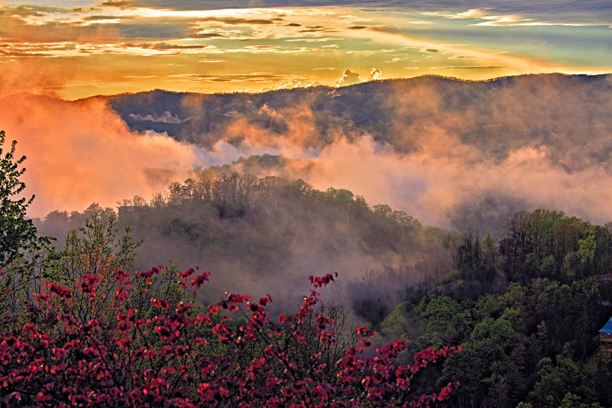
Help The more I messed with this, the worse it got. I basically applied three-layer masks to the sky, the fog, and then the foreground with some basic adjustments in LR.
Sky - Exposure - Highlights + clarity
Fog + Exposure + contrast + clarity - I lowered the effects of the masks to about 50 %
Foreground + Shadows - contrast + clarity - I lowered the effects of the masks to about 50 %

Something is off to my eye. Oh, I did not do border patrol yet. I would either warp out, clone out, or something else, that blue roof on the edge. It is distracting. Just did not get that far

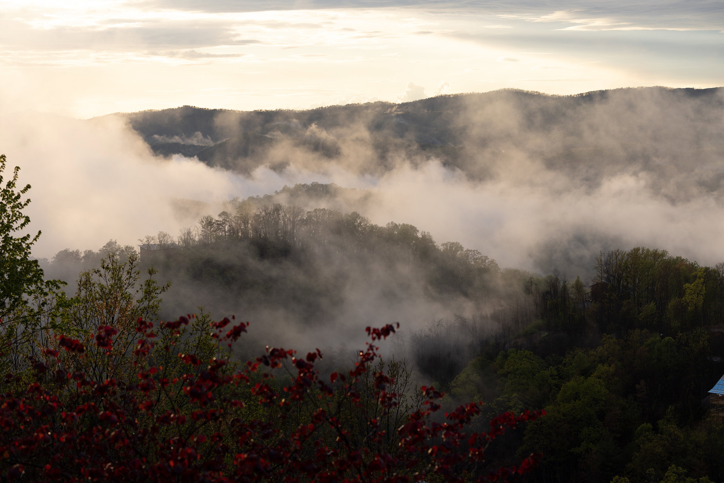
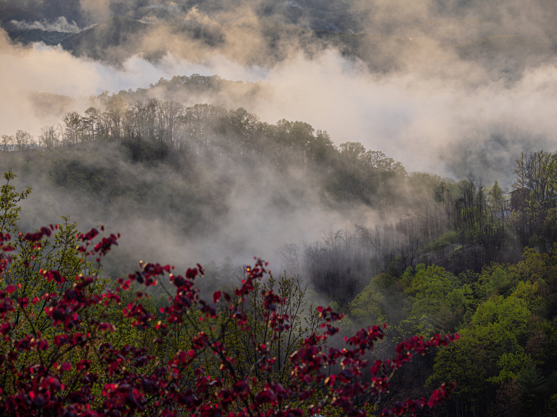
Raw File

_F221974.CR3 (42.1 MB)

You may only download this file to demonstrate how you would process the image. The file is Copyright of the photographer, and you must delete the raw file when you are done. Please post a jpg of what you created, explain what you did, and why you did it.

My Edit

I am interested to see too! :sunglasses: thanks for the input. I will definitely do some DB in Ps starting from an earlier stage. I am just beginning my PS journey but see the power in there. Beyond what LR can do. This might be one of those images I need to.

Hi Ariel,

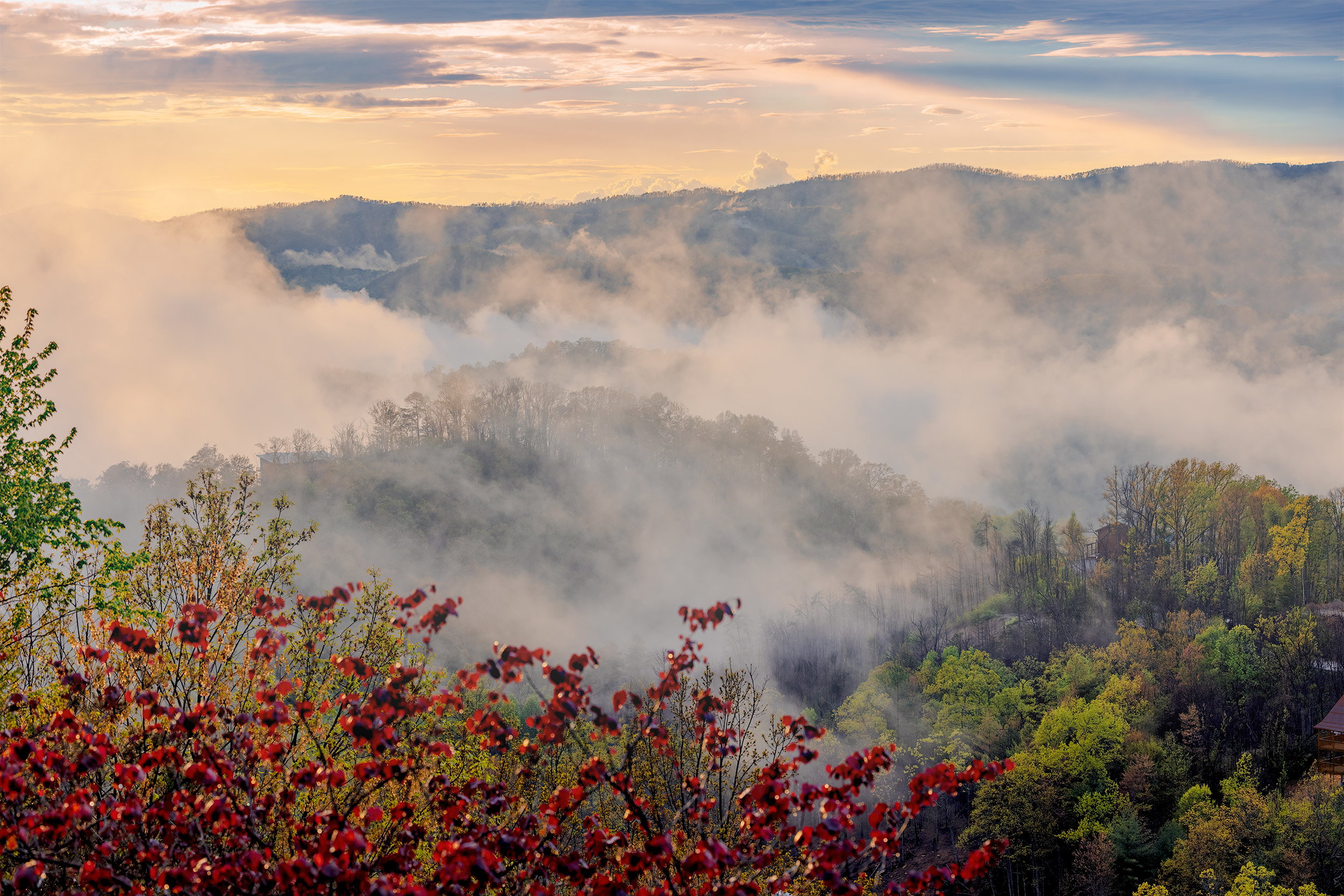
This is a very nice, thick fog scene, it’s quite dramatic and I like it. :slight_smile:

Was this taken in the fall? I ask that because the image has some embedded fall colors in the lower right quadrant as well as in the FG bushes, some of those colors aren’t immediately apparent in the RAW version but with some color separation using the HSL panel in ACR, those colors surfaced easily.
The color enhancements to the trees was done in the HSL panel (mostly red, orange, yellow and green).
I reduced the red luminance and saturation to minimize the presence of the FG red bush.
Then I increased the luminance and saturation in the orange and yellow but reduced the saturation in the green.
Oh, and I did use the color grading panel for fine tuning shadows, mid-tones and highlights, then a very slight overall adjustment using curves.

I enhanced some of the fog in the central area of the image using a radial gradient mask in ACR, to do that I increased the exposure, reduced contrast, reduced shadows, reduced blacks (slider moved to the right) and increased the highlights (with a pretty high feather amount on the radial gradient mask).

In my experience, fog is a delicate element and any use of contrast, texture, clarity and dehaze can diminish the affect significantly.
As @fue mentioned, clarity is kind of a blunt tool, so use it sparingly if at all.

In the edit below, I didn’t add any contrast, texture, clarity or dehaze, in fact, I reduced those to further enhance the fog, and for sharpening, I ran it through Topaz Sharpen AI with a minimum amount of noise reduction within the Sharpen AI plug-in.

I don’t know if my edit appeals to you in any way so if you could let me know, that would be great!
Knowing whether or not this approach appeals to you would be the next step in helping you achieve your goal of processing fog images.

In general, fog images need to be taken slightly under exposed, which is really close to what you did here.
The histogram shows that the whites are slightly blown in the ULC but only slightly, then the blacks are close to being clipped in portions of the LRC but not too close, I’d say you nearly maxed out the capabilities of your camera’s dynamic range.
If it were any brighter than this (where the sun is concerned), the use of a 2 or 3 stop graduated neutral density (GND) filter would have been required (in my view).

Rather than cloning out the roof and porches in the LRC, I simply changed the color of the roof to something darker using paint with the blend mode in overlay so it wouldn’t stand out so well and I reduced the exposure of the porches, it seemed to belong there so I left it in.

It would have been nice if the FG red bush was a little more in focus but it’s not really a big deal IMHO.

Anyway, I hope that what I wrote is at least somewhat clear and somewhat helpful.

Please let me know if the edit is anywhere close to what you had in mind.
And please feel free to tell me if it’s too dark or too bright or not enough of this or that, etc.
Depending on your answer, maybe I can do better at helping you with processing images with fog.

Gorgeous scene!! :slight_smile:

The most recent edit adding a little golden color to the fog/mist as per Ariel’s comment, see comment lower in the thread for details on how this was done.

The edit:

Copy of unedited RAW below:
1 Like

Wow, @Merv I knew there was more than I could do your sky is so colorful and dynamic, like that day. This is spring in the smokies; the redbuds (at least that is what someone said, but it doesn’t look like it to me) in the FG fascinated me in all these spring greens in the smokies were these vibrant Reds. It was crazy. I love what you did to that roof! Brilliant. I took some with the foreground in focus and out. With it and without. I was playing with the moving fog and light. There were edges of golden light on the mist not sure how strong it was at this moment, but it feels relatively cool now. Thank you so much for all your time and attention. I appreciate it. It has been super crazy the last few weeks, so just now able to come back and look, so thanks.

Thanks for your thoughts I think you are right. Less is more! I find myself taking it over the top. I will try some PS editing on it next as my PS skills increase!

Hi Ariel,

Thank you so much for the response and the kind words!!
I do appreciate it! :slight_smile:

I did an adjustment to the fog/mist after you mentioned that there was a golden color mixed in.
I just uploaded that version in my original post so you could toggle between all three images.

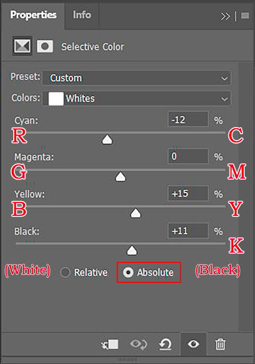
For that adjustment, I used the “Selective Color” adjustment layer in Ps and made adjustments to the “White” color only.
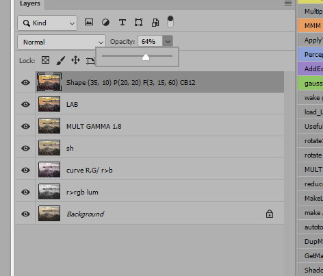
Below is a screenshot showing that panel.
At first, the selective color adjustment layer is a little hard to understand, but in basic terms it’s a way to make color adjustments to individual colors, in other words, since the fog is mostly white, I chose to make adjustments to the white color only, I added a bit of yellow, then a bit of red and a touch of black and it only effected the fog/mist without having to mask anything.
This method only targets the whites (or whatever main color you choose) in the image and any areas in the image that you don’t want to change can be masked out using the black color in the mask that comes with the selective color adjustment layer.

In the selective color adjustment layer, you can specifically target:
Red
Yellow
Green
Cyan
Blue
Magenta
White
Neutral
& Black
Then you can adjust the Cyan, Magenta, Yellow and Black (and their opposites: Red, Green, Blue and white) that can be found in each of the color choices found in the drop down list.
Pretty powerful adjustment tool, even better than the HSL panels in Lr and ACR, IMHO.

The sliders indicate Cyan, Magenta, Yellow and Black but they don’t show what the opposite colors are for some reason, it wasn’t well thought out IMO.

It should look more like the following:
Red________________________Cyan
Green____________________Magenta
Blue_______________________Yellow

I guess they’re counting on everyone knowing that RGB is the opposite of CMY&(K).

R____________________C
G____________________M
B____________________Y
& of course:
White_____________Black . The “K” in CMYK represents “Black”

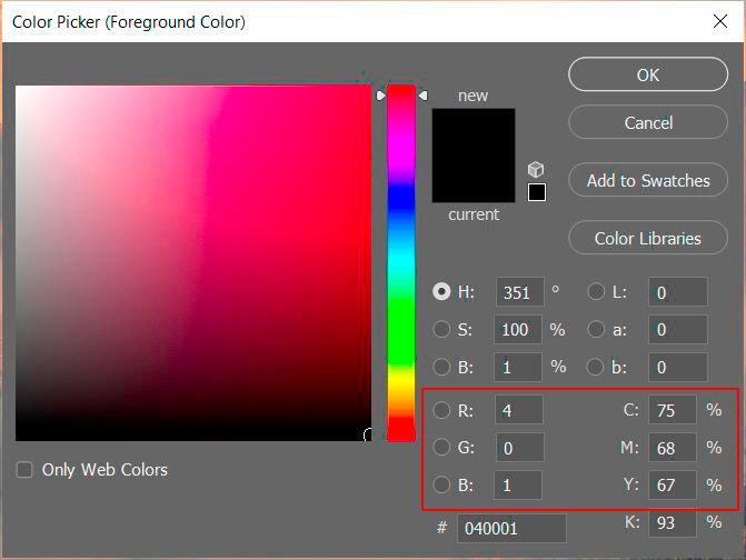
An easy way to reference it quick is to click on the foreground or background color picker and look at the bottom, right side of the window, it has the RGB and CMYK side by side in order as shown in the red box in the screenshot below:

You are probably fully aware of all the above information but maybe this will help someone just reading this post. We do have a lot of lurkers trying to learn from such posts! :slight_smile:

My goal here is to help you to be able to edit fog images, the above methods (including the ones in my first post) apply to almost all fog images in regards to retaining and enhancing fog.

If you decide to work on this image again to see if you can replicate the results, please feel free to come back to ask for further details or better explanations if you want or need to. :slight_smile:

Thanks again, Ariel!! :slight_smile:

1 Like

Great information, I am just digging into the Selective colors power of PS, so this is excellent timing! and yes it is a powerful tool. I appreciate your help and diligence in the amount of effort you put in to help me personally and anyone else … reading this. I do have a bunch of Fog images I want to process more effectively, and I will definitely work with your thoughts and advice. thanks again

Ariel, lovely image! I love fog and mountains :slight_smile: , and you captured some lovely light and layers here. Compared to what Marvin has offered you, my processing is simplistic and not likely to offer anything you didn’t already know. Like you, I’m still dipping my toe into PS, so my version was processed entirely in LR Classic except for using PS to clone out a small red branch that distracted me.

A rough overview of my approach:

  • Cropped in to emphasize the curves; the sky and flatter mountains in the BG didn’t feel like they added much, so they felt expendable to my eyes. Cropping also took care of that roof, LOL!
  • Added a linear gradient mask from top down to cool down the sky a bit and add just a touch of clarity and texture
  • Lifted shadows and blacks, lowered highlights and white just a bit
  • Increased vibrance just a smidge
  • Added some brush masks in a few spots to bring out the green vegetation in the lower right and a couple other spots
  • Slightly cooled off the red plant in the foreground
  • Slight vignette (-10, with midpoint/roundness/feather to 100)
  • In color grading, dropped the midtones quite a bit, shadows and highlights a little
  • Used a radial gradient mask to bring out what looks like a little bridge cover or structure on the right edge middle… looking at it now, I’m not sure it adds much or if I was successful, but it intrigued me so I attempted to pull it forward more.
  • Pulled into PS to clone out one part of that red plant that was distracting me a bit

This was a wonderful image to tinker with… thanks for offering it up as a processing challenge, Ariel.

1 Like

Hello! @Beth_Buelow! I need to get with you soon! How are you? thanks for tinkering with this! It is a challenge I will trying this one again soon. cole Thompson taught me something in PS that might be a fog game changer for me. The dodge and burn process he uses when dealing with smoke and was fascinating. I will try it and report back after my 100 things I need to finish this week. Lol

Nice to see you here!

Hi Ariel, I’m good! I’m thinking my tinkering didn’t do much for you, LOL ;-). I’ll be interested to see how you continue to work with the image and what directions you take it. And yes, I’d love to reconnect in real time soon! Looking forward to it :blush:

Oh, everyone who shares tinkering helps the more we see possibilities, the more our imagination can take us down new paths. So thank you! You did help!

Reading all about the selections and approach, I decided to try one without any local selections at all! Now admittedly I went a little over the top to make a point but you can easily blend this one back into the original to your own personal taste.

Untitled-1