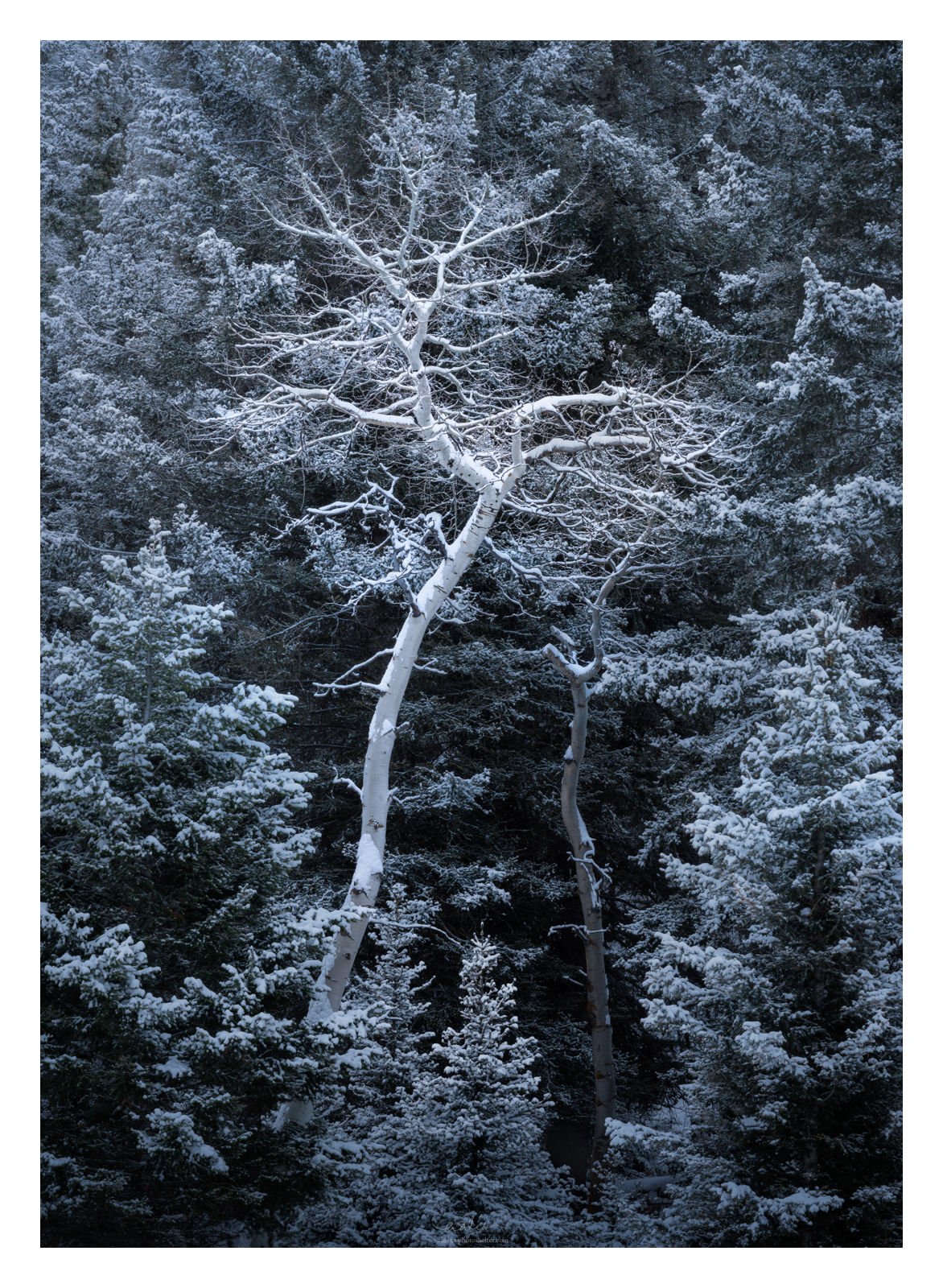
An intimate scene from Yellowstone. While looking out for moose in this area, I was struck by this small section of the “forest.” I was drawn by the birch/aspen(?) trees that broke the repeating pattern of the conifers. In my processing, I try to bring out that aspect of the image.
I played a little bit with the color balance, but even after tweaking it for half a day, I am still not 100% sure I like the outcome. And as always, all comments and critiques are most welcome.
Adhika, I love everything about this image! The light dusting of snow, the cool tones, the tree and its personality bursting out against a consistently-textured background.
The only thing that came to mind, and this is very minor, is very lightly burning the highlights in the upper left corner. That’s where the light is coming from so it’s a little brighter than the rest, but I think it looks nice if it’s evened out:
This is really nice Adhika. I’m so used to seeing images with from you with warm tones and light, that I had to double check to make sure that this was yours.
I think the composition is strong, I like how you placed the dominant aspen a bit off-center. As you know color is so subjective. If you let this sit for a week and come back to it, you may look at it in a different way. I played with Color Balance on this, and didn’t like any moves in any direction.
What seems the most "off"to me is the trunk of the aspen, and not the evergreen trees. So I used a Selective Color adjustment layer, and reduced cyan on the cyan slider. I then masked this in to only the aspen. For me it helps, but you may not agree. I think it helps separate the aspen from the background a little too.
Adhika, that bare, twisty Aspen stands out nicely from the surrounding evergreens due to it’s shape and texture. I’m not sure about the cyanotype approach. Clearly there are lots of possibilities, many of which you’ve probably explored. Using luminosity or color to let the Aspen stand out a bit more could work, but it’s also nice to have to have pulling the Aspen out visually take a more effort.
I really like the image, but the blue toning really isn’t working for me. I would be inclined to go straight B&W and play with boosting the contrast to really emphasize the center tree. Well seen and captured.
Thanks for this idea, Brent. Very subtle vignette, I like it a lot.
I tried this and yes wow, I am amazed. Super effective in bringing that tree out.
I am with you, Mark. There is something sickly about this cyanotype rendition and I think @Harley_Goldman has a good point here.
I have never thought about going B&W so I tried this and I think you are right, Harley, there is something here.
I added a B&W rendering in the original, just as a comparison. I have incorporated @Brent_Clark’s and @Ed_McGuirk’s suggestion before converting it to B&W. I do wonder though if B&W conveys the cold and the icy feeling to this image. Can the snow be seen as snow? Does that even matter?
What a lovely, moody winter scene. For me, the b&w does not convey the same emotion as the color version, which is quite austere. The cyan hue is a bit overwhelming, though. I like Ed M’s idea of bringing out the main trunk with different toning. I gave it a whirl, warming up the main trunk (in ACR) quite a bit. I also darkened, reduced clarity & texture, and desaturated the surrounding forest, as way to reduce the cyan tint and further accentuate the main tree. Sort of an in-between color and b&w take.
Bonnie’s edited image is an excellent compromised from the blue vs the black and white versions. I do think that a black and white image wuith tweaked contrast would look wonderful on a wall. Compositiuon is very nice and it will be interesting toi see what you go with for your final version…Jim
I really like the direction that Bonnie suggested so I gave this a rest for a few weeks and then reworked this for a little bit. I like the color more. I hope I did not overdo the centerpiece tree (especially, as far as clarity goes).