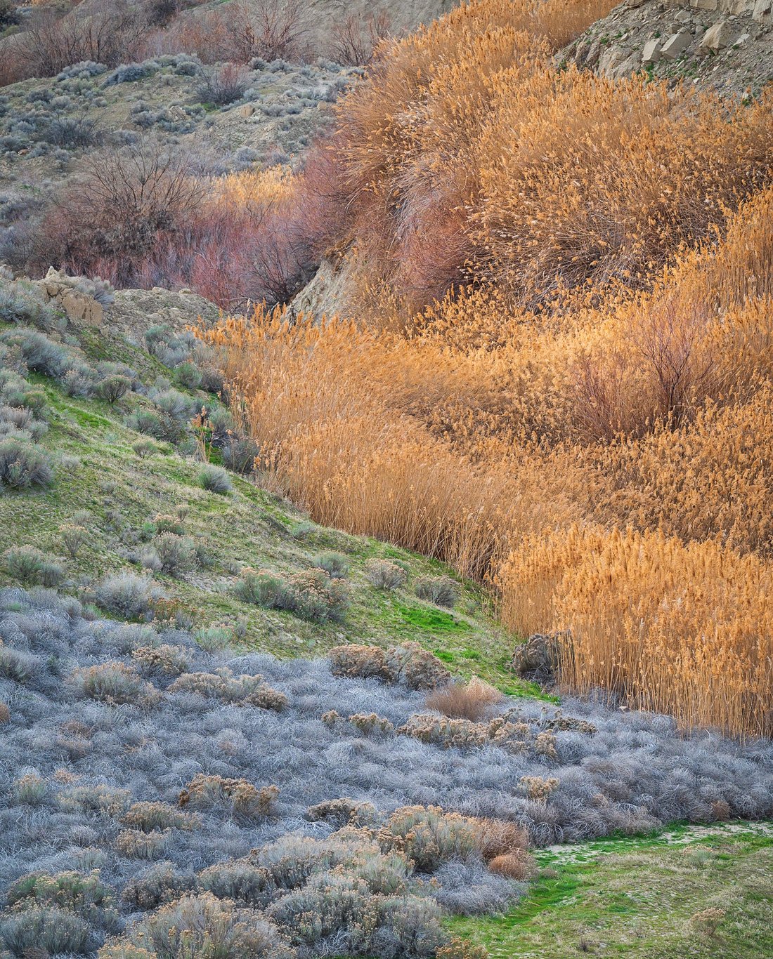
Trying to bring out the subtle and varied colors and textures of this spot in eastern Washington.
Specific Feedback Requested
Interested mainly in thoughts on the flow of composition, color balance and lighting. I don’t feel like I enhanced the color a lot, but wondering if even more subtlety would be better.
Technical Details
1/60s, f/11, ISO 400 at 200mm
processed entirely in Lightroom, landscape profile and mainly selective edits using radial masking and a bit of the brush. No color grading.
Hi Jack, I’ve kept coming back to this one, because I really like some of the elements and I want it to work. I’ve tried various crops and I think the best in terms of composition is a horizontal slice of the bottom 40% of the frame. However, I suspect that may be a bit too simple and not feature some of your favorite elements in the scene (the red bushes/trees up top).
I think the balance issue that had me trying crops in the first place is twofold: one, the oranges are pretty overpowering, both in saturation and in size/percentage of the frame/placement. So I would probably tone those down, while slightly lifting the saturation of the blue brush and the red trees/bushes. Then if it looks overdone at that point, you could lower the global saturation a bit to compensate.
But then there’s the second issue with balance: you have a really nice set of alternating layers at the bottom, with that wedge of blue brush breaking up the green grass. You also have some nice curving lines of interesting red bushes/trees up top. But the middle section is kind of empty and less graceful by comparison. It feels like I want to explore either the top or bottom of the frame more, but I can never really “settle in” or travel through the frame visually because the middle just isn’t working for me.
This could be mitigated with some scaling techniques in post - taking a slice of the image in the middle and “squishing it down” with the transform tool so that relative to the top and bottom, it’s less prominent. But I don’t think that will completely alleviate the issue because the orange section is still pretty overpowering in its size and placement.
All that said, I think it’s overall a neat image and subject, and I am being pretty nitpicky about the composition. At the very least, I think simply balancing out the saturation a bit so the orange section doesn’t overpower everything else would take it up a notch.
Appreciate you trying to make this one work. I’ve haven’t been comfortable with the image as it stands, but your input helps put words to it. I see the balance issue, in particular. Will try the alternative crop and working on the colors. Many thanks Alex!
First of all, welcome to NPN! I see this is your first post and so glad to see you here!
What I’m really enjoying with this image is the diversity of color, textures, shapes and lines. What a great and expansive combination of elements compacted in to a single frame. Which I think is a double edged sword and falls in to Alex’s detailed comments.
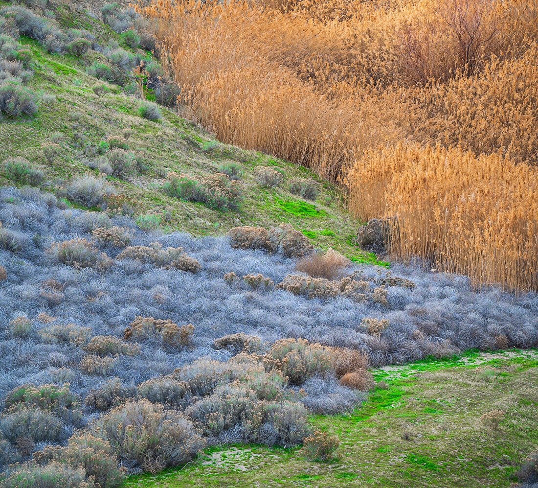
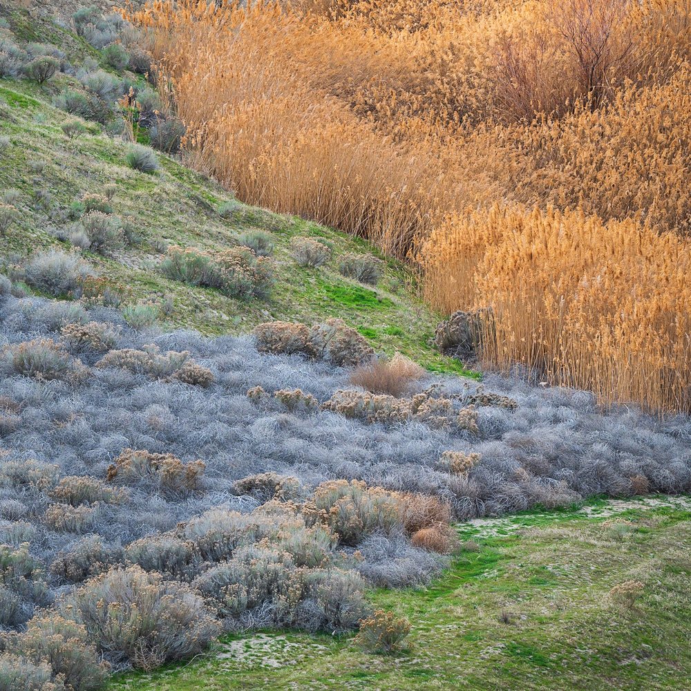
I had a similar thought thinking there are some options here in terms of pulling out simpler compositions. I’ve been drawn to square crops lately and I think you have some options here. Also, I’m not a fan of the tall, digital format and more used to like a 4:5 or 5:7 classic ratios - especially for the verticals.
Without adjusting any color/saturations (This is not overly saturated IMHO, but is pushing the edge ever so slightly and well within anyone’s personal preference) But the mix of colors from green, to blue to orange and red and many shades in between, I think are lovely!
Here are some crop options. Not sure if they’re improvements, but are alternatives:
I think I like the 1st crop the best. While I like the 4x5 format, not sure about the bits at the top of the frame, not so clean.
Anyway, I think this is a great image as presented! Enjoy this for many reasons. Any crops/adjustments are really just fine tuning to take to the next level. But clearly you had great vision here!
We look forward to more images and your participation in the forums and commenting on images!
I agree with Alex’s assessment that the orange is overpowering. For proper color balance I would either forgo reality and saturate other color to match the orange or desaturate the orange to match the other colors.
Hi Jack, I think that this is a beautiful image with great colour and a lot of wonderful texture. Personally, I like @Lon_Overacker first crop suggestion but I would also clone out the dark shrub in the very bottom right corner.
I think Lon’s first two crop suggestions work really well! The first is probably the most sound compositionally, but an argument can be made for the second since it includes the additional element of the red shrubs.
I appreciate your words of encouragement. It can be a little daunting with that first post.
Your suggestions for cropping are really helpful. To my eyes, the first square crop results in the best balance overall. Even though I’m losing the red bushes, I really like the way the image holds together.
That’s a tough choice. I tend to want to go for more nuanced color, so I’ll probably work on the orange first, along with the crop suggestions. Thanks Igor.
Ok, I don’t normally go overboard trying to modify someone else’s work, other than kind of first pass suggestions… But the more I go over this image, the more I wish it were mine. I’m just loving this. and if it were mine, it would be framed and on my living room wall.
So… I hope you can get this printed too and so I thought more and worked on a crop that included the reds. And not only the colors, but I think the zig-zag flow of lines (of color and lines…) just makes this a very pleasing image to explore. so here’s some additional tweaks. You can run with what you ultimately want for your own results…
Cropped to almost a 4x5 format, eliminating the bush LRC and some bare dirt/rock in the URC, as well as the unnecessary ULC.
actually I left enough at the bottom I had to clone the bush, and also cloned a couple of exposed rocks along the top edge.
Thru a mid-tones luminosity mask I bumped Vibrance +30
Thru same mask selection, opened Saturation, bumped reds a little, dropped the greens and selectively lightened the desaturated greens as they started going dark.
then I thought… hmmm, can I make that rabbit brush (or whatever it is) stand out a little in the field of blue? I did a general increase in Yellow saturation and brightness, but selectively painted those bushes as not to mess with green grasses or any other areas.
All of these are small tweaks, but man, this one is worth the efforts. I always think about this. You can always make a poor image better. You can make a good image great, you can make a great image super, and you can make a super image outstanding… with just some careful attention to processing and presentation… Of course the corollary is… you can never make a poor image outstanding… In your case, I think this can be elevated from super to outstanding with some fine alterations.
Maybe not be your final choice, but thanks for letting me play with it!
Can’t thank you enough for all the help with his image. Your latest ideas are sparking a renewed interest to flush out what this image has to offer. Luminosity masking is something I haven’t used a lot, but this is motivating me to work on incorporating it more into my workflow. Again, many thanks!
I think all these tweaks make the whole thing feel a lot more cohesive, great work Lon (and Jack!) Especially getting rid of the second row of red up top - makes it feel like the zig-zag is leading to a proper terminus with the singular red section. I wish I’d seen it that way!