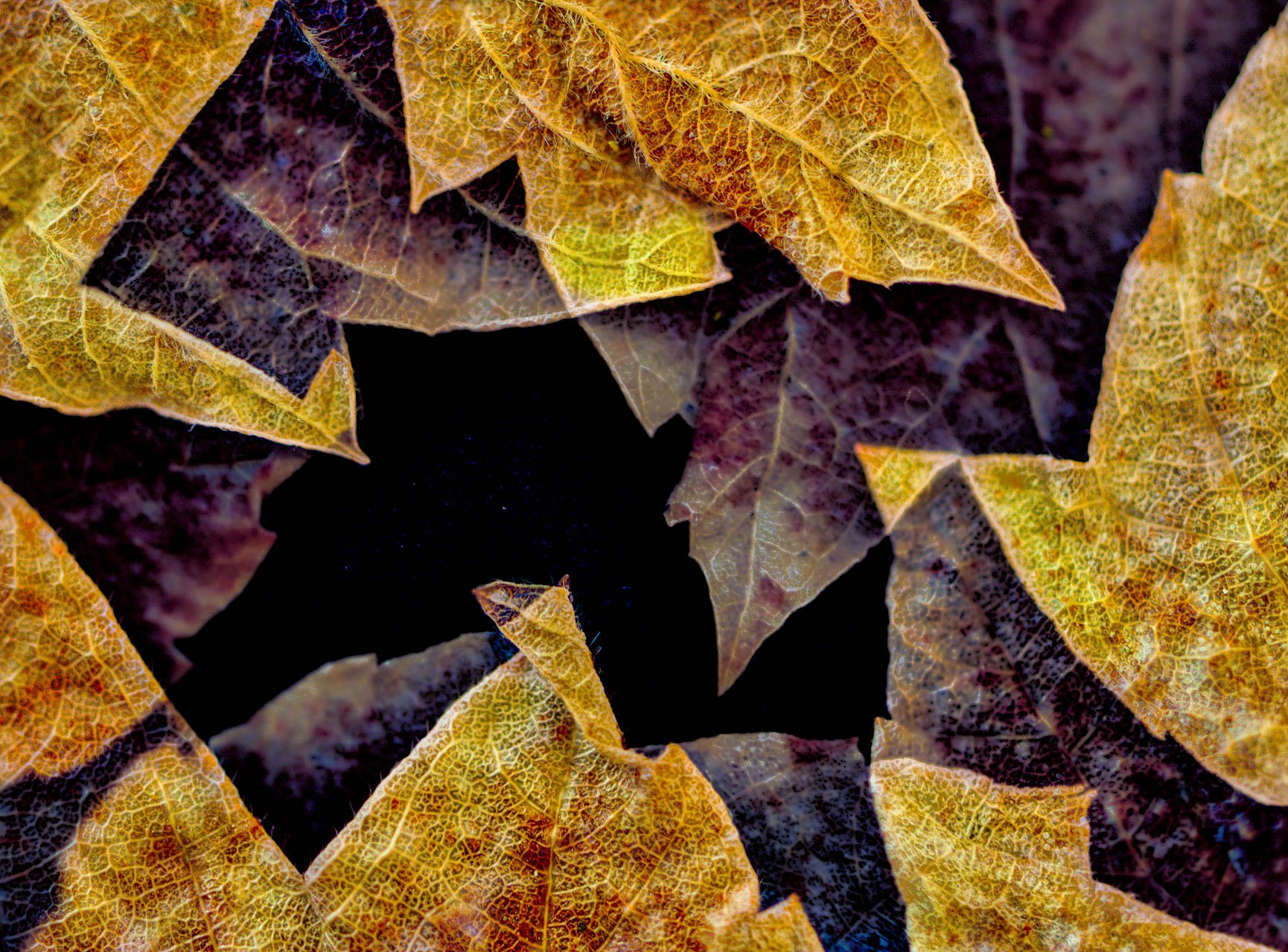
While playing with some more leaf configurations I inadvertently stacked the wrong files! But, I really like the affect. Not sure if this would be considered multiple exposures or composite or both??
I would love to know how you respond to it. Does it bring you into the void? Make you wonder, what the heck? Good feeling? Or not so good feel? Any other thoughts, comments and/or suggestions would be great.
After having stacked these 3 files in Hilcon, I took the combined image into LR and separated the brighter closer leaves then made sharpen/texture/clarity, hightlights/shadows and vibrance adjustments. Then selected the darker background leaves and did the opposite in an attempt to soften and darken the background.
Nikon Z6ii, needless to say my setting were all over the map. Since I was just setting up, apparently I was still testing different configurations. Not really sure I could repeat this. Like the title says: happy accident.
At first glance I liked the image and just thought it was a very strange phenomenon that caused such geometrically shaped discolorations in the leaves. Once you mentioned it was a stacking error it made more sense and then distorted my opinion of it. I do still think it’s interesting though!
Wow, first glance all I can think of were the wild, geometic shapes - then fractals come to mind, although I expect this isn’t really a good example/definition, but wow, the graphics from afar are almost mesmerizing.
There is definitely a feeling of entering a void - especially since the layers go from sharp and visible, to fading away - that last step in to the darkness is a doosy!
Only suggestion I have would be to crop from the right to remove the brighter yellows. I think the leaf on the right is much bigger as well and by cropping in from the right, I think that brings balance not only to the colors, but to the shapes; this in turn, I think, increases that feeling of the vast unknown darkness at the bottom…
And I would agree that knowing how this was made, or any details, in this particular case, does take away from any imaginitive response. Ahh, but only a little. I’m still really enjoying and impressed with this.
Wow – when I really look at how the various shapes/layers interact, I get lost in space – in a good way. Almost looks like blending modes. I could be convinced it’s the work of some well-known modern artist but can’t quite place my finger on which one.
I agree with @Lon_Overacker on a slight crop from the right because of the visual weight of that larger leaf but that’s my only suggestion.
Excellent, Linda. The purple and gold is a wonderful color combination and together with the black shape this came out really well. It would be wonderful to figure out how to create something like this purposely. I can see how this could be a method for some great abstracts. I actually like the ‘mistakes’ the stacker made that resulted in square and wedges of one layer of leaves in place of the other. I think those areas are what really makes this an abreaction. I agree that a crop off the right is necessary to support the theme of purple in the center and gold coming in from the sides. Actually, the structure from edge to center is gold, purple, black.
This may be the best abstract we’ve had so far in this gallery. That’s how much I think of it.
Linda, really fascinating image with some beautiful shapes and juxtaposition of contrast and colors. It does remind me of a modern impressionist paining. The other folks have done a good job of providing critique. Just wanted to share my reaction to the interesting image. Thank you.
Thank you all, @Lon_Overacker, @Diane_Miller, @Igor_Doncov and @Alfredo_Mora for your kind thoughts. It is nice to get all of your different perspectives. Cropping from the right, as many of you have suggested, is now obvious and a good point. As much as I do love this “happy accident,” I am already working a more purposeful “accidents.” That being camera settings and selected images I think will work. Stay tuned.
Thanks, @Matt_Payne and @Shirley_Freeman for your thoughts. Yes, Matt, I did consider BW - posted here - which, at least for me, is ok, the color just adds more excitement for me. Thanks again.
Linda, What a beautiful accident!! The layers give me a feeling of falling into a hole. Having the yellows on the the outside, then the purples further in, and then black in the middle adds so much depth to the image. I would try brightening up the image and saturating the yellows to give it even more depth. I agree with the others regarding the crop. Here’s a rough version of what I mean. Softening the darker background leaves was a great idea. Hope you manage to perfect this technique as I’m looking forward to more images like this
Thanks, @AndreDonawa. Yes, clearly there are endless possibilities and days can, and have, been spent on various versions. I’m glad you’re enjoying it and thanks for taking the time to post your take. Appreciate it.
This is a truly fascinating image, and it’s interesting to know that it was just a happy accident. It makes me wonder what other sorts of images can be produced with this method.
Thanks, Ben, glad you’re enjoying the accident! Yes, I am most definitely exploring the possibilities of this new found technique. I’ve managed to come up with several more versions, but am still in the phase of refining my process to make repeatable, predictable and an image worthy of posting on NPN. Stay tuned. Thanks again.
Thanks, Gary. Must admit, I have also had my share of double exposures, which also produced an interesting affect. For me, the difference is a more conscience decision to manipulate specific images. Even in doing that, as others have said, there are plenty of options about how this could be accomplish.
For example, the image I’ve posted here is a composite (as opposed to stacked in Helicon) I tried various blending modes in PS.