Version 2 - same to images layered in PS and used blending modes
A continuation of my exploring into the possibilities of stacking photos with a more intentional purpose in mind.
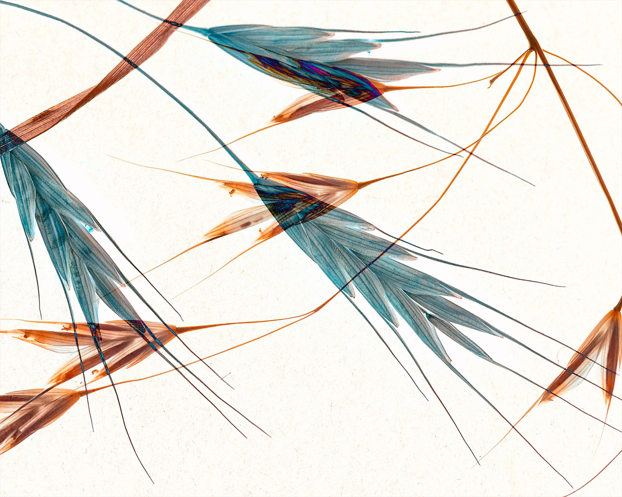
The first image was stacked with a high key image on top and a low key beneath. Then sorted ascending. In LR I did bring out the soft brownish colors.
The second image was brought into PS with the low key as the top layer and the high key beneath. Then used “difference” as the blending mode on the low key image.
Would love to hear your thoughts, not only on the quality of this as an abstract, but also which version - if any - work better for you. All comments and suggestions welcome.
Nikon Z6ii - image # DSC_1986: f/16, 1/5 sec., iso 200 @ 105mm - low key
image #DSC_2051: f/20, 1.6 sec., iso 125, @ 105mm - high key
both shot in studio with tripod and remote release
Beautiful images Linda! I love them both, but if I had to pick one it would be Version 1. I like the crop in this one better. The high key/ low key combination looks great, especially with the brown and yellow colour scheme. The texture and the lines all come together to make this a really engaging image.
This is sensational Linda. This is so creative and so well planned and thought out. I love the shadows and the texture that you created under the high key impressions. Like Andre, I love both versions but I really love the first version in tans and browns. This is a terrifically created art piece Linda that I think you should be very proud of.
Another great one. I find this one more decorative than your previous one. I like the composition of the first but the colors of the second. I might try the cream background of the first image on the second image. Overall I prefer the second image.
Perhaps you can someday go into greater detail on how this is accomplished.
Very cool concept! I enjoy looking at both! I have to say I’m leaning toward #1, but I tend to lean more toward monochrome images anyway. On version 1 is there any way to bring back just the slightest amount of detail on the leaves? grain? Is this wheat? I like how both layers have detail in #2 but think it would look nice in the color scheme of #1? Just a thought.
I’m so glad you’re continuing to experiment with this technique you stumbled upon. The first photo reminds me of some sort of artistic wallpaper from the past. I think it’s the color palette and the textures that give that feeling. I really like the color contrast of the second version as well. I look forward to seeing more of your experiments with this technique.
Super experiments, @linda_mellor . I too prefer the first, the crop, the complementary colours and the “fuzz” around the white ears. I especially like how the thin ends of the ears cut across the darker ears with fine pale lines; I think you could experiment with that effect more another time.
I didn’t realize it until I went thru the comments and came back to view the images again - that they were the same image! First pass I thought I was looking at two different scenes.
Knowing that actually just solidifies my first thoughts anyway. By a large margin I prefer the first for a number of reasons. First, the simple color palette is more pleasing to me and honestly I don’t understand this… but the arrangment of the elements looks better in the first image - and not so much in the second image. I think the colors have something to do with that and the large, prominent band across the ULC is distracting in the second, but not so in the first.
But the main reason I’m loving the first image - was touched on by both Igor and Ben
and
“Decorative” and “artistic wallpaper” - and my impression - one of those Japanese door curtains, dividers, whatever they’re called. It just has that style or design that might be found on a Kimono or that room divider or curtain; or even a delicate print on rice paper. Anyway, that’s the impression I have and I’m really enjoying the 1st image. The second one doesn’t grab me the way the first one does
Wonderful creativity Linda! Experimentation is a great pathway towards personal growth in photography so please keep pushing forward. I love both images but the first one speaks to me more. I think it’s the color harmony. Awesome work either way!
Since this process is still new to me, Igor, I am going to try to explain - succinctly as I can - what I have learned so far, what I do and hope this will help.
First I select compatible images - from what I’ve discovered they tend to be simple and detailed.
Second is two phased - Helicon:
1) place images in Helicon - so far I have only used two or three at a time.
2) experiment with sorting modes - ascending, descending or automatic to see which method achieves the feeling I want.
3) thus far I have only used Method 3 (pyramid) - and I have not done any retouching in Helicon
4) after saving the stacked image I bring it into PS - again I do very little adjustments - remove dust spots and/or slight color adjustments.
Then I work in Photoshop with the two (or three) images as a composite. I experiment with different layer configurations and blending modes to get the affect I am looking for. Lastly, I will make any minor adjustments to remove distracting elements, color etc.
Finally, I’ll chose whichever photo appeals to me the most. From the brief time I have been working with this process I have also discovered sometimes certain subjects will work better as a stacked photo and other times the composite works best.
I hope this helps in understanding the wacky, but fun, technique.
Adam, about the detail on version #1 - since it is a stack, from what I understand, the way the stacking process works is to blend the two (or more) images taking the best portions (i.e. typically the clearer more detailed sections) and combining them together to create a better image. In this case, the three (white) grass heads were on a black background and the five grass patterns (background) were on a white background. My guess is that Helicon read the black background as texture and melded it into the three grass heads yielding them as a soft texture.
Part of the creative process, for me, is to decide if I like that feel. I don’t know how to manipulate Helicon to change that process. Seems to me I am not using Helicon in the way it was intended to be used, but still I like the affect. Hope this helps answer your question?
Wow, Linda! I’m really loving your multiple exposure, abstract looking images! You really have a knack for it. I feel like this is your new signature style. Just beautiful! And I love the first one best mainly because I am partial to warmer colors.
This is stunning and very intriguing! I prefer the crop in the first but really like the blues/browns in the second, and the detail in the seed heads. I can see how you did the second but I’m trying to figure out what Helicon did with what looks like two very different images. That’s definitely an off-label use, but fascinating! I’ll have to see what happens with Zerene with a similar situation…
Thanks, @Diane_Miller. Since I am clearly not an expert on stacking it is hard for me to understand what Helicon did, but I do like it. Repeating the results on a reliable basis depend a lot on the selected subject. Lots of trial and error . I would love to see how Zerene handles this type of processing and can’t wait to see your results.
Linda sent me the raw files, and, as I thought, Zerene wouldn’t process them – it generated an error message about 6 screens long that said they weren’t closely aligned enough to stack. I’m surprised at the result that Helicon gave and wondering if Linda has stumbled on a new artistic tool.
What everyone said - this is so artistic. I, too, like the texture of the first one, and the negative feel of the white parts (with that shading around them). Feels very 3-D. The colors of the second are wonderful.
@Kris_Smith , the second version was completely done in Photoshop. I simply played with what the layer order would be then began experimenting with the blending modes of the layers until I got the affect I wanted.