Sunny Fields & repost with composite of 2 images

Combined the image below with the first post (it’s the same settings as the first but just faster motion on my part….

End result of 2 images combined….

This is a field close to where I live. I really liked the little yellow flowers layered through the tall grasses. So I combined 2 images based on some suggestions from @David_Haynes and @Lon_Overacker and also took out a few grasses based on @Mike_Friel suggestion. Curious what everyone or anyone thinks?

Specific Feedback Requested

Anything

Technical Details

ICM , ISO 100, 225mm, f/18, 1/20

4 Likes

Hey Vanessa - good to see you again.

Nice field. The stripe of darker plants helps set off those light ones. The shutter speed though…I’d like it to be longer or shorter. This looks like a goof although I doubt it is. Did you do any ICM with this field? Or maybe a longer exposure? Those could work. What a great field though - I hope you visit again, maybe with a close up lens! Gotta be some critters in there.

I like it as is, dreamy and a bit abstract. I’d be tempted to remove the long pale bent stalk emerging from the dark strip. I agree with you that the yellow flowers are attractive too.

Yes, @Kris_Smith I have a lot of pictures of all types from this field. It is an ICM. I mentioned it in tech specs and it also is in the title tag.

Thanks @Mike_Friel glad you like it! I was going for a dreamy, impressionist, abstract kind of look. Glad you think it was achieved. :slight_smile: Thanks for the feedback too about cloning out that stalk. I did kind of think it might be a distraction.

Love this ICM Vanessa. Hop you checked out ICM Photography Magazine FB Group, you would enjoy.

Very interesting, for being a “high shutter speed” ICM – in other words, a subtle one. The darker center provides enough variability to give a visual anchor. The subject is easily seen but abstracted enough to be very interesting. Well done!

Vanessa, I think this is so close to getting that impressionistic look. It’s actually there but just a little bit slower with some more movement might have made this exceptional. It’s pretty dang good as is but I think just a smidge more movement and you’d have one incredible image. If you can, I think it’s worth going back to that same location and trying again. This is a perfect scene for ICM. Also, if you have other images with this same composition, you could overlay another image on top of this one to really get that abstract feeling. Just a thought.

Ah yes, you did use the tag and I didn’t see it. Doh!

Hi Vanessa,

Yes, glad to see an image post from you. And just like Kris, I missed the “ICM” designation during my first view (which is my bad.) But that did color my first impression.

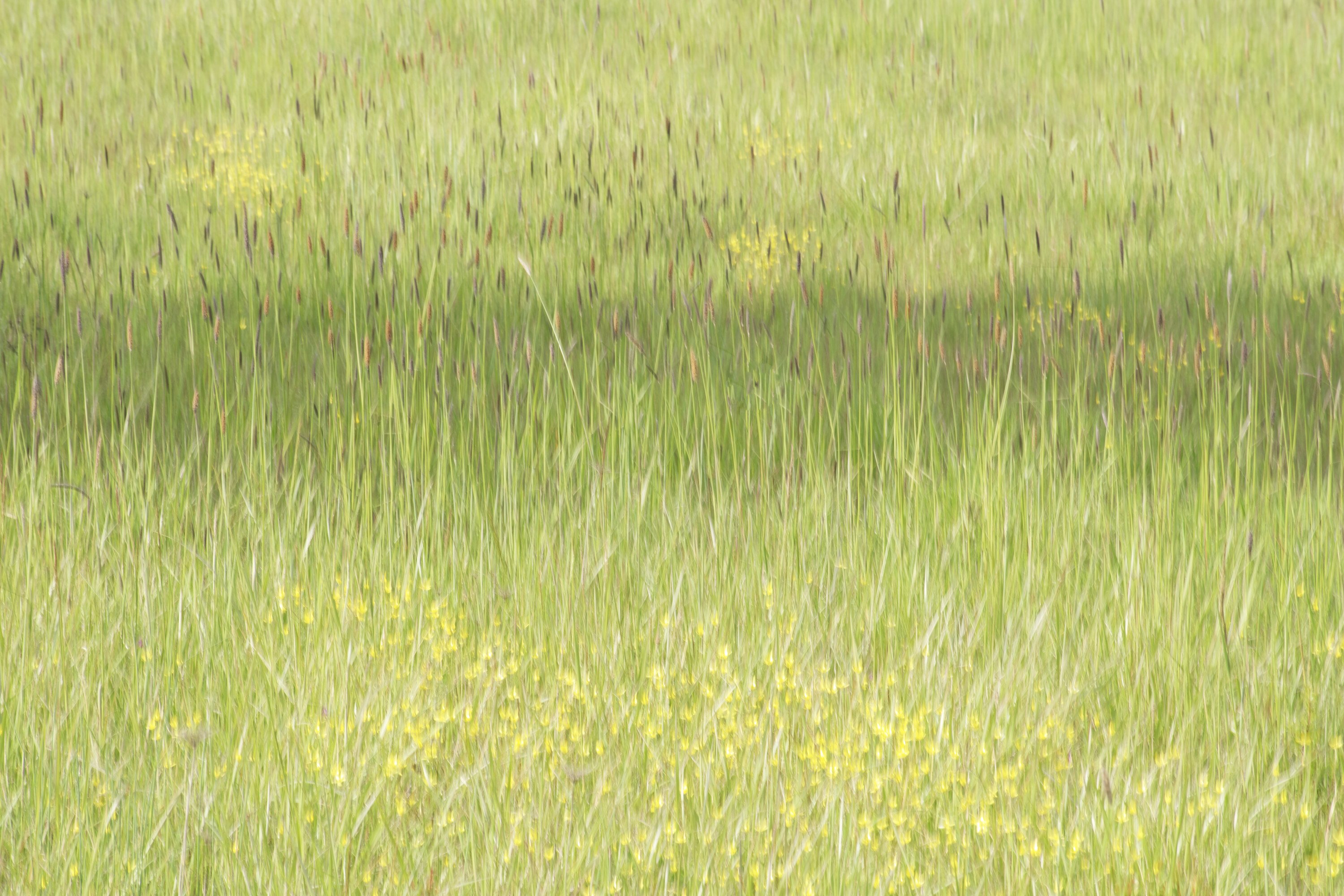
So, I’ve now gone thru several impressions, and they keep getting better. But for sure, this one can easily be interpreted in at least 2 different ways. My first reaction, not having an inkling of ICM, was of course - hey, this isn’t sharp! this would be awesome with a focus stack! I too love the presence of the little yellow flowers amongst the green grasses - and the variation in tone, and layers is quite wonderful! But then as one of those photographers who will stick his nose right up to a big 30x40" print and nitpick on the sharpness… when you look close here, of course it’s blurry!

But then comes the realization… doh! it’s on purpose! Now I get it! And this is a terrific example of an image that can only be appreciated when you refrain from sticking your nose in the print, up close. The closer you look, the more one wants detail and sharpness…

HOWEVER, the more you back away, the more impressive the “Impressionism” reveals itself. The layers of color and tone, including the darker area framed by the top and bottom lighter grasses - AND the scattering of little yellow flowers and darker seed (heads? pods?) - I now can “see” what you were seeing and have successfully captured and presented. Wonderfully seen.

I am with David in his comments. This is so right on the edge of “oops, I accidentally kicked the tripod” and a very impressionistic vision of are. I know you know the fine line with the ICM, trials and results… any longer shutter speed or greater distance of motion, and the colors just wash together in to nothing - no form, a blur of one color, etc. etc. And too much of one or the other and we lose whatever reference of reality there is.

So in the end, without bumbling any further, I think this works beautifully in a gallery setting, a very large print and viewing from a reasonable distance - Great vision, and a wonderful result. On the flip side, I don’t think works or has anywhere near the same impact looking at a 16x20 viewing from a foot or two away. Does any of that make sense?

BTW, I’m a big fan of ICM and so this is of great interest and appreciation.

thanks for sharing,

Lon

Vanessa, I need to take a class from you on ICM. Your images inspire me to take a try at it, but I generally fail in all ways! :slightly_smiling_face:

I love the impressionistic, Monet feel of this image. It certainly feels like a painting the master could have done. Wow. Well done! And it’s good to see you back with these awesome posts.

You’re funny! :laughing:

Thanks so much @Mario_Cornacchione really appreciate your kind words, I’m glad you like it. I haven’t been able to check that out because I don’t have a FB account and can’t figure out how to see it otherwise. But thanks for the tip!

Thanks @Diane_Miller glad you like it, I’m going to do a repost. I wanted it to look more like a painting…

Thanks @David_Haynes for your feedback, I ended up doing as you suggested and combined this photo with another more abstract one, curious what you think?!

Thank you, so much, @Lon_Overacker for all your valuable feedback! And I’m so excited that you finally saw it the way I intended! I wanted it to be something that could potentially be viewed really large from a distance. That’s my vision anyway, no idea how to get there! I’m doing a repost based on @David_Haynes idea of combining 2 photos, I’ll be curious to see what you think… thank you, so much, for the editor’s pick too. Not expected at all!

Hi @David_Bostock ! You’re too kind, I would love to do a class. I hardly would know how to begin, but I love to teach people stuff that I know. I’m doing a repost so interested what you might think…

Hi Vanessa, I like the rework. Nicely done. But I think I like the image with more movement even more. It’s so painterly and peaceful. I gotta start working on my ICMs. Thanks again for your inspiration.

1 Like

Vanessa,
I just love your creativity of combining the two different types of images. You got a beautiful result!

1 Like

Beautiful Vanessa. I think the rework could use some of the highlights from the original but otherwise, it’s very nice. Like @Lon_Overacker said, you could print this large and really enjoy it from the correct distance, more like the distance you would look at a painting and not a photograph. Us photographers tend to be pixel peepers and that’s certainly not what this is all about. By the way, Great to have you back. It’s been a little while.

1 Like