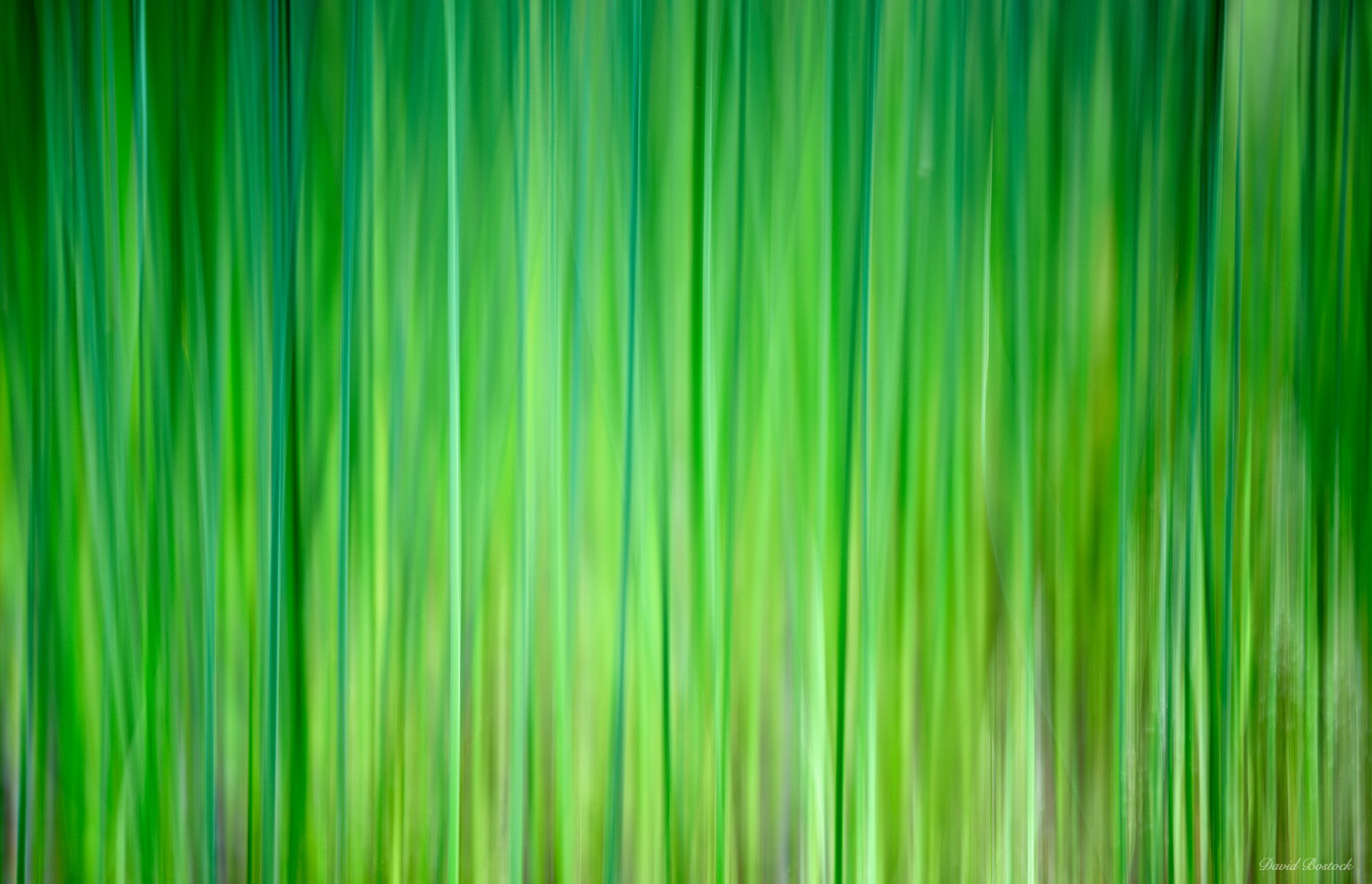
Don’t want to flood NPN with my new found fun of ICM, but wanted to share this one. It’s a shot from a local wildlife preserve of reeds in a shallow marsh land with yellow flowers in the background. It turned into a total abstract, but I kinda like it for the color and glow.
I think you’re quickly getting the hang of this whole ICM thing, David. This is a lovely abstract piece which I could definitely see hanging on the wall of an office or medical building - it seems like it would be right up their alley, in terms of working with interior designers.
I’m looking forward to seeing what other photographs you come up with and where this ICM journey takes you. Thanks for sharing!
I have to admit, I’m not a huge fan of ICM images although I was recently looking at some of Alfredo Mora’s work and was impressed by the moodiness he is able to evoke through this technique. In terms of colour and glow, this image has to be declared a complete success. It is a veritable “study in green”. As @Cody_Schultz points out, this could work well as a wall size installation but as a photograph … well, as one of my mentors, furniture craftsman and designer Jim Krenov used to say, “Just because it isn’t my cup of tea, doesn’t mean it isn’t good tea”.
@Cody_Schultz, thank you for your kind comments. I guess I need to reach out to my Interior Designer friend. Seriously, I think I was just lucky with this image. I definitely need more practice to know what works and when.
@Kerry_Gordon, thank you for your comments. I understand the not my cup of tea thing. I think ICM works only when the subject and technique support it. Alfredo Mora’s work is definitely inspiring and he certainly knows what subject and technique work. Thanks again.
The yellows and the greens are working so nicely together here David. I also like the luminance of this image. There are enough highlights and shadows to really make this appealing. I think really good ICM is very tough to pull off. I think this is well done. Glad you shared this one.
David, wonderful ICM image! I think you captured the essence of the scene quite nicely. Structure in ICM photography is important as it sets the foundation for motion. Structure is represented well in your image. Great job!
As far as ICM work goes, this seems good to me. I’m generally not a big fan of ICM just because it is too “obvious” for me in terms of what it is trying to do/be. The colors here are really nice.
Totally not meant as a jerk comment, but I do find it a little “giggle” worthy that a 100 megapixel camera was used to create a blurry image
Anyways, as far as ICM goes, this looks good to me! Nice one!
I have to admit that I’m not much of a fan of ICM, but I will make an exception in this case. The repeated vertical lines together with the color variation make this work for me. Nicely done!
Hi David, I really like the luminous, almost glowing quality of the colours in this image and the vertical alternations of light and shadows which evoke in me the feeling of a “curtain of green freshness”. The vertical streaks also have a rhythmic quality to them which introduces the feeling of undulation as well. This image blown to 80 inches wide or above would look fantastic on a wall.
For me, an abstract image should convey sensations in a purified form - like the green of the forest “without the actual forest”. A sort of non-verbal distillation of the artist’s deepest perceptions. I think your image succeeds in this!
Just one little thing I would like to mention: my eye “stops” at a little whitish lump in the upper right quadrant, just about a third of the way to the right of the centre, which has the effect of breaking the rhythm somewhat. At the same time, it also evokes the “real” grasses and flowers “behind the curtain” which ties the mind back to the original subject. This is a super minute detail, totally subjective - so please feel free to ignore it entirely
Hi @LauraEmerson, thank you for your comments. Being new to the ICM stuff, I appreciate your thoughts a lot. I see the the white lump you mentioned and have removed it and posted a revision above. Thank you once again for your comments.
Great ICM image, David. You have got the colors, patterns, light and unsharpness fully correct. If this is your ICM beginner quality, I am really looking forward to your future ICM postings.