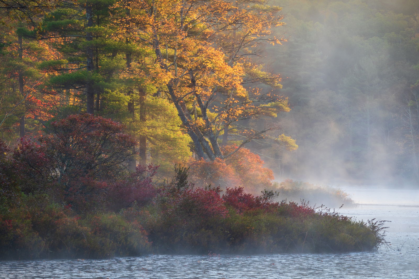
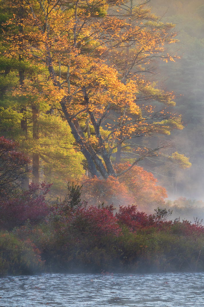
Here is one from autumn 2018 at a pond in Central Massachusetts. I had great light on this morning, and it was cold enough that the mist kept rising off the pond for a long time. The mist on the water, and the light on the maple tree was what attracted me to this scene. After reviewing my original horizontal composition at home on the computer, I am concerned there is maybe too much negative space on the right. So I tried a vertical crop as well.
What artistic feedback would you like if any?
How do you feel about the negative space on the horizontal? Are you bothered by the leaning of the maple tree? Do you prefer the horizontal or vertical composition, and why?
Ed, a wonderful fall scene. The rising and drifting fog / mist is a real plus. The leaning tree does not bother me at all. If it was a bare snag I’m sure it would project a more negative look there. I do very much more prefer the horizontal over the vertical or cropped view. I think the inclusion of the water on the right provides a solid view and understanding of the environment overall…
A gorgeous scene, Ed. I love the moody mist mixed with the fall color. While I liked the horizontal more at first glance, I think I actually prefer the vertical. I think the balance of the composition works slightly better and shows what feels to be the subject—the leaning tree—better. On the vertical, the water at the bottom does seem to distract my eye and doesn’t really connect to the rest of the scene, and I found myself wishing I could see more of the dark red tree poking in from the left. Have you played with a square crop? Maybe take out the water and show more of the wooded area? Mostly just thoughts to play with. Gorgeous images that give you a lot to explore. Cheers
I like both because each one tells a different story. A square crop anchored on the right side might work, as well. The light is gorgeous, and I love the mist rising the horizontal image. The processing looks great to me.
-P
Beautiful, Ed!! For me, it is not even close, the horizontal. The negative space isn’t negative to my eye. It really sets the scene and the mood. I love that foggy background. The leaning maple looks great. All around, a terrific image.
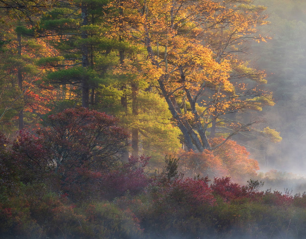
@Paul_Breitkreuz, @Adam_Bolyard, @Preston_Birdwell, @Harley_Goldman thank you all for your helpful comments. Sometimes you get too close to an image, and worry about things too much, like the leaning tree. So it’s helpful to get outside input. Preston puts it well, each tells a different story. The vertical came after the fact here, but sometimes I don’t see these “scenes within a scene” until after I’m home. I agree with the thoughts of a third square crop, I’ll have to give that a go too.
Hi Ed,
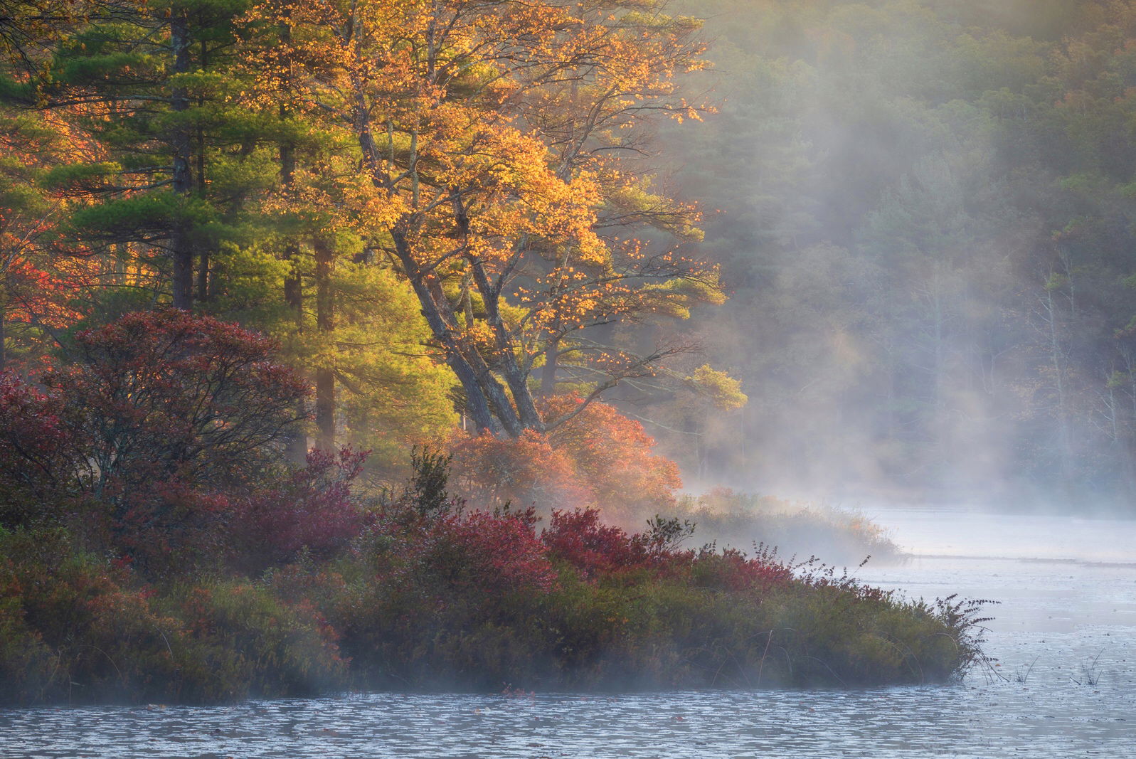
I really like the horizontal’s negative space, call me crazy but I would’ve even included a little more to “wrap up” the bushes. I would crop a tad of the left hand side. I did a quick extend on of the right side with snapseed and the cropped it a bit on the right.
I also like the vertical, as Preston said, they tell different stories. And the leaning maple tree doesn’t bother me at all, it’s natura and is chaotic plus it tells a story of tree fighting against gravity and the water next to it.
Thanks for the comments Jose. Actually the original raw file has more space to the right and the top, but I cropped it in my original post, so there is latitude to restore some space too. I always try to shoot too wide in order to leave some wiggle room.
Wow Ed, this is gorgeous! The rising mist is icing on the cake, but combine that with the variety of autumn colors and the back lighting… yum, I love this!
I can’t pick between the two versions - because they’re two completely different images, to me. The rising mist in the horizontal really creates a wonderful, “rise and shine” mood and the colors range from soft and rich to bold and brilliant. While the water at the bottom of the first one is the weakest link, I think, it’s still important as it connects the right side of the frame and of course is the source of the mist. Put all together and this one is gordeous.
The vertical is less about the mist and more about the color and backlighting. I this one, as someone mentioned, I think the water is totally disconnected. If you’re going to crop for color and light, I’d lose the water. I do really like the vertical crop (without the water) but am wondering because there is so much more subtle beauty on the left that I would leave, if you’re going to crop at all. Here’s my take on it. Granted if you had only shown the original horizontal, I probably wouldn’t be thinking crop…
Full disclosure besides the crop. I also did a small content-aware clone to cover a little of the water LR leftover from my crop. Could have cropped tighter, but love the foggy mist.
Thanks for your comments Lon, they are appreciated. I like the square crop too, it tells yet a third story. I guess when you have have great light and weather to work with, it makes everything else a heck of a lot easier, all of these compositions seem to play well.
Superb capture, Ed. For me, horizontal is the way to go because it tells the whole story, whereas the vertical is leaving out the last chapter of a mystery novel. Beautiful scene throughout. My only suggestion would be to dodge the red bushes JUST SLIGHTLY in order to brighten them somewhat.
Ed,
Both are nice but I prefer the horizontal. The water, fog and foreground tell a more complete story and convey a better sense of place vs. the vertical. The leaning Maple adds interest and is a plus. Really a beautiful scene!
At this point I’m mainly just going to be echoing the sentiments above, but I love this scene. The bend of the tree may irk be a bit if it were for the detail in the distant trees you can see through the fog on the right. Because of that, it seems less like negative space and instead just has something different to look at. The processing looks spot-on, and I think each of the compositions mentioned here work well. I think it just depends which story you’d like to tell–they may even work as a small series if that’s the way you wanted to go. Overall, great shot!
Wow! This image has so many different ways you could compose it and still have a winner, Ed. This has it all; great light, some lovely fall color and a wonderful mood with the rising mist. I think that leaning tree adds some nice visual tension to the scene and makes it a little different. FWIW I am partial to the original.
Stunning image, whatever way you slice it. I prefer the horizontal and love all the negative space filled with mist. It is almost as important as the trees IMO, and I do like Jose’s extension of that space and crop on the left. The leaning tree is fine (and I also liked the tree in one of your other recent images that leaned to the right.) Beautiful colors and processing, in addition to a stellar place to take a photo.
Hi Ed, I little late to comment on this… but I had to because it is exquisite. Strong preference for the horizontal format for the reasons others mentioned. I’m liking Jose’s crop the most. To my eye it has the best balance.
Beautiful photo! I prefer the horizontal. The composition, while unusual, totally works for me. My only nit is that I would darken the bright area of water on the right just a bit. It pulls my eye there too much.