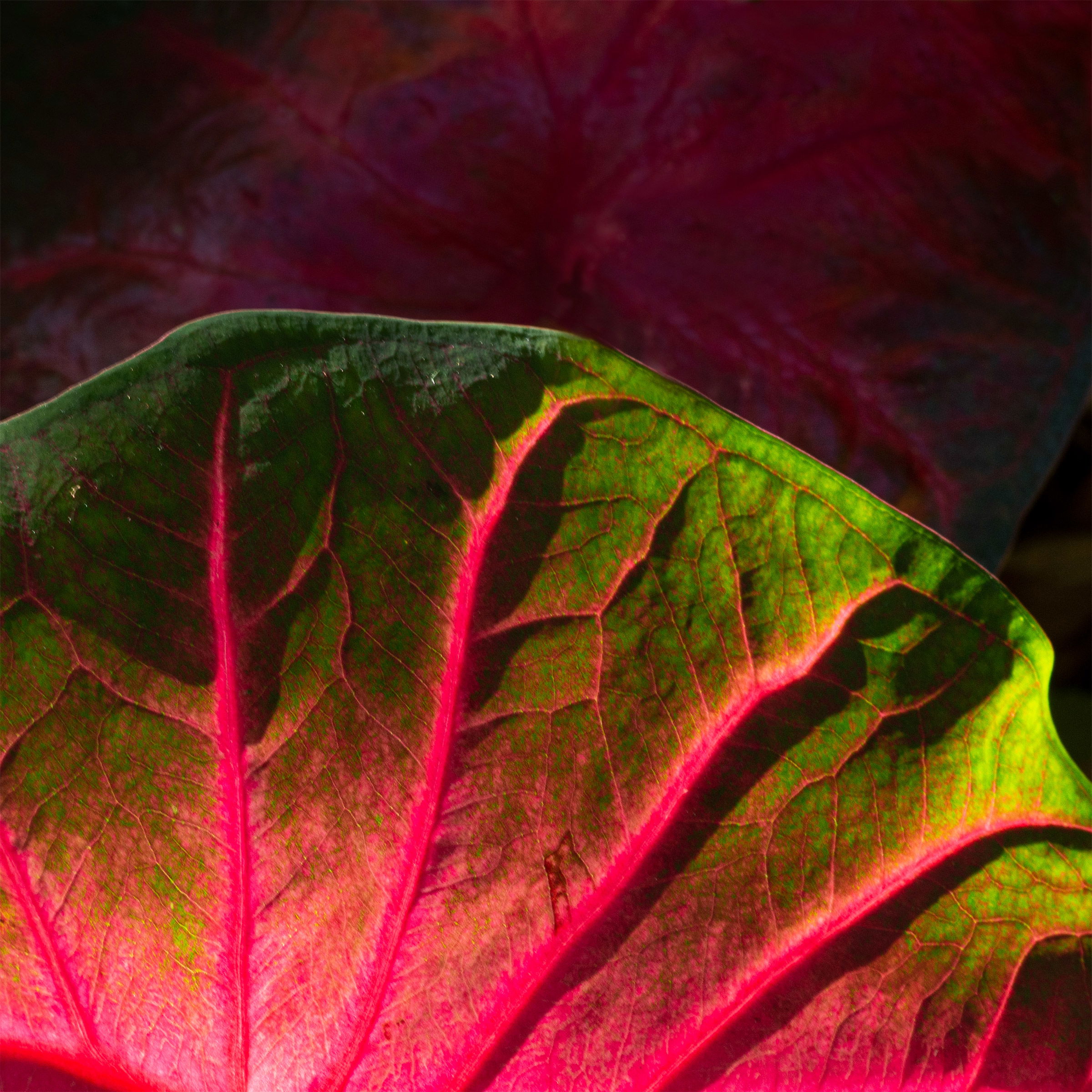
On a recent day trip to the San Antonio Botanical Gardens I saw these coleus (I think this is what it is?) and just love the way the sun was reflecting through the back of the leaf.
Still working on details and clarity. Any suggestions, comments would be appreciated.
What artistic feedback would you like if any?
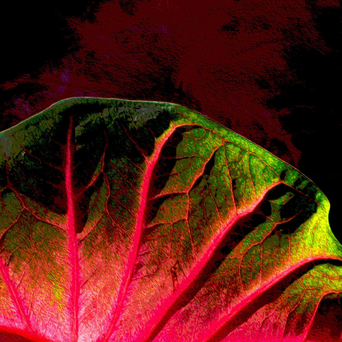
I was enjoying the intensity of the colors and the feeling the veins were reflecting the sun raise so I’ve posted two version. First is minor adjustments in PS. The second version I’ve “posterized.” Do either of these “speak” to you? Other comments, suggestions are always welcome.
Pertinent technical details or techniques:
Cropped 1:1, Did a couple of content aware to remove two very bright leaves in the upper corners and burned the leaf just a bit in the ULC to tone down some hightlights.
Linda, I can see what drew you to this leaf too. I like the play of light on the veins of the leaf as well as all the variations of red and green. I think I like the original the best. It just looks more natural, and I guess I am one who likes that best most of the time. Just a matter of personal taste. I think if it was my image, I would crop some of the top off, as to me it isn’t adding that much to the image, and I just love the subject. Well seen and captured. So glad that you were able to go to a Botanical Gardens. I haven’t been anywhere for the past 4 months. Don’t see it happened for some time to come either.
Thank you Shirley. This was definitely a special treat to be able to go. We went first thing in the morning to avoid the crowds and had to wear our masks (in 90 degrees) the whole time. Not sure when we will be able to go again. Quite an adventure. I appreciate your input and can see what you mean about the crop and will give it a try. Thanks again.
Linda, I like the first image better, as it brings out some the texture well. The dark areas in the posterized version distract my attention. Agree with Shirley on the crop on the top.
Hi Linda, well seen and taken - the colors and mood of the image are wonderful. I prefer the first photo for being natural and I think the composition and textures already lend toward an abstract feel. Well done.
Linda, this is a very striking look at this Coleus leaf. The side lighting and colors show very well. I too prefer the “real” version. For me it has enough abstraction that the addition texturing makes too strong, especially in the oof area at the top. That, of course, is my personal reaction, you may well find other audiences who prefer the more abstract version. It’s definitely fun “playing” with all the embellishments that software offer.
Linda: I’m going to go a little against the grain and say I prefer the second image. I do agree with Shirley about a crop. I think I would remove about 1/2 of the BG up top. Good vision and a solid capture and presentation. >=))>
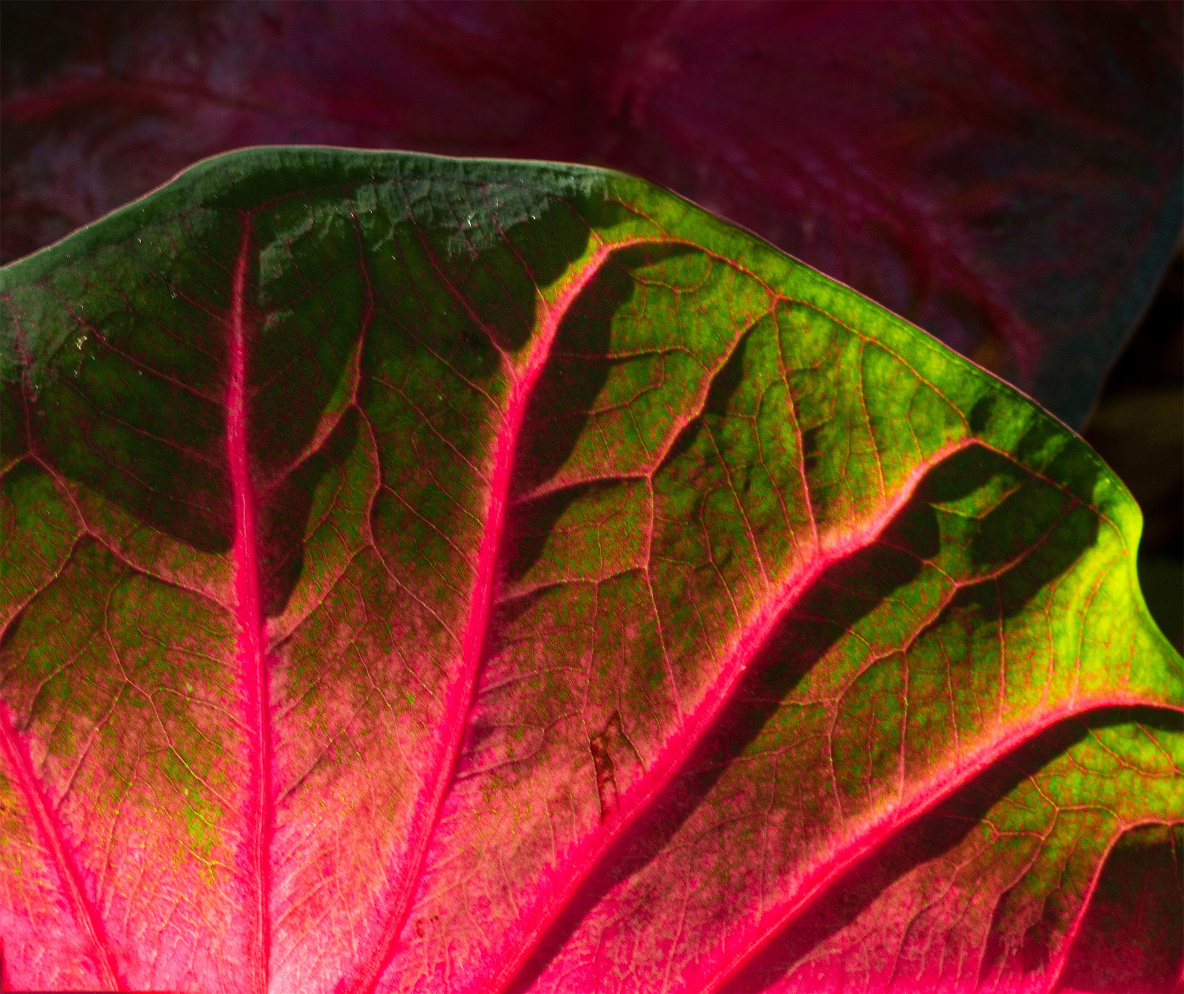
Cool! I’m enjoying the first one, myself. I agree that you could take some off the top, as it’s not adding much. The other bit that catches my eye is that small rib in the LLC that is pointing the opposite direction. You could easily clone that out, so that all the ribs make that nice sun-ray pattern.
Thanks everyone. And Bonnie, thanks for noticing the LLC vein, absolutely going against the grain, so I did a “content aware” edit and think this has eliminated the distraction. Great comments.