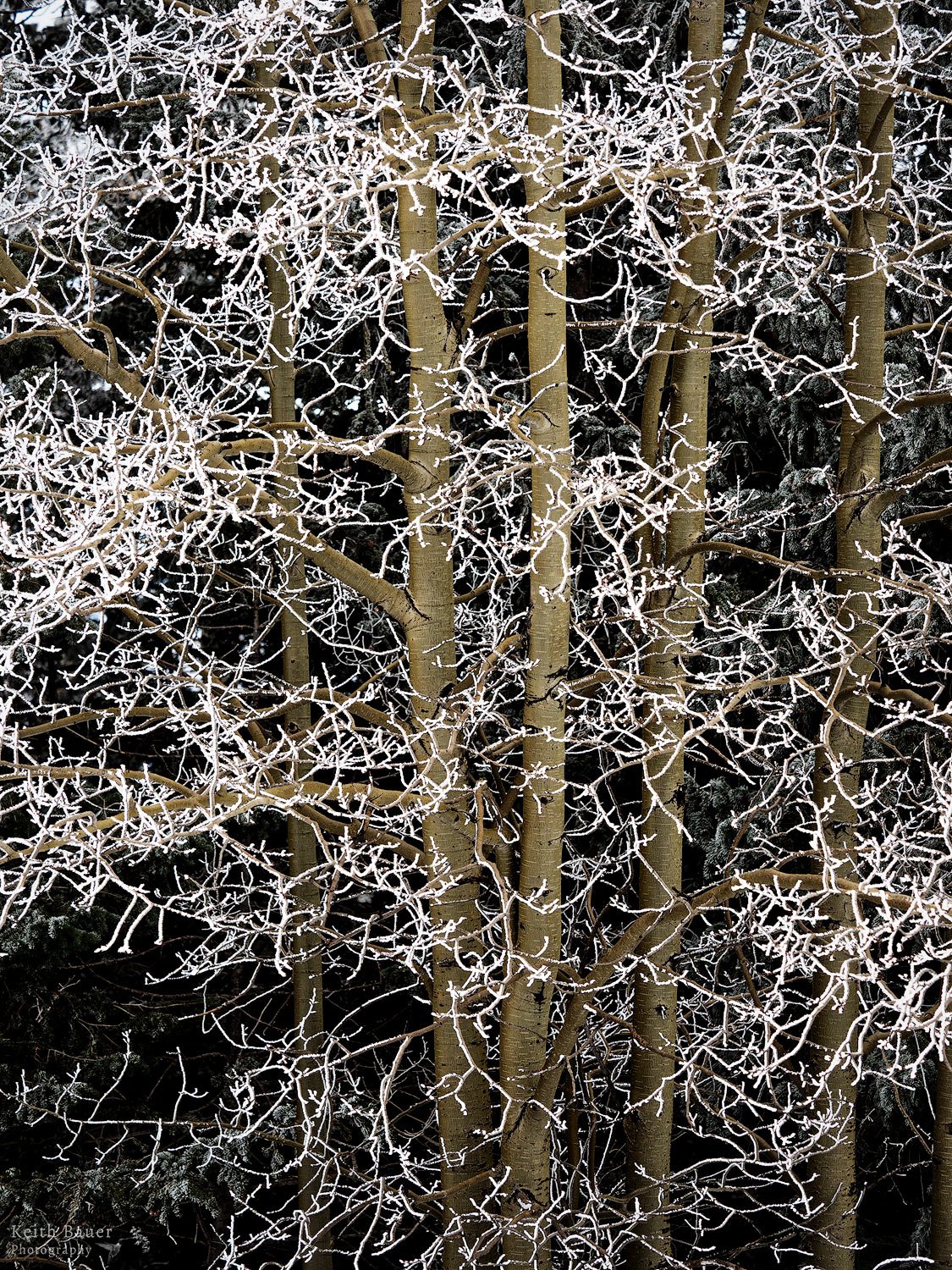
I shot this yesterday up at the top of the mountain near my home. I really liked the hoar frost on the branches with the aspen trunks. Played with several processing options and came down to the two I’m attaching here.
I’m undecided on the color or B/W options. I’d appreciate your input on either.
Pertinent technical details or techniques:
(If this is a composite, etc. please be honest with your techniques to help others learn)
If you would like your image to be eligible for a feature on the NPN Instagram (@NaturePhotoNet), add the tag ‘ig’ and leave your Instagram username below.
You may only download this image to demonstrate post-processing techniques.
Keith, most definitely the color for me also, for same reasons as Ronald. The warm tones of the trunks really set of the graphic aspect of the hoar frost.
Beautiful! The hoar frost shows off wonderfully here. And definitely color for me too. The color better separates the trunks and the frosted branches. With the b&w, the contrast is excellent but the separation with the trunks not as good. No nits or suggestions.
Sure looks like it was a great time to be out! And great work isolating this intimate winter scene.
Another vote for the color, Keith. I think the color version has better color separation of the hoar frost; which is magical BTW; and the trunks of the trees. The dark BG is the perfect canvas for showcasing the lighter tones. Lovely image.
Keith, the hoarfrost here is wonderful, what a find…
Another vote for color, the warm tones of the trunks add a lot of vibrancy to this scene. It creates a wonderful contrast against the frost I’m actually surprised the B&W is not as interesting, this is the type of subject that usually converts well to B&W. I think it may be because the B&W has most light tones, and there is relatively little space with dark tones to create contrast. The color version surprisingly has more contrast than the B&W.
I prefer the color version as well, since the trunks separate so well from the hoarfrosted branches in that version. But maybe a cooler rendition would be in order, to lend it a bit of a wintry vibe? Then you may get some nice complementary golds and blues. That’s a matter of personal taste though, I can understand if you prefer the frost to be fully white. In terms of the subject and composition the image is great!