The photographer has shared comprehensive information about their intent and creative vision for this image. Please examine the details and offer feedback on how they can most effectively realize their vision.
Self Critique
I enhanced the patterns and textures of the image in post processing. Could the lighting/contrast be improved?
Creative direction
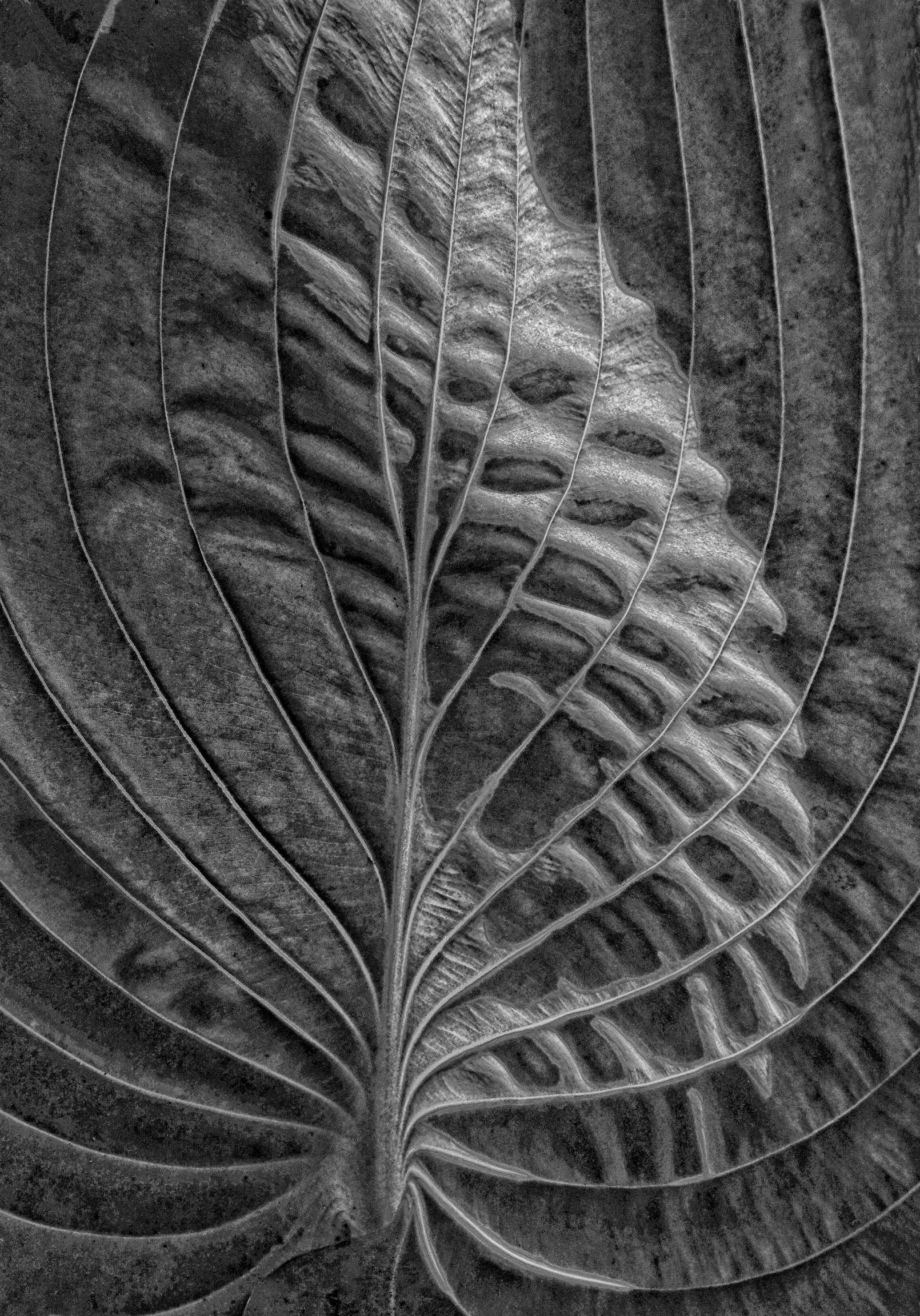
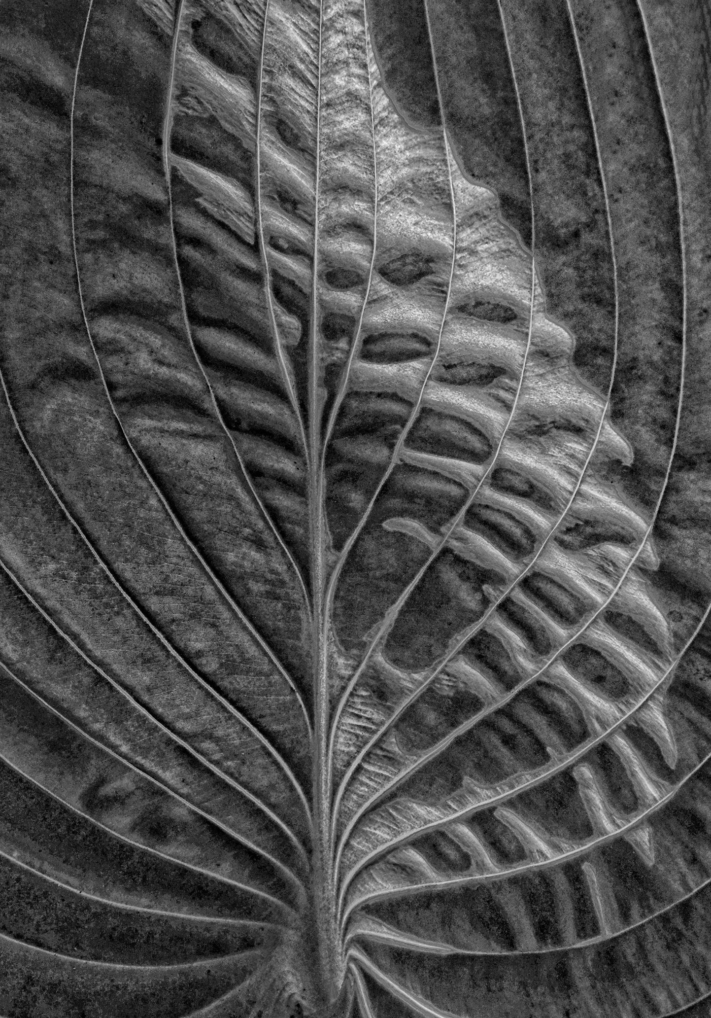
The goal was to capture this Hosta leaf in a way that one’s eye is drawn to the varied patterns but not immediately identify it as a Hosta leaf.
Specific Feedback
I feel this goal was achieved but was wondering if the image was too dark.
Technical Details
Photo taken with an Olympus OMD E-M5 using the Olympus 14-150mm @36mm, 1/640 sec., F/6.3.
Description
While visiting a friend’s shade garden, I was immediately drawn to the lush Hostas. The vein patterns and repeating “pockets” begged to be captured.
This is lovely!! The B/W treatment is a great choice to emphasize the patterns, and the detail is captivating! My only thought for improvement would be to try a graduated subtly darker vignette from the LL and UR corners, to further emphasize the diagonal light area, but it’s hardly necessary – just a possible tweak. Wonderful seeing and processing!!
This is a nice image Kari. I like how the veins of the leaf extend out from the center and curve towards the top of the image. I think I would like it more if you cropped the image to make it more symmetrical and straight from top to bottom. It seems a bit too bright and could benefit from some added contrast, but that’s a personal preference as I prefer images slightly darker.
Kari, this looks great. Your handling of the light give it a very strong 3D feeling, even as the pattern is nicely emphasized. The brightness looks good, with a complete range of lights and darks.
Kari: I got a nice -meter spike form this one. I’m not a huge fan of B&W and am seriously challenged in that genre but this is striking and compelling IMO. Superbly crafted image.>=))>
Like everyone else’s comments, this is a fantastic image! I agree with Don’s suggestion to slightly adjust the leaf’s arc , but otherwise it’s amazing.
Tom,
Thank you for your enthusiastic comments! I have to agree that Don’s slight adjustment was a huge improvement. I remember struggling with what line to use for a vertical alignment.
Kari
I can only agree with the other comments. Striking image, nice conversion to B/W. Top contrast choice. Reinforcing the symmetry, as suggested, could make the picture even stronger. I will not look at hosts leaves the same way from now on. The ‘explosion’ at the base of the stem seems a very attractive topic for one of my next shoots. Thank you for the pleasure of viewing and the inspiration.
Stunning textures, lines and patterns. Well seen, photographed and processed. If this was mine, I would try Dianes suggestion. I think the image might be slightly enhanced by the vignetting.
Thanks Fritz. I am definitely going to make an edit with the slight change in “straightening” (per Don) and then another version with a subtle vignette per Diane. Once I get the right version I will repost.
What pulls you in immediately is the leaf itself, transformed into something between an anatomical drawing and a piece of weathered sculpture. The veins radiate from that single anchor point at the bottom like the ribs of a cathedral, or the bones of some patient sea creature that gave up swimming a long time ago. There is real reverence in the framing. You clearly wanted us to see the leaf not as a leaf but as architecture, and the intent lands cleanly on the first look.
The choice to fill the frame and shut the rest of the world out is the right one. We are asked to stay, and we do. The stem at the lower edge gives the image its gravitational center, and the eye climbs upward along the veins like it is walking a staircase made of silver wire. Tonally there is drama in spades. Highlights catch the ridges with a sheen that flirts with metal. Shadows pool in the troughs between veins and turn simple botany into something closer to geology. The decision to go monochrome was correct. Color would have softened a leaf that very much wants to feel carved.
Now the gentle pushback. The processing is doing a great deal of heavy lifting. Clarity and structure were invited to the party and stayed rather late. The crunch and micro contrast on the right side push toward etching territory, which is striking but starts to feel brittle in the brightest patches near the top center. That bright zone is also the loudest voice in the room. A modest burn there, and a hair less local contrast across the upper right, would let the leaf breathe and keep it feeling organic rather than fossilized. There is a faint left to right imbalance as well. The right half is busier and brighter than the left. Asymmetry is fine and even welcome here, but the current weighting tugs the eye away from that lovely radiating origin point at the base.
Overall this is a very proficiently executed, sculptural, almost devotional portrait of an ordinary leaf made strange. Ease the processing by a hair and the image will whisper instead of declaim. Both registers can be beautiful. Right now the leaf is declaiming. It is your call whether you want it to sing or shout.
 -meter spike form this one. I’m not a huge fan of B&W and am seriously challenged in that genre but this is striking and compelling IMO. Superbly crafted image.>=))>