The photographer is looking for generalized feedback about the aesthetic and technical qualities of their image.
Description
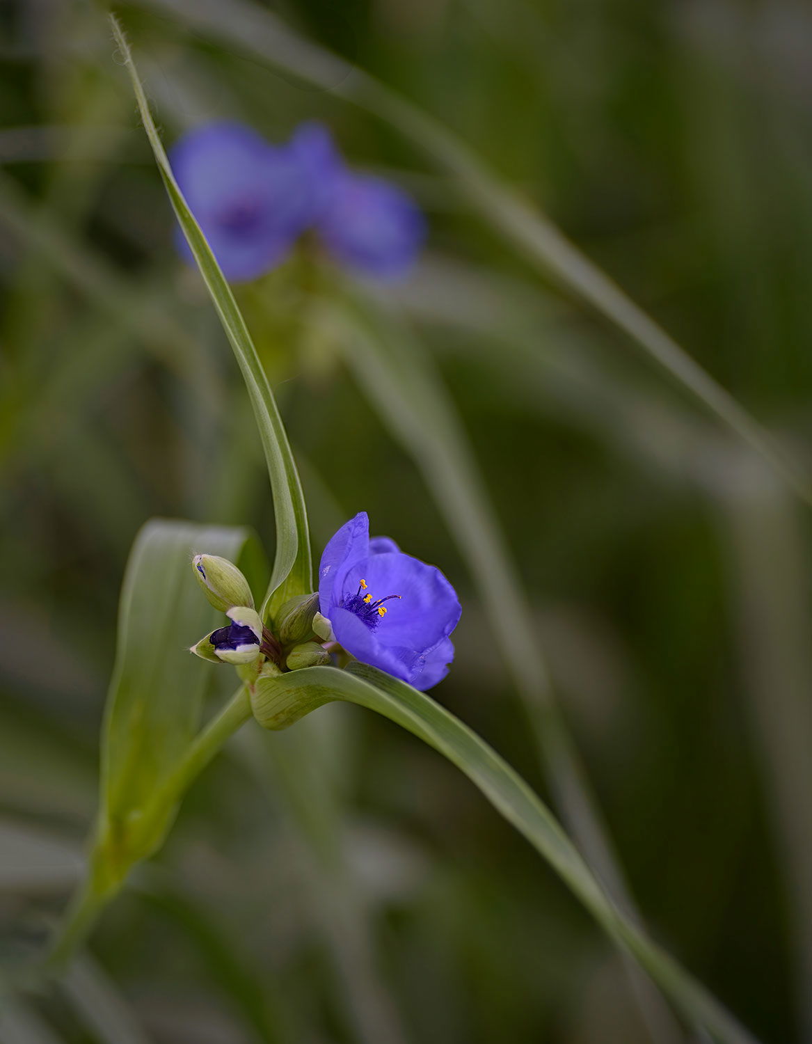
This is a spider wort in our yard. It looks as if it’s ready to take off in flight. The outspread leaves remind me of wings. The yet-to-bloom and buds just opening add interest and balance to the flower. By limiting the in-focus subject to a single flower I thought I eliminated the chaos of all the surrounding flowers. I think the other leaves in the bokeh complement the subject. I would appreciate overall reactions.
Specific Feedback
Overall impression of the image. Have I adequately eliminated the chaos? How does the geometry work here?
Technical Details
Nilon D750, Tamron 90mm macro lens at f3.2 , 1/60 second
Critique Template
Use of the template is optional, but it can help spark ideas.
Very lovely! The crop allows the leaves to create a very pleasing shape around the flowers. I wonder about a slight punch in contrast – maybe just on the selected subject.
The title is great, Larry and I love the subject. I think you did a very nice job on controlling the background. The one out of focus bloom still pulls my eye a bit and I wonder if maybe reducing the saturation on it just a bit might mitigate that.
Larry, this is a fine take on this Spiderwort, with the flower sharp and the long leaves angling corner to corner. I like the oof blooms, as they add interest to the rest of the frame.
Larry: I’ll ditto most of the positive comments and I especially like how you arranged and placed the main subject in the frame. Like @Dennis_Plank the OOF buds break up the image and pull my eye. A tighter crop might work but then I think you lose some of the impact of the full frame. I messed with some generative Ai but nothing worked. Dennis’ idea of desaturating might be a good tack. Still a very well conceived and presented image. >=))>
@Sandy_Richards-Brown@Dennis_Plank@Bill_Fach@Mark Seaver. Thanks to all of you for your helpful comments. Diane, I will look at the contrast on the main flower. Dennis and Bill, I agree that the saturation on the blurry flower needs to be lowered.
Dennis, I have reducing the saturation on the out of focus flower on top and it looks too light, kind of weird. Any suggestions on how to do this. I did an object selection in LRc and lowered saturation.
I also tried a saturation mask in PS, neither produced good results. Thanks. Larry
Well, my suggestion may not have been that great, Larry. I played with it in PS by using the Color masking tool in the TK9 panel and painting black over the subject bloom leaving nothing but the out of focus bloom. With the saturation layer I reduced saturation, reduced lightness and shifted the color tone toward the green a bit. I still didn’t really like it so I played with a couple of other adjustment layers all without getting it quite where I was thinking. If they want to improve photo editing software, they need to can the AI and develop a headset that reads our minds and produces what we are envisioning! Anyhow, here’s the layers panel and what I ended up with for what it’s worth.
Thanks for your stab at editing this. Your best advice is " can the AI and develop a headset that reads our minds and produces what we are envisioning!" That’s perfect. I don’t go in for all the generative AI stuff. After all, AI is neither artificial nor intelligent. I also use TK9, so I’ll try your work-flow. Thanks again.
Dennis, Here’s my repost. Looking at my original and this more unsaturated blurry flower, I can see that my eye is drawn less to the top of the image. I think it’s an improvement; time to stop, eh.
Again, thanks for your viewpoint and workflow. Our dialogue is what NPN intends – connection with others, critique, and learning that applies to more than the single image critiqued.