Specific Feedback Requested
All feedback welcome.
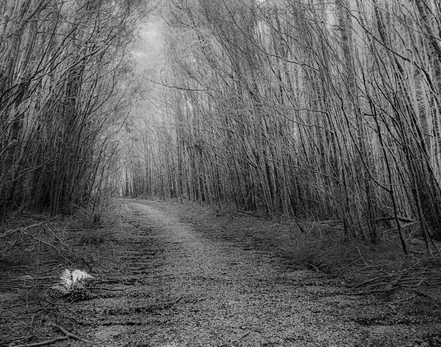
Alan, this is a very nice entry for this week’s challenge. I like your choice of BNW instead of color, too. Another interesting point I want to make is regarding your choice of having the natural tunnel not being dead center. It worked really well here. I think the image could be made much stronger if the top section were a little darker. That would anchor our eyes down on the trail and into the tunnel. For me, the bright light in the sky takes my attention away and out of the frame. You could likely fix that problem with a gradient or radial filter to darken that and surrounding areas. Then, the trail would completely anchor and lead our eyes into the tunnel alone. I’m also a little distracted with the fern on the LLC. It does not seem to belong in the overall scene. Nature has her own mind as far as that goes. Anyway, this image is very strong and gives me a feeling of both isolation and tranquility. I really like it.
Hi Alan:
First of all, I love the lonely fern in the bottom left, juxtaposing the otherwise dead-looking trees and brush around it. Such a nice little detail.
My primary suggestion would be to darken the top half of the image, as my eye cannot help but be drawn to the top of the frame, instead of through the pathway tunnel, where you would want the eye to be drawn. (This is due to our mind being naturally drawn to the brightest part of what we see/the frame.) From there, you may want to consider brightening the pathway by a bit, but only if it needs it once the top half is darkened.
Otherwise, I really think this piece has a lot of potential, if you work on it just a bit more.
Hi Cody,
Thanks for your positive comments and helpful suggestions. I did try to darken some of the bright spots in the top half using a brush, but I agree that the whole section could be a bit darker.
Cheers,
Alan
Hi Edigio,
Thank you for taking time to review and comment on my submission. I agree that the top section needs to be a bit darker. I do think that the little fern serves as an interestingly odd feature rather than a distraction.
Kind regards,
Alan