Image Description
Simple and different.
Type of Critique Requested
- Aesthetic: Feedback on the overall visual appeal of the image, including its color, lighting, cropping, and composition.
Specific Feedback and Self-Critique
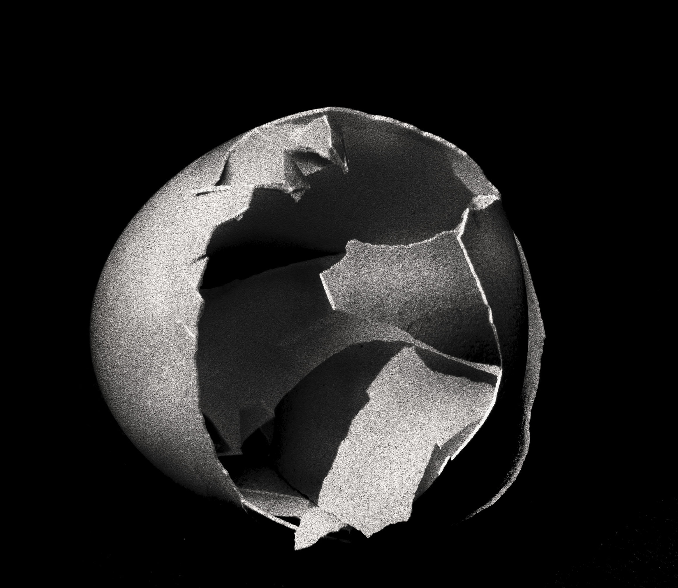
A simple photo i shot one evening. After dinner thought. i did one in color and black and white. ISO was high so some grain but the rough texture of the shell and the grain gave it a rougher look. Soft light and little editing …
1 Like
Cool! And imaginative! Although I love a soft, dreamy look in many images, this is one where the grain and texture work so well. In painting and drawing, the roughness of the texture of the substrate is called tooth, and it can give a very nice added dimension.
My only useful thought would be to explore some slightly different angles, but that’s not a criticism of this one – just a thought about the richness of the potential.
Again, for me, I’d prefer a little more room on the left, which is easy to add, but that may not work for your vision. I think there is potential here to use that edge to keep the eye in the canvas with some expansion and edge burning, and to further emphasize the roundness of the shell as a contrast to the hard edges – which is already very nicely shown in a couple of other areas. But just a thought and reaction, not a suggestion. I don’t think anyone here would want to feel they’re trying to mold someone into a generic box to please the largest audience. And I’m sure you’ll just take it as extra exposure to slightly different ideas.
I only take time to play with images I already like! And seeing it here, I might add a little canvas on the bottom and take a bit off the top. A visual weight thing.
Oh, I like this, Gill. Who would have thought an eggshell could bring such interest. I like that you left the crushed in portion inside to help fill the hole and give more shapes and lines. I also like what @Diane_Miller did, it just seems to balance it better. Nicely done!
Gill, this is a normal composition rule, to have your subject off center. But when you use a square crop, it feels better balance to have the subject more centered, if that makes sense. Rules are just guides for us. We just have to view each image and decide what really looks best rather than just sticking to a rule, is the way I see it.
1 Like
thanks i understand. Thanks for showing interest. Rules are guidelines and sometimes I just do the Rules of Gill. for better or worse. But to hear and see and read what others think is great information. Another view point i always welcome.
thats why i joined the Network. To Learn and see and hear what everyone is doing.
Thanks again very helpful !!!
1 Like
It’s a good idea to have the subject off-center. Except when it isn’t a good idea. And the much-vaunted rule of thirds can be very nice sometimes. But so can the rule of 7/16ths.
SO much flexibility with creativity!
But I think there are a few “guidelines” that are pretty common to most people’s visual appreciation – if appreciation is the goal, which it doesn’t have to be. I think two of the more obvious ones are a balance of visual weight in the frame, and a lack of tension or clutter at the edges, which helps direct attention to the subject. Others could chime in with more items.
1 Like