What changed: I wasn’t going to share a revised version, as I was basically trying to replicate Lon’s results, but I wanted to try out the new feature. I like this better than my original, and I’m looking forward to taking another 20-30 exposures to see what happens. All I did here was cool the WB a bit more, boost the highlights and contrast, increase saturation a tish, and applied a radial filter to brighten the lower right corner. I might push it even further, but now I’m more interested in shooting for different patterns in the fish movements.
Added after receiving feedback from the community.
The photographer is looking for generalized feedback about the aesthetic and technical qualities of their image.
Description
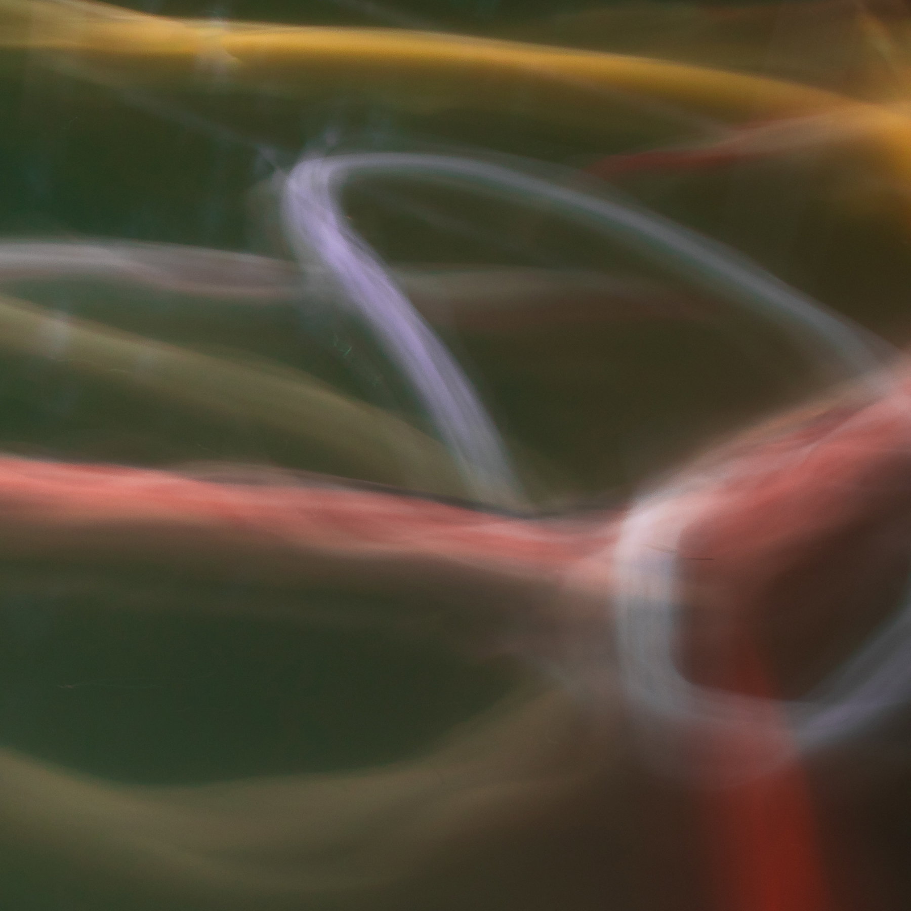
This is a long exposure of Koi in the pond at the Portland Japanese Garden. While photographing them there, I ran into Joseph Campisi (former NPN guy from sometime before 2012. I told him what I was doing, and he shot the same area and came away with much better results. I’ll have to ask him what he did.
Mostly I was interested in seeing what I would get. I was thinking ICM, but of course, the koi were moving just fine, so I set the tripod down and did a dozen or more exposures of 13 seconds or so.
Specific Feedback
Mostly I’m curious about whether you think this subject and technique has potential. It’s very difficult (lots of throw aways) and I think the best time for it would be earlier in the day (fewer people on the bridge, less reflection off the water.
Question:
Does this look interesting?
Are the colors too unappealing (greenish water and yellow and orange koi)?
Do you have suggestions for how to get better effects? I already know I need a better polarizer that’s not on a step up ring (lol, this is a quarter of the frame).
Any suggestions for processing, color, etc. I only use LR, so keep that in mind.
Thanks for taking a look.
Technical Details
Canon 5DIV with 24-105mm at 40mm and cropped off about 1/5 of the frame
ISO 100, f/20, 13 sec.
LR processing for some saturation, temperature shift to cooler tones
Marylynne, this is good fun! I knew what it was immediately from your previous post. It’s a neat idea and it looks good. The colors are fine. Maybe it’s knowing your subject, but the reflections don’t bother me as they add to the mystery and provide a touch of interest away from the colored lines. My one suggestion is to even out the brightness of the streaks, particularly in the middle left side of the frame. That may be possible with multiple LR radial masks. Pursuing this idea looks like it could be a major, very pleasant time eater…
Hi Marylynne, great image! It looks like an abstract painting. There is a lot of potential for this series. The colors go together well to my eye. I wouldn’t have guessed the subject from seeing the image without your description.
This is terrific. As Mark points out, if it weren’t for your previous post and description, I would have no idea what this is. Of course with Abstract art, that’s usually a good thing - gets the mind engaged and wondering or imagining.
And with that, because it’s abstract, anything goes in terms of color, processing, etc. In my view, because of the brachish water , it kinda comes across as muddy. I think increasing contrast, perhaps some Dehaze in LR/ACR or even cooling the WB a smidge. These are all things to play with. You could even try adding an Orton effect. But again, all subjective.
Better effects? really, only experimentation and lots of images will get you there! One huge difference here is that you are not controlling the emotion by simply letting the fish swim around during a long exposure. Your capture here certainly works wonderfully, but you’re at the whim of the subject.
I decided to go ahead and post an example based on my suggestions. Hope you don’t mind.
Marylynne, I think it’s an interesting and promising approach. The lines are very intriguing. I don’t love the yellow-green water but you can fool with that. I might try setting the white balance to fluorescent to push the greens towards blue.
I can see interesting possibilities for multiple exposures with this subject.
I did play with color temperature and dehaze a bit, and it improved the colors, but not as much as Lon’s suggestion. I like Lon’s version a lot, so I’m going to play around with WB, dehaze and contrast a bit. At the time, I was still trying to keep the streaks “koi-ish” in color, but I’m not sure that’s a priority.
I’m looking forward to playing more with this. With fewer folks and the bridge and a better polarizer, I think I can get some neat lines and swirls. There was a guy there that day who had a long walking stick. He said he taps on the bridge to get them to come to him. I think he’s there often, so I might post up next to him to see if it increases my “catch of the day.”
This is very cool! Late to the party on comments, but thought I’d put in my 2 cents. I love what you and Lon did to darken the water - that gives this more depth. Since this is totally abstract, I wondered about making it more colorful. Maybe that’s not your cup of tea, but I thought I’d put it out there. I also wondered about a flip, so the “fish trails” would be pointing more upward, thinking that would be more energetic. All of this may not be to your liking, but here’s my idea and screen shots of what I did (in ACR, I don’t use LR, but it’s similar).
Oh, I like that. I believe I did some rotation, but not a total flip. In the original, the orange streak was angled in an unseemly fashion and invited comparisons I preferred to chuckle at privately rather than invite . This is cool, and I like how it gives the image some directionality with the white loop. I was hoping for more of a circular swirl (you know, like paintings of koi swimming in a circle), which it didn’t get, but your flip provides the kind of rotational effect I was hoping for. I think the color goes a bit further than I would go (just the funkiness at the edges of each streak), but the composition is mucho mejor!
Hi MaryLynne! I really like your idea of capturing an abstract through long exposure rather than ICM. The resulting image is very cool. I like both Lon’s and Bonnie’s adjustments. One of the things that make abstracts fun (not that I do a lot of them) is how you can make all sorts of adjustments until you find a combination you like. As Lon said, “Anything goes!” I’m looking forward to seeing your next post using this technique!