The photographer is looking for generalized feedback about the aesthetic and technical qualities of their image.
Description
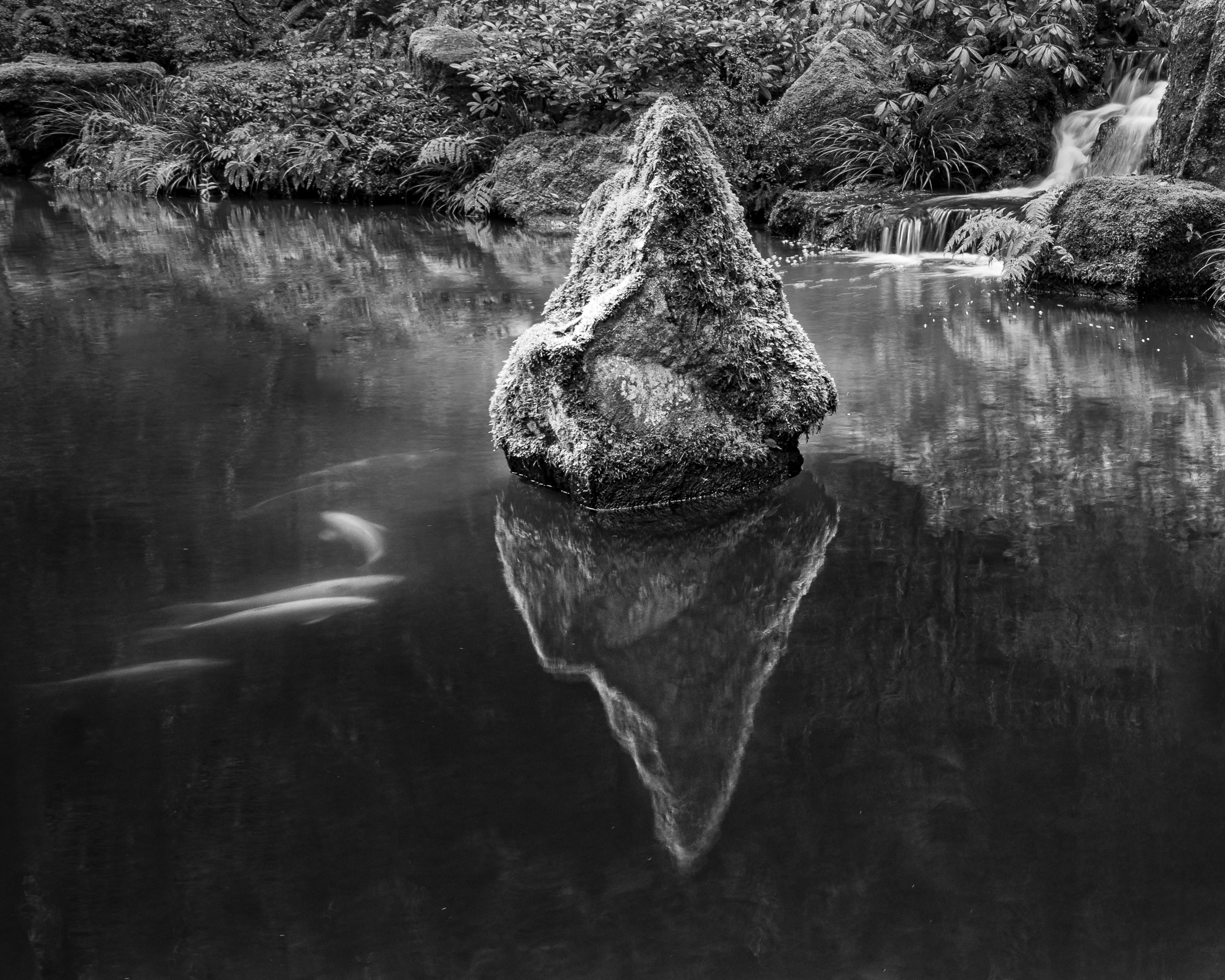
I went back to the Portland Japanese Garden to see whether I could improve upon a composition I made a week or so ago. You can see that one here: Snow Lantern and Rock at the Strolling Pond
What I didn’t realize is that the reflections that were so captivating the last time were a result of a power outage, so the waterfall pump was off, and the water was very still. I decided I would give it a try anyway, isolating the rock from the lantern, etc. Of course, now the waterfall is an element. And some koi, so I went with it.
This location is really hard to shoot. So much going on, and it might just be that I can’t really isolate a subject here. But these are my efforts from today.
Specific Feedback
As always, I’m eager for any feedback, including a big yawn of ennui. In particular, I’m wondering the following:
On the top image, does the composition work or is there still too much going on?
Canon 5DIV with 24-105mm at 24mm for the top and 32mm for the second image.
Processed in LR for a quick black and white conversion.
Critique Template
Use of the template is optional, but it can help spark ideas.
Vision and Purpose:
Conceptual:
Emotional Impact and Mood:
Composition:
Balance and Visual Weight:
Depth and Dimension:
Color:
Lighting:
Processing:
Technical:
Marylynne, I love this image, the top one. There’s an imaginary diagonal line connecting the koi and the waterfall that makes for what I think is a compelling composition. To my eye it works better than the earlier one with the lantern. And the koi draw you into the water. Nicely done catching them there!
The Top One. Really nice !!! Works great in B&W … The Koi works great. gives the water some interesting views and makes it very natural. They need to be there. Well Done. You caught your vision. Caught my eye and interest !!!
Marylynne, I prefer the top image also, with a tweak. The aspect ratio in the top image works better because it offers more real estate without overcrowding the rock. The white streaks - look like fish on the left - add interest and some diagonal flow. They also provide some balance with the waterfall in the background . The tweak I suggest is to open up the luminance on the rock as it is in your bottom image. This adds interest to the reflection. The brighter rock and reflection lead into the light water in the mid ground and background. Lovely image that looks great as a B&W.
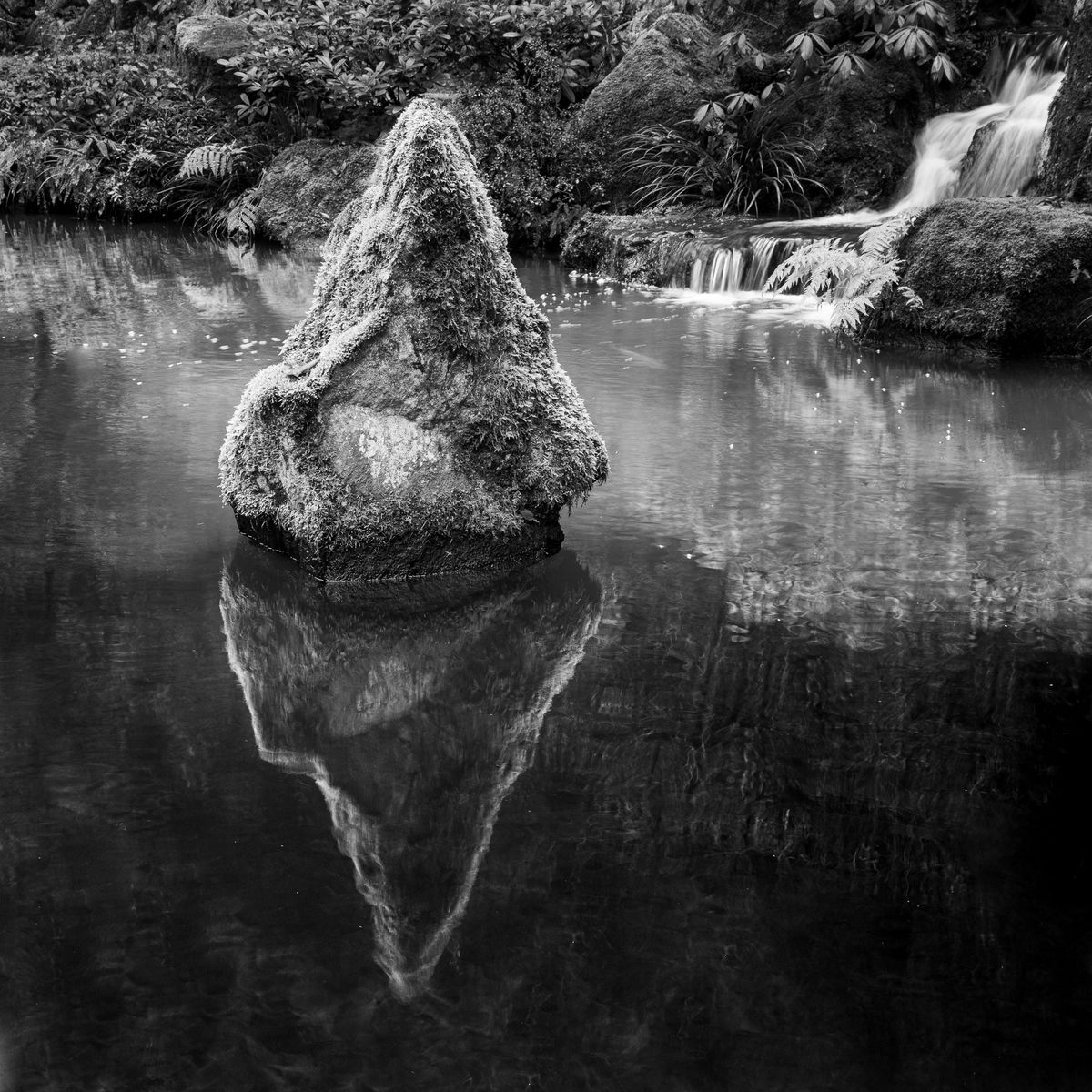
The horizontal image really works for me. The fish add a dynamic element to the scene. Nice placement of the elements for a diagonal flow across the image.Processing looks great imho. The square image is nice, but not enough going on. The reflections don’t bother me. I think they fit this image with the implied movement of the waterfall emptying into the pond. Top notch work. The only small nit I might have is that the top of the rock merges with the BG. I’m being nit picky.
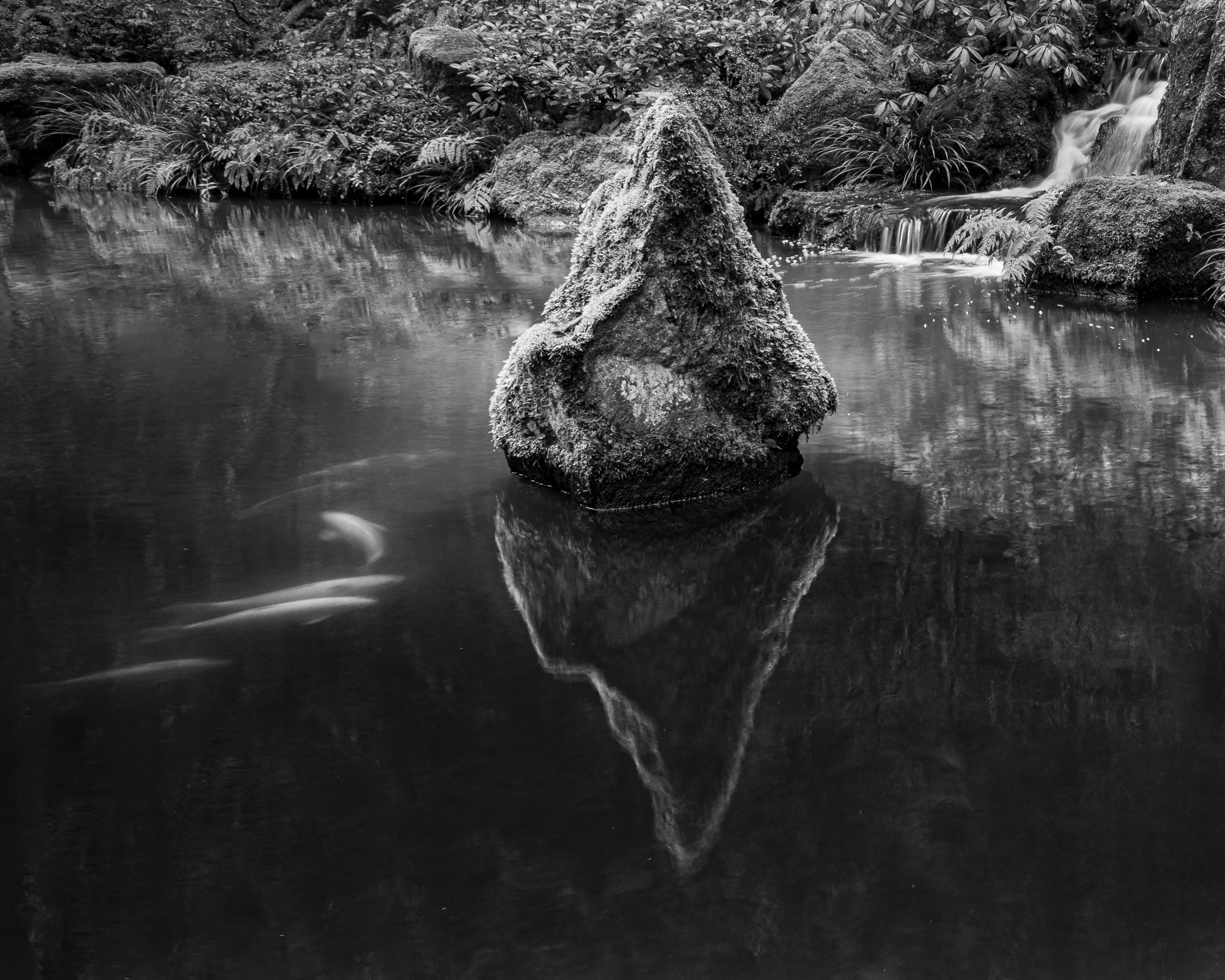
Thanks, everyone. I played around a bit with the luminosity in the rock and went to 300% to burn some of that background foliage a bit. I think the result is better. I’m posting it at the top momentarily.
ML
The top image nails this one, Marylynne. The rock no longer merges directly into the background and your rework makes it more three dimensional. I love the diagonal created by the highlights from the koi fish running across the scene to the waterfall and the square loses that whole flow. The reflection is very dynamic and adds a lot to the scene. When viewed small, the upper left corner stands out because there is a very dark cross on the left edge of the frame that pulls my eye. I would think about dodging that pinwheel/cross area. Other than that, I much prefer this top version to your first post a few days ago. It’s a better composition and everything is cohesive. Beautiful work.
Thanks for catching that, @David_Haynes. Darkened the whole background a tish and that got extra somehow. It’s a shadowy area under a rock. In looking at it, I found other annoyances at 200%, so I cleaned that area up, grew some grass over the dark area.
ML
Hi Marylynne,
I am loving your top version as well. I think the koi make this a much stronger image as they make this wonderful diagonal with the pyramid shaped rock and waterfall. The reflection is flat out gorgeous and I like the fact that you were able to give the rock a bit of seperation from the BG. This has a nice range of tones and works beautifully as a B&W.