The photographer is looking for generalized feedback about the aesthetic and technical qualities of their image.
Description
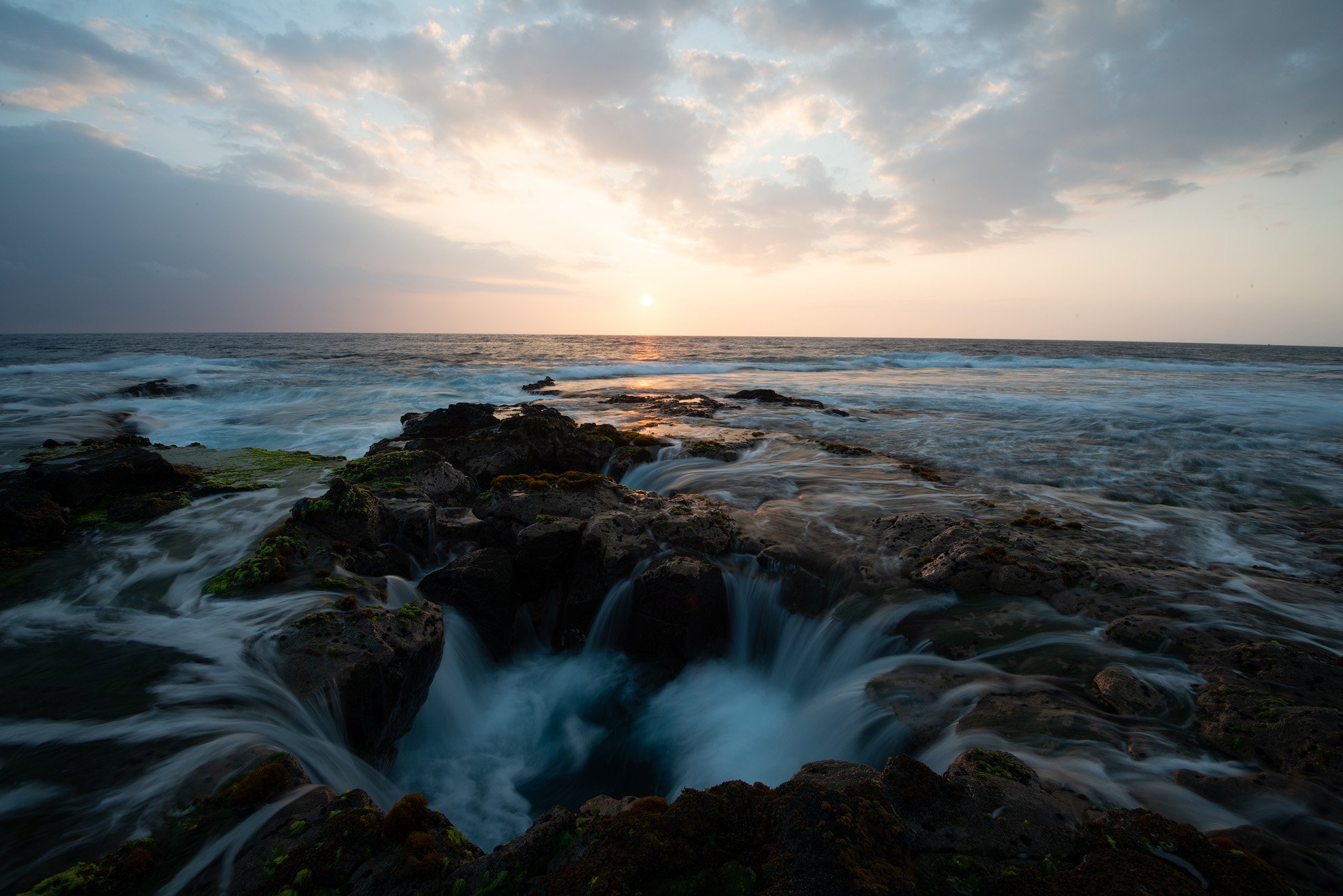
This lava sinkhole is near the Kona Airport on the island of Hawaii. On a previous trip there back in 2015, we were told about it by a local photographer and went there for sunset. Before the major eruption in 2018, the plume from the Kilauea caldera would often blanket the island in volcanic fog (vog). This was one such evening. However, I think the hazy skies worked in our favor. It was tricky timing the exposures to get a nice blur from the water draining out of the bottom of the sinkhole.
Specific Feedback
There is a large piece of dark lava rock in the left middle of the frame which I don’t like. For the new edit I cropped to a 7 x 5 format, more or less, and did content-aware fill, etc. to try and eliminate that. I think having the sun off center actually improves the comp, though. With 20-20 hindsight, I wish I had changed my shooting angle, or shot a little wider, but that’s life.
I’m still not completely happy with the color and tonality, although I think you will agree the new edit is a big improvement over the previous one. LOL!
These images were shot at f/22. These days, I’d shoot at f/16 and manual focus bracket. However, these images sharpen up OK with the magic of Topaz Sharpen AI.
Technical Details
Nikon D800, Nikkor 16-35mm f/4 @ 16mm, f/22, two exposures, 1/8 and 1/2 sec, ISO 100. Processed in ACR, PS, Topaz Sharpen AI, and TK panels version 8.
The re-work is definitely an improvement, especially with the colors. I do like the water having more blue, although you might consider pulling a bit back as it feels (to me) too saturated. I like how the shape of the sinkhole is mirrored by the shape of clouds.
Hi Patrick,
wow, that looks like an amazing location. What a beautiful seascape shot. I love the beautiful clouds and the warm sunlight that is reflected on the water’s surface. The shutter speed you chose is great because it still allows you to see some texture in the water.
I really like your re-edit. And I agree with @DeanRoyer on the colors. It’s a matter of taste but in my opinion, the water has a cyan hue. I would try to shift the cyan tones a bit into the bluish and desaturate them slightly.
Additionally, the green moss looks a little bit too green. I think the image would benefit from toning down the greens a bit.
And I noticed a small difference between your original edit and your re-edit: The sun in your new edit has a halo/banding that is not present in your original.
When I think about cropping, I’m not so sure which I like better. I think I like the overall balance in your original slightly better. The new crop feels a little bit left-heavy.
But overall it is a great image. I could spend some time shooting scenes like that.
Well done!
This looks to be an amazing place. The composition you put together here is really good - low and close! I like the added canvas on the left of the original edit, too. Just enough sun and sky to show us what time of day it is, but you’re not trying to cram it all in and I appreciate that. On the whole I really prefer your first edit although it has some issues, too, the glaring intense blue and green are just too much for me in your revised version. I’ve never seen a sea of mouthwash before and that’s what blue water like this makes me think of. Hawaiian waters really are blue, but this just makes me want to look away.
And I shouldn’t want to with a scene like this. There is enough energy and intensity that I don’t think you need to overcompensate with a ton of saturation, clarity and contrast. That’s just me, of course, and it’s your photo, but a more subtle approach could work here and I’ll give it a go later in the day when chores are done. Am glad you have two images to blend with - very smart.
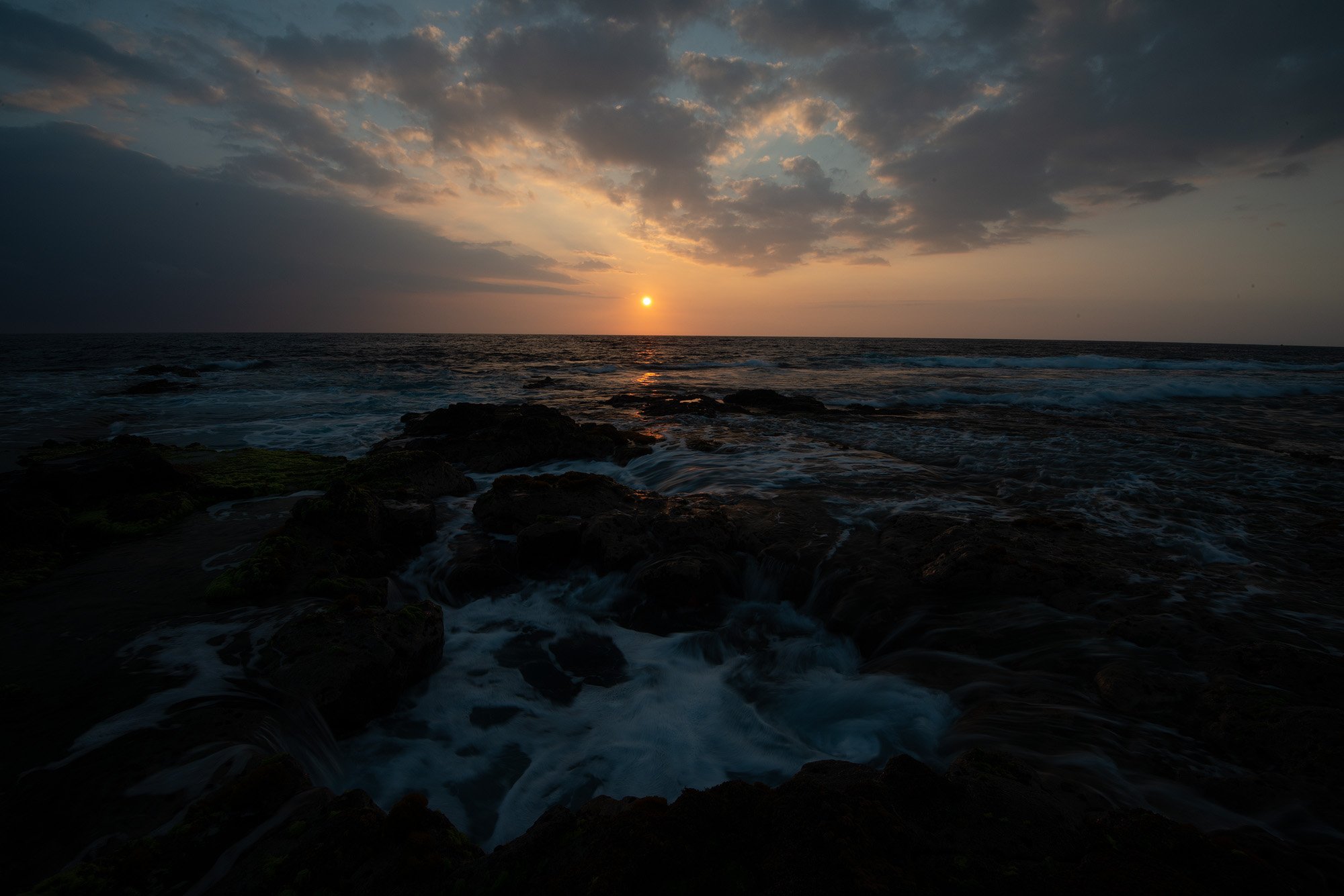
Thanks to everyone for your critiques! I tried to incorporate your suggestions in yet another edit…
Yes, I agree! I got carried away with the cyan saturation due to applying an Orton effect. Guilty as charged.
Yes, agree on the cyans and yellow-greens. See above.
Fixed the halo.
I went back to the original comp. The sun is now dead center.
I did a little dodging on the black rock left center of frame, which made it less noticeable to my eye. Then went back to the original comp which was having the sun dead center.
@Kris_Smith That comment made me laugh out loud, almost spilling my coffee. You do know how to make a point!
Phew. I didn’t want to come across as a total jerk. The latest photo, the top one, is closer to what my edit would have looked like had I actually done it last night. MUCH more realistic and pleasing. I want to wander in it to take in details rather than cringe and close the thread fast. Now I’m able to see the subtle pattern of water snaking away and to the right just behind the rocks. The way the light plays there is really something. And the rock on the left isn’t as much of an eye catcher because we want to linger everywhere else. The sky looks more natural, too, but there seems to be a bit of haloing across the horizon that is more evident on the left, but it’s all the way across. Using a linear gradient or similar way of feathering the sky adjustment into the water will fix that. What a glorious morning.
So I went back to the original file and re-selected the sky. I figured out what went wrong. If one does a sky selection in PS or ACR or LRc, it tends to feather the bottom edge of the sky. If one uses the quick selection tool, it doesn’t feather the selection.
Along the way, I did a few more tweaks, did not center the sun with the crop, and added a slight vignette. Hope you like it!
Selections and the way different tools make them has always been a little baffling, but experimenting is worth it. I did that with some distraction removal the other day - different brush opacities, layer opacities and finally blur all helped to make my fix less noticable.
There is only one small detail that bothers me slightly. On the left side, it is quite obvious that you darkened the sky. There are dark clouds on the horizon and the water below gets abruptly bright. The sky should always be a bit brighter than its reflection. I would burn the water a bit to soften the transition a bit.
Sorry for being so nitpicky!!!