The photographer is looking for generalized feedback about the aesthetic and technical qualities of their image.
Description
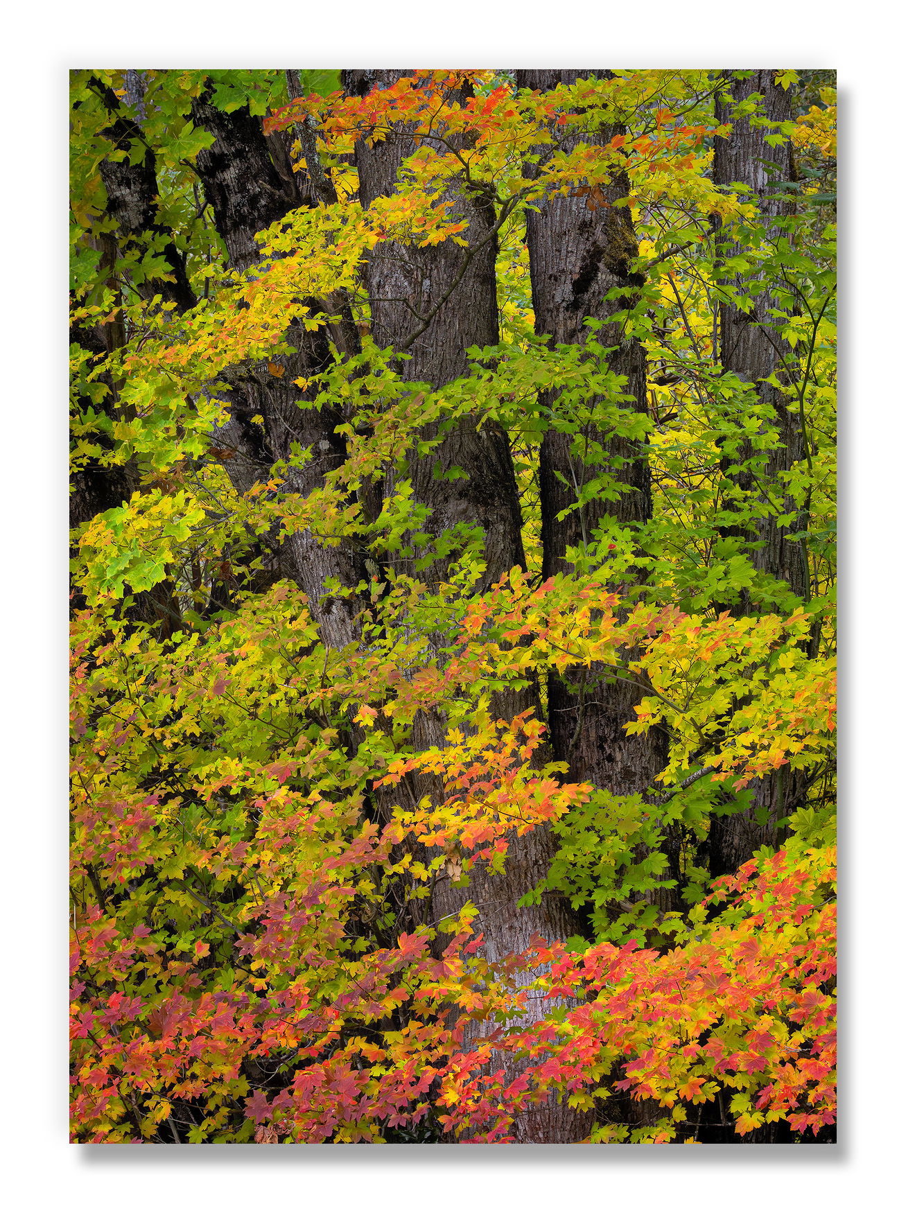
While I love the oak (and aspen) that I’ve recently posted are a beautiful part of the eastern slope of the Cascades, the stars of color as you move into the central and western slopes are the maple. Vine maple is a lovely green in summer and nice yellow in fall, but can be brilliant red with direct sun exposure. I liked this little patch that showed all three.
Specific Feedback
I’ve taken a lot of Vine Maple photographs that are a wonderful wall of color, but compositionally felt boring to me. In an attempt to combat that, I picked this less dense patch with evergreen trunks behind. Any thoughts on composition most appreciated.
I struggled with the color balance on this one. The camera read it much cooler than it was, but getting the Vine Maple to look correct made the trunks in the background seem too warm. Does the compromise I came up with seem natural to you?
Technical Details
NIKON Z 7II
NIKKOR Z 24-200 f/4-6.3 VR at 155 mm
1/125 sec. at f/16.0 and ISO 2500
Critique Template
Use of the template is optional, but it can help spark ideas.
Vision and Purpose:
Conceptual:
Emotional Impact and Mood:
Composition:
Balance and Visual Weight:
Depth and Dimension:
Color:
Lighting:
Processing:
Technical:
Fabulous composition. It is so difficult to get good compositions with leaves and trees, but you succeeded. Well done! I opened it in Photoshop and played around with the blue/yellow slider and like the version with more blue, less yellow better. If the hue of the trees bothers you, it would be fairly easy to create a separate layer for the hue adjustment for the trees, and just mask out the trees by hand or by using a luminosity mask with the color or darkness of the trees.
Hi John,
Love the vine maples around the mountain this time of year. Such a treat, and to me, this feel very natural in color and color temperature. If the trunks were in the shade, they might have a color hue, but as the light is fairly even across the scene, they feel appropriately warm. I would be curious to see Tony’s suggestion if you end up going that route, but it would not have occurred to me to comment on color temp at all had you not asked about it.
ML
Thank you for the suggestions. I played with the image a bit more, and am posting an edit moving the image slightly more blue (while leaving the pure yellows as they are). The conifer trunks were quite dark in the original, and I decided I had moved them too far when opening them, so I’ve also backed that off in the edit.
John, the mix of colors in this view is striking. I also like the balance between all the leaves and the trunks. The revised version look notably better, with the darker trunks and slightly more colorful leaves.
Hi John,
This looks like another winner to me. I like the FG horizontal pattern of the colorful Vine Maple autumn leaves against the strong verticals of the BG evergreen tree trunks. Your slight color tweak and the darkening of the tree trunks in the rework made an already great image even better. Very nicely done.
I think you nailed this one, John. The edited version is better but both are excellent. The colors look very natural to my eye and I’d be happy not changing a thing on them. I love the oranges and reds along the bottom and the little splash of oranges and reds at the top of the frame. Very rich and vibrant. I can’t see anything in the composition that i’d change at all. I don’t even see anything poking in on the edges or any eye grabbers. Great image, John. You’ve posted some really beautiful Fall color images. Congrats.
I think the composition works well here. I like the idea to put the evergreen trunks in the background as it provides structure and visual rhythm to the composition. The color balance looks spot on to my eye.