Never mind the color – I tried B/W and love it! Now this has become the evolution of an image, from the bottom one to the top version. I next tried a split-tone and love it even more:
The photographer is looking for generalized feedback about the aesthetic and technical qualities of their image.
Description
We’re approaching a full moon and I wanted to try to get another version of a shot I got several years ago with fog coming in: Misty Moon
I wanted to get a wider angle this time to show the shapes of the trees, but that meant climbing the fairly steep hill behind the house to get past a fence. That put me close enough to the trees to do light painting but made the moon small. Because of the hill, the moon was only visible an hour after sunset so it was getting dark and I decided to let the moon blow out. I had tried the night before to do a focus stack from farther away with a longer lens and the moon bigger, but it moved more than I wanted in the frame while I fumbled with focus and exposure changes.
Specific Feedback
All comments welcome!
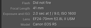
Technical Details
Minor exposure adjustment in LR. Into PS to stack the light painted frame and mask it. It was shot with a several second exposure but at lower ISO so the general exposure was the same (so I had time to paint) and I had to mask out the much brighter moon and stray light on the FG grass.
Not sure about the black border – just added it because it doesn’t show well on a light BG.
what a great ghostlike image! Love the outcome! I tried this in a similar way here in Germany once, but it was a complete failure.
My favorite is version 4, because of the nice tree top and the stars above it. Not sure if the color version adds a lot more. I like the split-tone versions, too. What irritates me just a bit in v1/2/3 is the half-covered moon (there’s a branch in front of it, right?).
Thanks, @J_Fritz_Rumpf and @Markus_Albert! Yes, the moon is just emerging from behind a branch, but it wasn’t a full moon so basically all of it was just visible. This is looking up a “1-hour” hill and by the time a full moon would be visible it would have been too dark to get the bit of light in the sky, so this was shot 3-4 days before.
HI Diane, I really like the BW from the original color image, mostly because I really like the position of the moon in that. But I also think that the additional light painting starts to pull my eyes around in the frame a lot. That being said, I like the toning you did in the other variations! Maybe a toning to the BW conversion from the original…just a thought! Mainly I’m excited to see people out trying new ways to photograph the moonlit scenes out there.
Thanks, @brenda_tharp – I always appreciate your keen sense of composition! I could easily tone that version, and will. I do like the stars in it, which were real. After finding how much I liked the toning from the other version I just didn’t get back to it. I didn’t get the feeling of the painted areas in the final version pulling my eye so much as cradling the moon, especially when I included the last branch in the final version, which points at the moon. But after working on it so much I’m sure I lost sight of the initial impression.