Critique Style Requested: Standard
The photographer is looking for generalized feedback about the aesthetic and technical qualities of their image.
Description
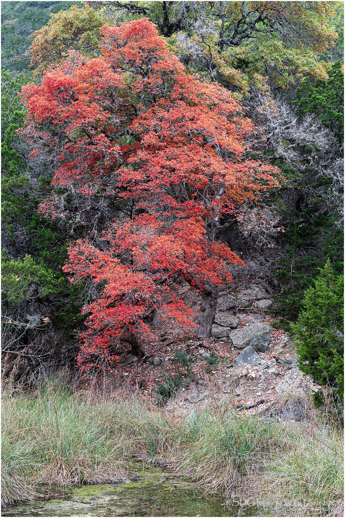
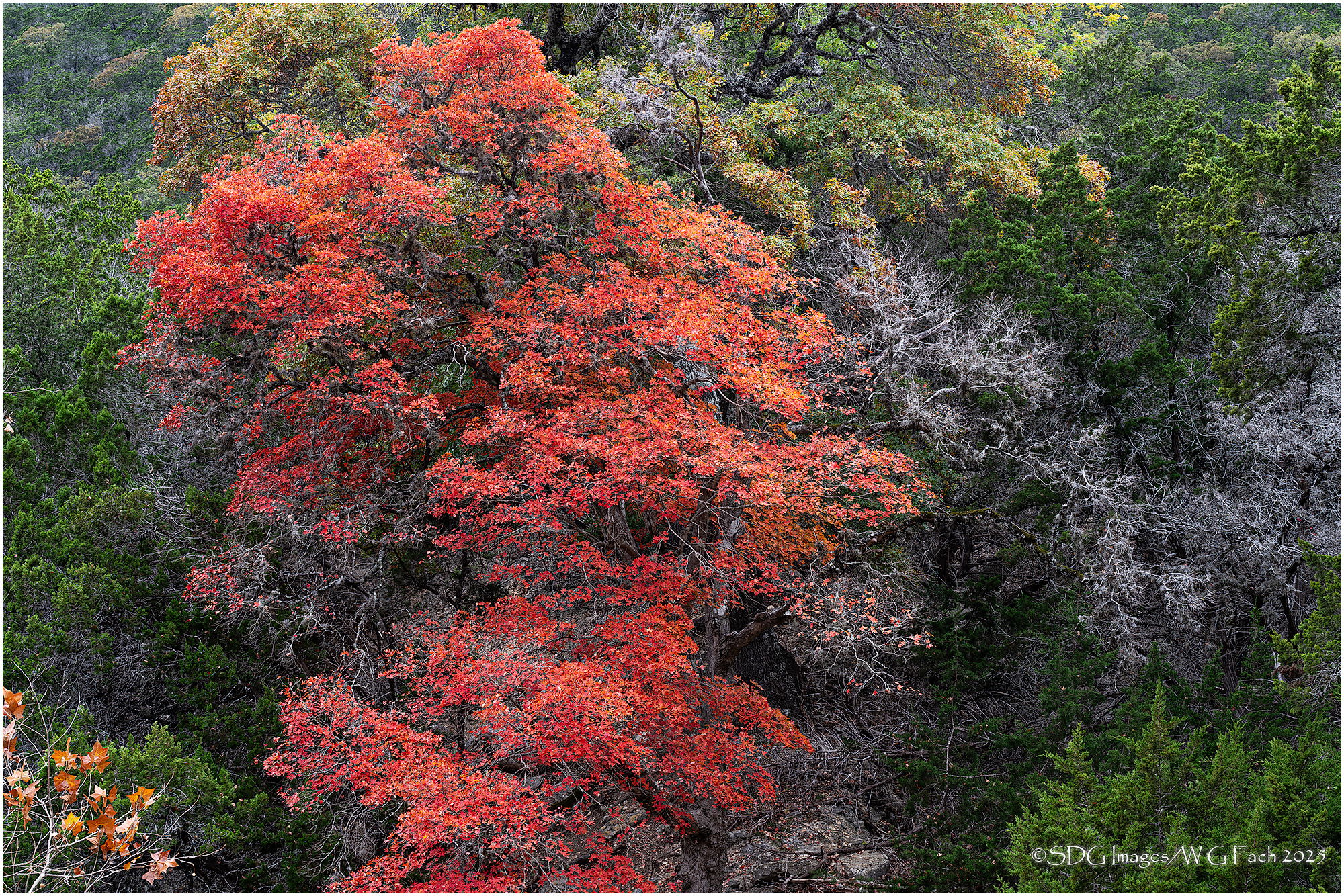
Lost Maples State Park in central Texas is a hidden enclave west of San Antonio where a stand of maple trees survive along the Sabinal River. The fall color show was a little late this past year which allowed me to make a day trip there in early December. Scenes like this are pretty common with a maple tree somehow getting a foothold in the limestone hillside. I couldn’t decide which image I liked best so here are my two keepers. >=))>
Specific Feedback
On the horizontal I debated making the leaves in the LLC go away. They did intrude more than I liked on the vertical so content aware fill fixed that frame. Your thoughts?
Technical Details
Sony A7rIII
Sony FE 70-200 f2.8 GM-II
ISO 100, 1/10 @ f11
Critique Template
Use of the template is optional, but it can help spark ideas.
- Vision and Purpose:
- Conceptual:
- Emotional Impact and Mood:
- Composition:
- Balance and Visual Weight:
- Depth and Dimension:
- Color:
- Lighting:
- Processing:
- Technical: