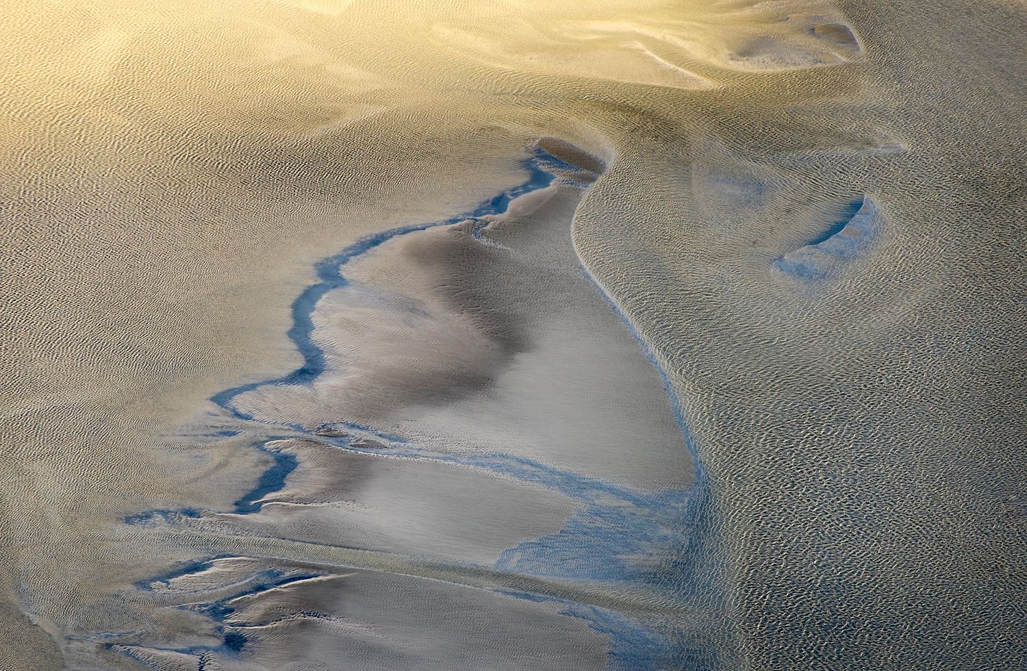
Few days ago I had the honor to realize the photographic goal for the summer: to visit a sandur (a plain formed of glacial sediments deposited by meltwater outwash at the terminus of a glacier) in the Alps near home. I posted an image of the first time in the old version of the website. I took this in a different place and it was a great experience for an abstract and wild nature lover.
Looking forward to explore the new website
Critiques and comments always welcomed and appreciated.
Sony alpha 7
Tamron 70-300 @300
f8 - 1/400s- iso 640
This is a fantastic shot! I love the light processing approach you’ve taken with lighter tones and light contrast.
I think the only thing I’d like to add is maybe tighten up the crop a bit? I feel like the river and fantastic texture you have in the right are the stars of the show, so maybe a tighter crop would highlight these features? Otherwise, I think this is a fantastic abstract image. Great job!
hi mattia,
i absolute love the textures and colours captured here! those little waves (or is it sand?) are just awesome. i bet this looks great as a huge print!
that said, there is something that kind of bothers me about the image and that is the contrasty horizontal lines in the lower left part. not sure if their impact can be reduced by lowering contrast or clarity (could also be that they are just oversharpened?). it might be worth playing around. i’d probably crop out the line running closest to the bottom edge or give it some extra breathing space.
having a place like this close to home must be awesome. i’m sure you can go there every day and find different compositions! great find!
cheers
This is really neat. I am only viewing this on my laptop, and I will have to look at it on my big monitor. I love abstracts in nature, and this has a cool feeling to it. I like all the curves, the changing light and dark, and the asymmetrical feel. And the colors; I really like the colors.
I might find some nits if I view it on the big monitor, but my first impression is really positive.
This is certainly an interesting scene, Mattia. It’s intriguing to understand the sense of scale. I think you have some potential for different comps. My first impression is that it appears to be over sharpened, but maybe that’s just me. In terms of the composition as framed, I think that bit more room along the bottom edge would relieve the cramped feeling down there on the left side.
This photo works very well for me. I love the meandering bluish line that enters from the lower left and how it is broken up in places, as well as the smaller bluish line on the upper right third. They play off each other very well, and the warm highlights near the top help give a sense of depth. This is the sort of photo I could stare at for a very long time and take in all the subtle details, colors, and textures.
This is great! Not seeing anything wrong with it except that you could maybe create a radial vignette to keep the eyes more in the center by mainly darkening the bottom and right edge a bit. Super interesting image and I love the handling on those colors!
Great to see you post here! What a wonderful abstract of nature. The scale is deceptive - wait, I still can’t figure out the scale, is this an aerial?
Don’t have much to nitpick, but I am torn about the brightness up top. Not sure if burning that down or making it more gold would do anything. I’m thinking this is quite awesome as presented.
Mattia, I love this image! I can’t figure out the scale - is it looking down off a cliff or out of a helicopter down at a large beach, or is it a small section of sand taken from around eye level? That I am made to think about the image in this way makes it all the more compelling for me.
I get hung up a bit tonally in the top-central area. It’s more saturated and contrasty there than elsewhere in the image- you’ve got the brighter, more saturated yellow against the top edge of the frame, and then immediately below that a darker, more saturated and contrasty-looking area that looks as though it should be the same brightness/saturation as the rest of the frame below it. So I would work to even out that transition from top to bottom, so it’s not bright-dark-bright as you move downward, but more a gradual gradient from bright/saturated to darker/less saturated, without the stripe of contrasty darkness between.
To @Eric_Bennett’s point, I would like to see how a little vignetting looks, but along the left and bottom-left edges of the frame. Then again, if that is light spilling in from the top and left, maybe that’s why you left it brighter on that side…
Mattia, nice vision here to extract this from the landscape. I love the soft understated colors here, this has such a calm soothing feeling to it. I agree with Alex’s comment regarding the brightness/saturation of the yellow band at the very top. While I think a vignette would help the image, I might also consider cropping about half of the yellow band away, the top portion of it is the most bright/saturated.
Really unique image, and i like as presented, but it’s probably worth experimenting with some tweaks.
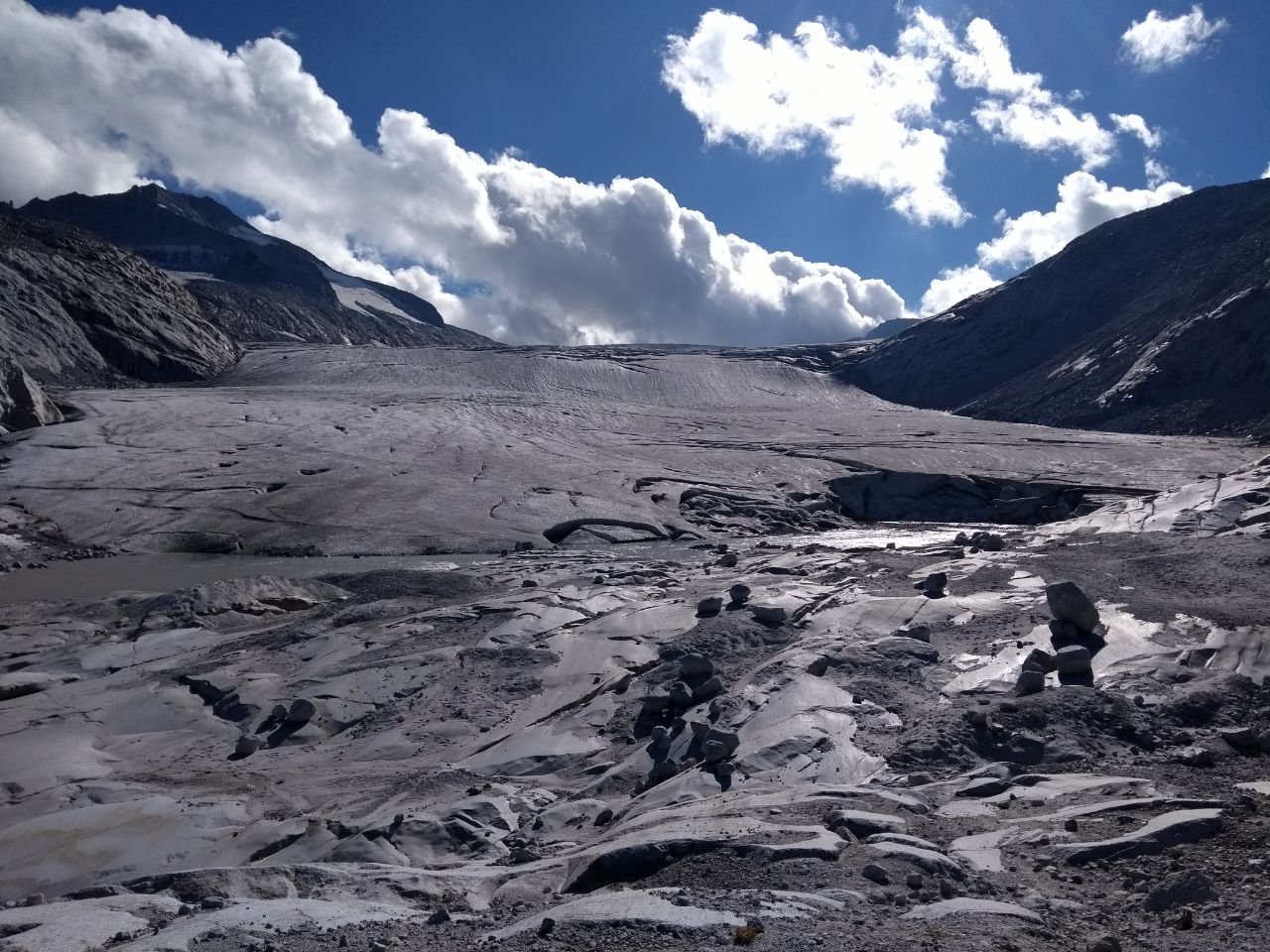
This image should clarify a bit the sense of scale and the beauty of the place few minutes after I took the photo. As you can see is a sandy lake (called New Lake) which can change quite rapididly depending on the water flow.
Unfortunately it is close to where I live but no so close that I can go whenever I want (2 hourse by car and 3 hours walk)