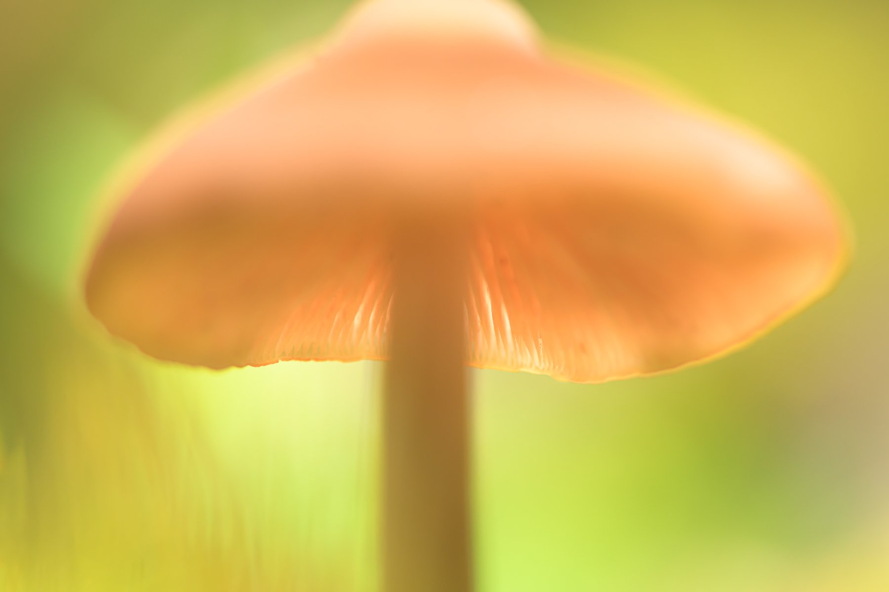
This Spring, I’ve been trying out some macro work, which I’ve enjoyed a good bit. I was stumbling about in the woods a couple of months ago, and found this toadstool in beautiful light. I fell to the forest floor and started trying to grab some test shots, experimenting with depth of field. As someone more used to working landscape shots, I’m trying to release my strangle-hold on maintaining complete focus.
This shot was really kinda of an experiment with very low expectations. All my focus-stacked images leave me empty inside and are tremendously unsatisfying. Yet, I keep coming back to this mistaken shot and am most happy with this of all my images from that day. I’m not even sure why I like it, but I do.
I’m not sure whether this is a successful image or not. You surely won’t hurt my feelings if this leaves you flat. Please be open/honest and let me know what you think, how you respond, what could be different/better and thanks for your time as always!
What technical feedback would you like if any?
What artistic feedback would you like if any?
Pertinent technical details or techniques:
(If the background has been replaced, etc. please be honest with your techniques to help others learn)
D850/105macro at 1/200, f/7/1, ISO 720. Processed in Lr and Ps with minimal clean up and some NR in Ps.
If you would like your image to be eligible for a feature on the NPN Instagram (@NaturePhotoNet), add the tag ‘ig’ and leave your Instagram username below.
Jim: Intriguing shot from a great POV that works for me because of the light airy feel to it. I think the back lighting works especially well with your POF on the back rim of the cap. My only squirmy feeling is with the place that you cut off the top of the cap. Seeing the entire cap or cutting a bit more off of it would probably make this better for me but I’m OK with this as is. There is enough cut off that I do get the impression it was intentional and not a mistake. Thanks for making me think a bit, Now I’m off to get a couple aspirin .>=))>
Jim: I’ve come back to this and think I have a better handle on my impression of the top of the cap. I think it is its brightness that bugs me as that bright area near the edge pulls my eye up out of the frame. Cropping that bright top makes this better for me. Back to you.
I quite like this, Jim. Funny, I was thinking along the same lines as Bill, as the bright spot on the edge violates one my my regular “rules” (which of course, are made to be broken). Having seen the modified version and having had more time with this image, I am really liking it as presented. The tension of the bright spot at the top adds a good feel and strangely, it does not pull me out of the image. I am enjoying this one.
@Harley_Goldman, @Bill_Fach…thanks for your time and revisiting the shot. I might be tempted to burn it down a bit on a rework. The thought occurred to me too that I had excluded the cap and was wondering if that was a deal-breaker for me. I must say I remain undecided. If I had included the cap, I think it would serve as a more dominant aspect in the image drawing the eye away from the primary subject (which may be a nice counterpoint…I just can’t tell).
An artistic image. I like the repost without the distracting top. Most people like the closest part to be in focus, but this has the rear part in focus. May be that is what makes it a very appealing image. I like the subtle changes in tonality and some blending of the color of the mushroom with the background color.
 .>=))>