2nd Edit:
Original:
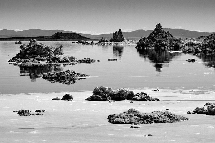
Over Memorial Day weekend, my wife and I traveled to the Eastern Sierras in California. I had driven by Mono lake several years earlier and had always vowed to return and take pictures. The lake is rather unique and such a beautiful place. I loved all the tufas sticking out of the water. I wanted to get the white foam that formed in the foreground and set it against the darker tufa towers.
Specific Feedback Requested
I like this image but it’s missing something and I think it has to do with the clear sky. A bunch of clouds may improve it but I’m not sure. Looking for general feedback.
Technical Details
Fujifilm Pro-2, f/11, 1/480, ISO 200. XF 55-200mm set at 80mm. Processed using LR, Silver Efex, and Photoshop.
I like this image very much David. It’s unusual to see these tufas shown darkly like this so I feel it’s a fairly original take on the subject. Mono is usually depicted in a mellow low contrast manner. The composition works very nicely for me. It’s complex enough to keep the eyes searching. I think the white beach adds to the image in that it adds another layer. I’m not sure you need clouds in this sky because there is so much going on below. I might try a tonal gradient in the sky from with it being darker as you go up. But the width of the sky layer looks right to me, so I would not crop down the sky.
One thing that I would have tried is to move a bit to the right and shoot a bit to the left thereby eliminating the right bank entirely. That’s speculative of course since I don’t know if all those rocks could be arrange for a good composition.
1 Like
Thanks Igor. There was room to move to the right and eliminate the right bank. That is a great suggestion. If I find myself back there, I will have to give that a try.
I agree with @Igor_Doncov that this is a very original image, David. B&W works well. I don’t think you need clouds, but agree that a gradient darkening might help. I also feel like the beach is overwhelming my eyes. I think you could tone down the highlights on the beach and allow the eye to move past it into the scene. Terrific scene.
1 Like
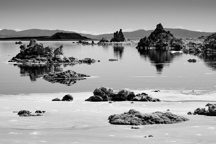
Thanks for the feedback, David. I took @Igor_Doncov and your feedback and made a quick edit to see how it would look.
There you go, that works quite well, David. Nicely done.
Now, if you want to, you can edit your original post and I recommend the following:
Add “w/Repost” to the subject.
Then add the reworked image at the top of your post, calling it out as the rework and then tagging your original post as the original.
That way the rework is shown as the thumbnail in the category.
See, my post here as an example:
Come on home to Green River w/Repost
Cheers,
Daivd
1 Like
Done. Thanks for the advice, David!
1 Like
David,
Welcome! And glad to see you jumping right in!
Agree with the others that this is a unique and refreshing view of Mono Lake. In fact, I’ve been going there for years and it’s so unique, I can’t figure out where you were - and that’s ok, but again, it’s quite refreshing to me.
Different as well in that it’s not very often at all to see the “sea foam” (this is an ancient sea right? ) included as a major element. I like the depth and progression from the fore, mid and background elements you’ve arranged here.
Also a great choice to go b&w here. I know from being there that once the sun comes up and starts rising in the sky - everything goes hot and color images are difficult to make work with such blue bird skies. Speaking of skies, I think you have the right amount included - any less and it would feel cramped, and of course more sky doesn’t add anything given there are no clouds.
My only small nit, and this is all just personal taste, is that I think the blacks are a bit heavy, especially on Negit Island (black feature in the back) Yes, geologically the island is actually black, but even the tops of the tufa seem darker than what even the contrast of a bluebird sky would create. Otherwise, I’m really enjoying the arrangement of all the elements and again, the uniqueness of the landscape find you’ve captured.
Lon
1 Like
Lon, great feedback. I lightened some places that you mentioned and reposted at the top. Thanks for such a great comment and kind words.
I’m a little bit late to the party here David, but the reworks have worked well to tame the highlights along the foreground and the blacks in the tufa’s. For me, the sky is fine as is. You don’t need any clouds, particularly since you went B&W with this. A great choice by the way. It’s a really different view than I’m used to seeing from Mono. I agree completely with @Igor_Doncov regarding moving to the right to eliminate the right tufa’s that are next to the pyramid tufa which doesn’t add anything to the image. Great new take on a well photographed area.
1 Like
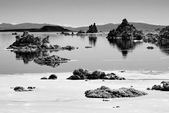
Thanks for the feedback, David. I messed around with a crop to get rid of the right bank. Do you and @Igor_Doncov feel that’s a better crop? Not too tight? I had to do some light cleanup in PS to make it work.
I think this is a much improved image. You have a very nice right to left leading line and although it pulls the eye up towards the left portion of the image the eye certainly catches that triangular tufa because it’s darker and heavier. I think this is well balanced now. Great job!
1 Like
Yes, it is too tight. The original was a stronger composition imo.
1 Like


