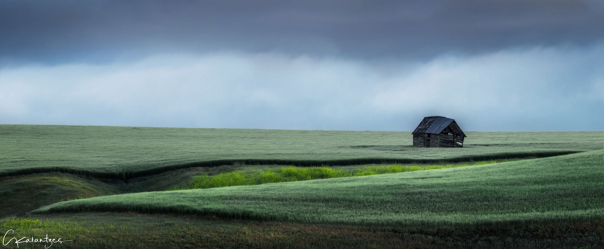
I made this image recently after an afternoon/night of rain with subsequent clearing and fog in the morning in the rolling grain fields behind my house. It was a memorable morning because the landscape transported me to Europe and Tuscany more specifically. The fog rolling thru the gently sloping terrain was absolutely gorgeous. Unfortunately, I had an obligation that limited my morning shoot to about 40 minutes…this is the only image that I’m happy with.
Attractive inviting colors, calm and relaxed. For me the right and left sides may be competing with each other. Abandon house, crack in the earth, mysterious. TY for post.
Really beautiful pano George, I love the sweeping lines in the fg leading to the cabin and the ominous mood.
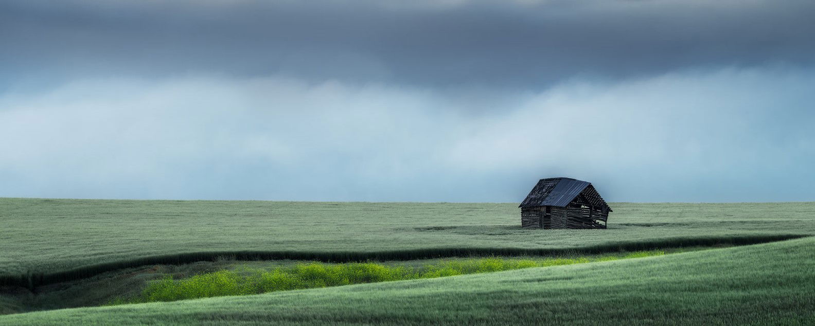
I’m not sure if it helps but I made a few adjustments.
I warped the horizon
Changed the tint in the sky to less green
Darkened the very top
Also it appears there is some slight haloing around the cabin, possibly from the orton?
There is a very lonesome mood to this that I find attractive. I especially like the curves in the foreground. Blakes re-work looks nice, but the original looks nice, too.
–P
This is my kind of scene, George. I like the color palette and the lonesome house on a field of green. I can see the logic in the comment by SteveM that the left and right are competing a bit. I think it’s because the curving fields across a small dip or stram really grab the eye. There is a nice abstrct there, frankly. However, I don’t know whether the image would look better with some of that cut off. I’m sharing one crop, which simplifies the scene significantly, but I’m not sure it is an improvement, just a humble offering of possibilities.
I like the image as originally presented except I would probably straighten the horizon. Even if your camera was level I feel sometimes it’s better to make the horizon appear level. JMHO
Beautiful George. I like Preston’s term lonesome. I think that nicely describes the mood. I like the original best as posted. Great lines, depth and color. I like this a lot.
I can’t give you exact reasons why I like this image except that it is very relaxing to look at. I can feel the peacefulness of the early morning and maybe a little breeze blowing across the open landscape. Very nicely done.
My initial emotional response is that this looks like a great place to unplug and get away from it all and as such it feels very serene. I like the lines in the foreground. It may just be the topography of the landscape, but the horizon line feels tilted. Nicely done!
I haven’t lived in Eastern Montana for 30 years. This Scene could be anywhere but I feel as though I know the place. Beautiful shot, thanks for the memories. Mel Kidd
Lovely, simple and elegant. Whether it is because I am more used to a Scottish palette of light I am not sure but I prefer the palette displayed in Blakes version with the original crop you made it where subsequent crops were tried, it improves the layering effect and neutralises a cyan cast that seems evident to me. I am also a tiny bit aware of what appears to be a post processing darkened smudge effect in proximity to the old barn, possibly caused by a little too much recovery of shadow detail in that area. It might be possible to mitigate that with a little extra input there.
I prefer the original post. I agree with @Ian_Cameron that there appears to be a smudge near the building (maybe processing, maybe a raindrop?). I do like the cooler colors used here, it makes teh grass look very interesting.
This is wonderful! There is something cold and mysterious with the color palette here - not off or wrong, but as Ian describes just a different kind of lighting. I envision an F4 about ready to drop on the scene and consume the fragile, old barn. “…Bill, we’re in the core…” (for those movie buffs who get the reference…)
Regarding the horizon. I too was thinking about “correcting,” but a few things came to mind. First, “rolling grain fields” by definition indicate not much is level and B., the left edge of the barn is pretty verticle - although this structure could crumble at any moment.) And lastly, the slope of the horizon is slanted enough make me think and see slope, rather than a tilted horizon.
I really like Marylynne’s alternate version, but still, your original is just excellent as presented.