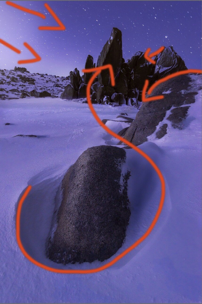
I took this on a recent multiday camping trip to the snow here in Australia.
The idea for the composition was to use the rock in the foreground as an element that ends up directing the eye through the frame to the rock structure in the background (composition pictured at the bottom of this text).
What helped this was a moonrise behind where I was standing which flushed the area in light.
Specific Feedback Requested
This was built with two images for focus stacking purposes (one in the foreground, one for the background) - do these match?
Is there anything I can do to add more mood to the image or help the overall feel?
Does colour composition work? I was going for a cooler monochromatic feel which is a first for me
Are the streaky stars a distraction? The shutter speed was at around 15 seconds to get enough light
Technical Details
Is this a composite: No
Two images ISO 1000, 22mm, f4.0, 15sec brought into photoshop, stacked manually with camera raw adjustments added after
I think you have a nice image going here. I understand your thoughts on composition and largely I think it works. I wish there was more room on the right edge as it feels a touch crowded ad the rock edge.
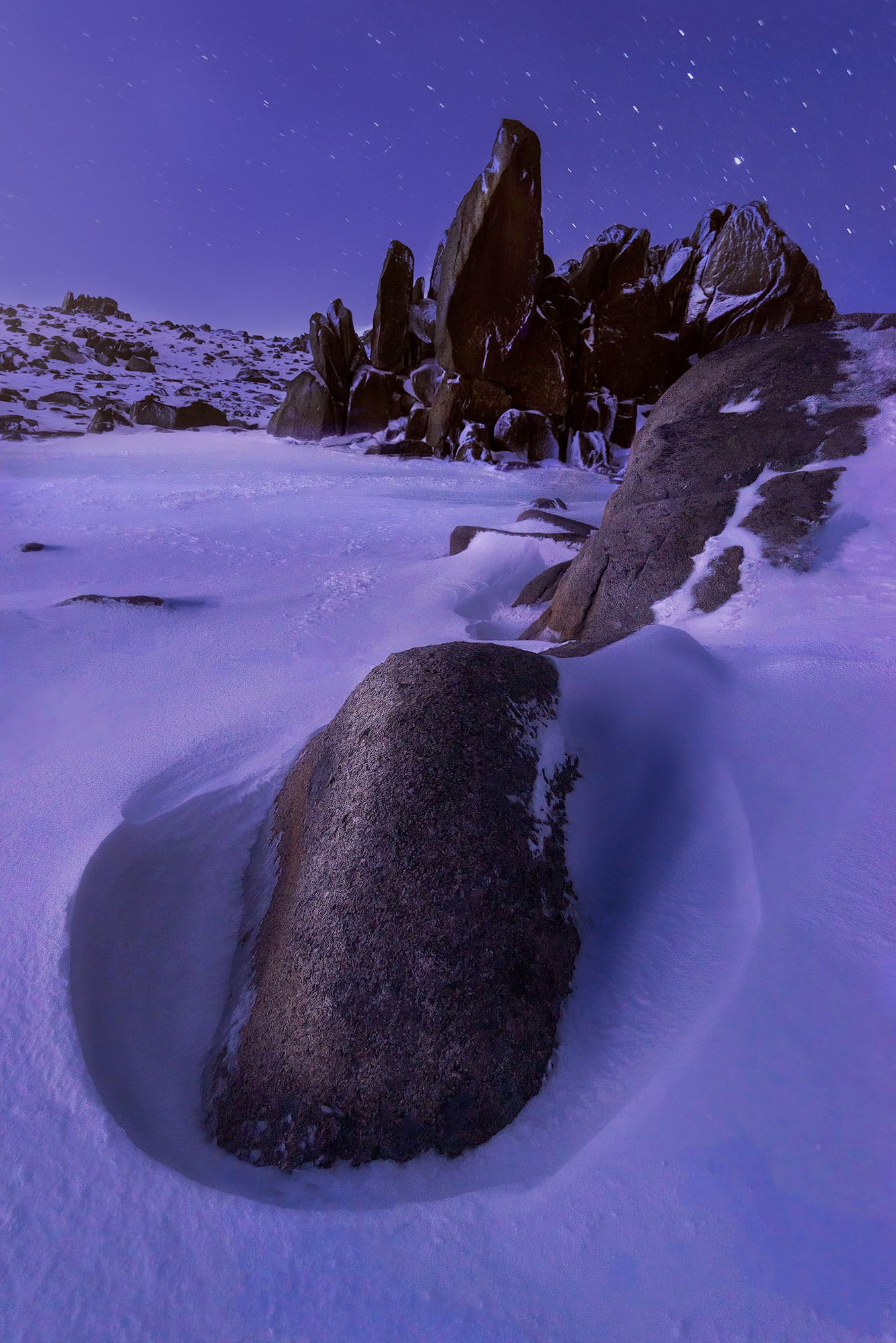
I find the moonlight in the ULC distracting and wanted to see what it would look like with a more uniform sky. Stars: Surprised you got as many small trails in the stars as you did at 15 seconds and 22mm. Ideally I wish they were either points, or full blown trails.
Here’s a version I worked to deal with the sky, added a bit of light to the rocks and see about balancing the overall exposure. Clearly this may not be what your vision for the image was, but wanted to share my thoughts on the processing.
1 Like
I agree with Keith’s concern with the light in the ulc and how it draws you away from the main subject. I was going to suggest brightening up your point of focus but dimming that light works even better.
I would reconsider next time about this composition. Yes the fg is connected to the bg and there is a line of vision between the two but to me they seem at odds with one another. I think it has to do with this large circle in the front and the jagged bg. That’s just my opinion. Perhaps other don’t see this disunity.
There’s one other thing. The image has a bit of a purple cast. I’m not saying that’s necessarily a bad thing but I just wanted to bring it to your attention because it’s not natural. There’s no rule that things have to look in a picture as they do in nature though.
1 Like
I like the composition with the strong foreground feature, though don’t find the middle ground it leads to all that compelling. The cool tones work with both the snow and the night conditions. Agree with Igor that there’s a bit of a purple cast here that does feel a bit off.
1 Like
OK…bear with me as I wander down a rabbit hole…this is an interesting conversation about the elements in the scene that I think @Igor_Doncov is touching on. There is a clear “contrast” between the smoothness/roundness of the foreground rock and the sharpness of the middle ground peaks. While contrasts and counterpoints in the image can be dynamic or dramatic, I do think it is beneficial to have a clear relationship between them, either in the nature of the elements themselves (raindrops and mountain streams), or in the general shape/color/texture/luminance of the elements themselves.
For example, many photographers endeavor to find repeating elements in a scene, where say a foreground smooth rock may mimic a similarly smooth round cloud in a sky. In your image, the contrast between the shape & texture of elements seems to be disruptive to some viewers and I find that interesting.
To continue down the rabbit hole, this may also be a “symptom” of how we as photographers are perhaps unifying our collective tastes and how social media and sharing sights such as this may be creating a “lemming effect” where we are all trying to get each other to unite our aesthetic taste at the risk of discouraging unique expression.
With all that said, I do agree with the incongruence or discordance of the foreground and middle ground elements.
I wouldn’t mind the increased luminance in the URC if there were shadows to assist in supporting this element. Sometimes, elements can be implied out of the frame and add interest. In this case, the brightness alone seems unsupported by the remainder of the image.
Finally, the color choice is yours of course. The purple hue is certainly not “natural”, but again, that may be your intent and style. So follow your instincts as with all artistic endeavors.
2 Likes