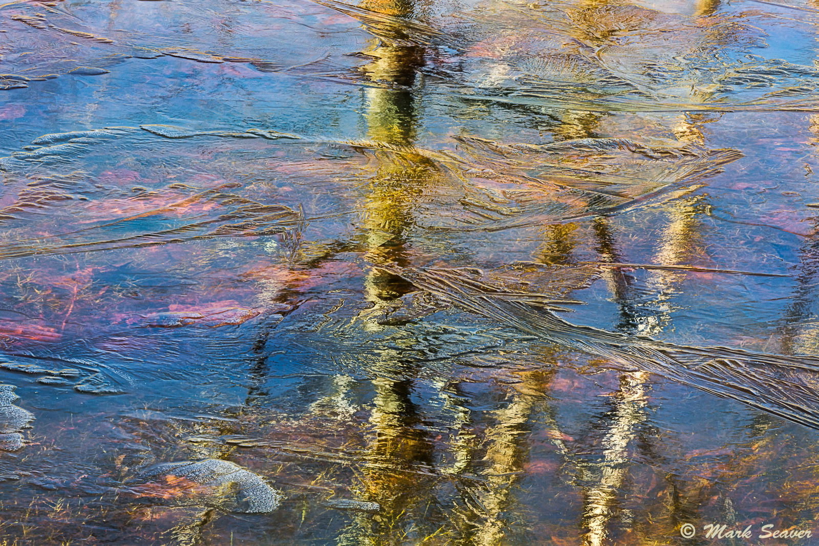
This ice is not on my backyard ponds (surprise, surprise…). This was a very shallow side arm (3-4 inches deep) off of one of the ponds at the Patuxent National Research Refuge where I volunteer. It’s a mix of reflected light (the trees), the ice structures, and the growing grass and fallen leaves on the bottom. A 7 shot stack for edge to edge sharpness. (5D3, 100-400 @ 248, 1/25 s, f/16, iso 800, tripod, cable release and polarizer to adjust the amount of reflected light from both the trees and the sky.) Best viewed large.
2 Likes
Mark, this is just gorgeous. The colors, the shapes, textures and lines, I am just sitting and enjoying this. Love everything about it. 
1 Like
This is a awesome abstract, Mark. The colors, textures… really unique and compelling. I do think the composition is a bit right-weighted. I would be inclined to play with some crops off the left to move the large central tree off center.
Mark, I like the image as it is. You did a great job with the focus stacking. The clarity, textures, and color management is what makes the image speak to me. I am fine with the centered middle tree branch because the image is weighted to the right and the gray rock, foreground helps set up the balance.
Mark,
You have produced some amazing ice abstracts. This is very engaging and the focus stack looks perfect. The lighting here is fantastic as are the array of colors and the lines of the ice. Beautifully done. I could see a sliver off the left; just past the rock along the left side. That is more of a personal preference rather than a critique because this is wonderful as is.
Oh this is excellent. This is the best of many ice shots that I’ve seen from you. If it were me, however, I would back off on some of that magenta though.
Another excellent ice abstract from you Mark. I agree with Dave on a crop from the left and Igor on toning down the magenta slightly. Overall though I am enjoying this a lot.
This is great, Mark. A most enjoyable abstract. I am on board with taking a little off the left, but very minor stuff. I like this a lot.
Mark, this also my favorite of your recent ice abstracts. Really wonderful vision on this composition.
A minor nit for me is a touch off the left would be my preference.
Beautiful work!
Wonderful photo Mark. I agree with a very slight crop on the left, but disagreen with reducing the magenta. Well done!
Another lovely “stained glass” type ice abstract Mark, the tree reflection elevates this to one of my favorites of this series form you. I agree with @Alan_Kreyger, I could see a crop from the left, or possibly just cloning away the bright white patch of ice in the LLC. But that is a minor point, this is still one of my favorites of your ice abstracts.
Really nice abstract shot, i love the light and you have processed it. In my opinion you can try to crop 1:1 around the trees, probably the composition can works better. Thanks for sharing.
Interesting how much better this is in the larger view. I really like the ice formations, they really add an interesting texture to overlay the rest.
Not your pond? I guess that means you “have pond, will travel…” and can order these up?  jk
jk
Love the ice patterns here as I think the surface detail and patterns give this some depth with the reflected and submerged colors. Very cool.
Not much to improve here, although I can see a slight crop left, and bottom to tighten this up and remove the lighter, different ice patterns LL. But I wouldn’t go so far as to say they’re distracting or anything like that. Love the vibrant colors throughout as well.
Lon
Your ice details are nicely refreshing! Again, I like how I am looking at the ice, the trees and the colors after each other and at the same time.
Beautiful composition Mark, sort of “painterly”. At first I wanted the center tree moved over too, but that may have resulted in some unwanted details and the rock serves to add some weight to that side anyway. Sharp throughout! BTW, I’m also a volunteer with the USFWS up here in CT.
Jim
I like this a lot, but could maybe see vignetting the edges a bit to draw attention to the center vertical elements a bit more. I have a feeling we could all find beauty like this in your backyards if we stopped and took a look.