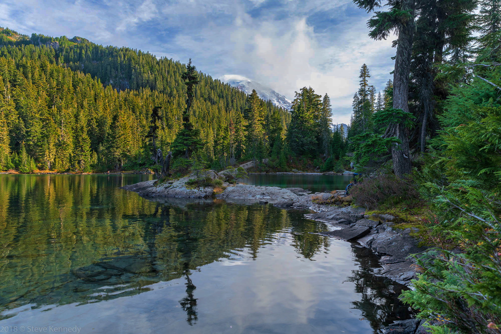
There is a pack and a person mostly hidden by a tree near the rocks, and I haven’t tried to clone them out yet. I will work on that a bit later. I wanted to but couldn’t just ask them to move
This is Mowich Lake on Mt. Rainier after a long hike. It is an HDR from a bracket of 7 images, using Lightroom. Also used luminosity masks to balance the light and add contrast I have very little experience with HDR so please give me feedback on that, as well as any other issues you see.
These were taken at ISO 64, 26mm, f8 and various shutter speeds from 1.3 seconds to 1/100th.
You may only download this image to demonstrate post-processing techniques.
The comp is really good, the curve and just the glimpse of the mountain…
Detail is superb.
I might lower the exposure, With all the detail you captured, I think you could achieve a richer look.
Nice work.
Steve: This looks like a lovely scene. The curve created by he rocks is very nice.
The processing isn’t working though. When I first opened it, I thought something was off, then I read it was a 7 image HDR. The tones in the image look HDRish, rather than natural. It also looks oversharpened, yet when I look at the larger version at the stand of trees in the upper left, they are lacking any detail. I’m guessing that is from the blending. I can’t tell from this image what the original dynamic range of the scene was, but I’m wondering if an HDR was even needed. If you look at the middle exposure (or one near it) in your series, is the histogram clipped on BOTH ends? If you captured all the tones in one of the frames, HDR is not needed.
Steve, I have to agree with Keith here. It is indeed a lovely scene but, and this is a matter of personal taste, I find the image is pushed too far - the saturation, colour and clarity all feel over then top. But the biggest problem I feel is the HDR. Perhaps Keith is right and it might not be needed at all but my feeling is that HDR rarely produces good results when it is done with a program. The program is making all the choices and one of the problems with that is what happened to the trees on the hillside - there is a kind of muddiness that so often results out of the automatic process. Learning to blend by hand is worth the effort. If you are already using luminosity masks in your work flow, I expect it won’t be too difficult for you to add blending to your post processing arsenal. Sean Bagshaw has a great tutorial series on blending for dynamic range, which might be worth a look.
OK, I’m pretty embarrassed by this post. I did not take the time to look at it critically before I posted. Bad idea! I agree with all of your comments. As soon as I saw the image after posting I saw the color and detail problem.
Keith, all images were clipped. The middle image was clipped at both ends.
Kerry, great suggestion! I’m just starting to learn about the luminosity masks. I downloaded Sean’s tutorial.
At least this was a good learning lesson! A little lemonade from the lemon.
In-line with the other comments.
There are some very nice elements here I just think it needs to be re-processed.
The S curve of the rocks, snowy peaks are all excellent. I even see some nice light in the middle ground but the overly bright foreground is taking my eye away from that and over boosted micro contrast (clarity, sharpening or otherwise) is really hurting all of the trees and entire picture in general.
When you blend different exposures you have to be A.) careful with any of the automated processes of doing so and B.) try and recall what parts of the scene were brighter and darker and still edit with that end goal vision. Right now for example if the immediate foreground was darker I would see better that nice light in the mid ground.
The one pine shows that diagonal line of where the natural sunlight is hitting, everything in the frame below that line needs to be a good amount darker than it is now.
Thanks Bill! Yes, I did a blend of 3 images and it did solve the detail issue but the HDR color problem was still apparent. I’ll try the blend using luminosity masks after watching Sean Bagshaw’s tutorial and see how that works out.
Reflecting my tastes and personality, I’d leave them right where they are. I am especially fond of photos that leave a little “reward” for viewers who take the time to really study them, and this amply qualifies. Kind of like my taste for abstract paintings that are just shapes and color until you study them and find one tiny little element that gives them sudden substance. That jump in “perspective” is priceless to me as a viewer and a photographer. We have 14 abstract paintings on the walls here in our Florida winter home and 9 qualify.
This is a lovely photo well worth your efforts, but made better rather than diminished by the person and the pack.
What camera did you use? You may have enough dynamic range not to bother with HDR. I have tried HDR using several different software programs, and it never looks natural. Maybe a blend of two images would produce a better result. That said, I like your comp and placement of the elements.
Hank, I like your perspective on the human elements. I’ll take that into consideration going forward.
Eva, I use a Nikon D850, so there should be plenty of dynamic range in most cases. This was shot around 3:30 in the afternoon so it was very contrasty, which is why I chose to use a bracket of several exposures. Below is from the center exposure. The histogram is clipped on both ends, so I lost some detail. I used HDR because of the clipping and because I had never tried it before. In this image I have done very little processing - I used Lightroom and brought the whites and blacks back into the edges of the histogram, which gave me some detail in the mountain and the sky, I added a touch of contrast and used the radial tool on just the mountain to bring out a little more detail. There is promise here with a little more work. But I’m still going to try the luminosity blend - a good technique to learn regardless.
I’m seeing quit a bit of color shifting, especially in the greens, when I post. My monitor is calibrated and the colors before posting, in both Lightroom and in Windows Photo Viewer with the JPG file, are more natural looking than this i,age. Any advise on what’s happening here? My export to JPG uses sRGB and I use ProPhoto colorspace in Photoshop.
Based on this image, I’m still not convinced HDR is going to get you anything you don’t already have in a single frame. Even though this is a compressed jpeg with minimal dynamic range compared to the RAW file you have, this is an option I came up with just using luminosity masking to work tonal ranges, some simple dodging and burning and a small warming filter based on the blue shadowed colors. See what you think.
Really like the comp here. Think the hdr look is brutal. Not sure what system youre on but 7 shots is a crazy amount. With nikon/sony @iso64 you could prob use 2 shots and be fine. Personal preference is for a much more natural look.
A beautiful scene and most certainly worth the extra work on this one. Not much I can add to the discussion or suggestions. Your second post is moving in the right direction as you’ve regained a lot of detail throughout. I think Keith’s final version is spot on. I especially like the treatment of the sky/clouds, which needed some work in your second post.
A great image and good exercise in post processing; definitely worth sharing.
Steve, I’ve used Sean’s approach to hand blending multiple images (usually 3) using luminosity masks for a number of years and find that it works well at maintaining realistic contrast and colors as you blend in areas that either to dark or too bright in a single image. This is a lovely image, well worth the trouble of getting the processing right. Keith’s version gets the contrast and tones right, but there are some blown whites in the sky (no surprise in working with a jpeg).