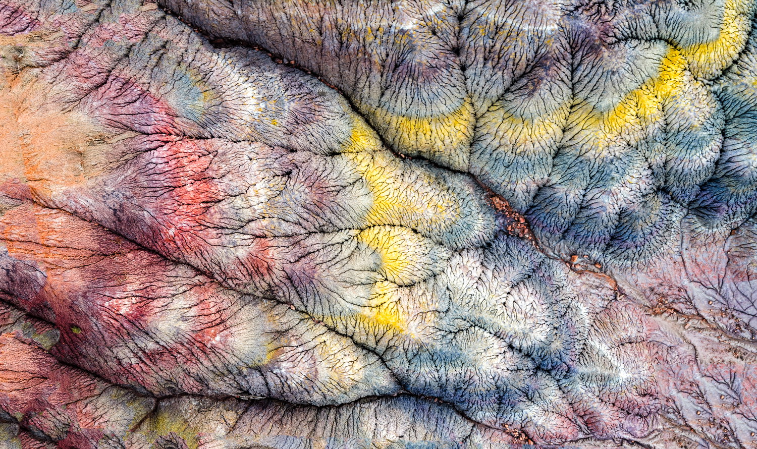
My Brain on Drugs

Critique Style Requested: In-depth

The photographer has shared comprehensive information about their intent and creative vision for this image. Please examine the details and offer feedback on how they can most effectively realize their vision.

Self Critique

I find some areas a little out of focus. I’ve fixed some of them but wonder it the others (right upper corner, for instance) detract. I’m often accused of over-saturating my images. But this is an abstract. Still, advice on saturation would be appreciated. I’m not great at cropping. Help there would be appreciated as well.

Creative direction

I try to capture the joy or magic that I see when taking the image. Have I succeeded? If not, suggestions for improvement would be appreciated.

Specific Feedback

I want to print this to display in our gallery, both on paper and as an acrylic print. I would love to have feedback on any improvements you can suggest: color, sharpness, cropping, and all of the above: aesthetic, conceptual, emotional and technical.

Technical Details

I shot this with a Mavic 4 Pro drone. 14mm, ISO 100, f/8, 0.6". It is a composite panorama. It was edited in LR using basic panel adjustments, curves, Super Resolution; and PS: a lot of Generative Fill to remove blurry areas. Even though sunrise accentuated the colors here, I did increase saturation with the curves adjustment.

Description

I find drone photography is addictive. It allows me to see the landscape in ways not visible from the ground. I find this magical. This area in Southern Utah has many otherworldly formations. I especially loved this formation for all the fine structural lines superimposed on the large rock formations, with colored shapes on top of it all. I love the abstract nature of it.


Critique Template

Use of the template is optional, but it can help spark ideas.

Vision and Purpose:
Conceptual:
Emotional Impact and Mood:
Composition:
Balance and Visual Weight:
Depth and Dimension:
Color:
Lighting:
Processing:
Technical:

2 Likes

Bill: Great to have you posting again and for me there is so much to like. I’m an unrepentant color junkie so the saturation is fine with me, especially since you have a full spectrum. I also like that there is zero sense of scale and a really high “what is this?” feeling to it. I’m also with you regarding drone photography although in my part of Texas there are few interesting subjects close by. I’ve also learned the stitched pano technique for getting large files and from what I can see here it worked out well for you.
I’m not really seeing any blurred areas at this size but wonder if they are near the transition points. This looks like a straight down view so any DOF issues would seem unusual especially at f8. I’m still flying a Mini 3 Pro (lusting after a Mavic 4) so I envy you the aperture flexibility. How high were you flying? Keep up the good work and I’m looking forward to more of your images.>=))>

Wow Bill! The “not knowing” of what the image is , is really intriguing for me. It’s hard to tell how high you were flying.

I love the shapes and patterns that flow so nicely across the page. I’m not so much in love with the colours. But, that’s just me. Maybe there could be another version with softer colours just for comparison?

Hi Bill, this image was a scroll-stopper for me! As others have mentioned, part of the attraction is the mystery. I couldn’t tell if those rocks in the crevice… or at least they look like rocks… were pebbles or boulders. I’ve never tried drone photography before, so I’m always in awe of what can be created.

You ask about sharpness. I can’t see any issues, and certainly none that detract from the image. But my priority is rarely sharpness. I believe abstracts to be more forgiving than literal images, as the intent is more important than the scene. But that’s my philosophy, so take/leave as you see fit.

RE: cropping, without seeing the full frame image, it’s hard to tell what potential there is for additional or different cropping. In addition to cropping, I find it helpful to play with the orientation of an image to either better emphasize a particular element or to amplify the abstraction. It might be something to consider.

RE: colors, the only color that distracts me is the yellow. It’s so much brighter than the other tones. As you can see from the orange lines I made on the attached image, the yellow draws my attention to the angular, up/down/left/right aspect that feels against the grain to me. You have some really strong diagonal lines (turquoise) that add depth to the image. The less prominent (purple) lines pull my eye up/down/left/right just a little, and maybe some tinkering with the orientation/rotation might soften their presence (but it also might mess with the stronger lines, which is always a risk!).

Finally, and what to me is most interesting, is your question, “I try to capture the joy or magic that I see when taking the image. Have I succeeded?” I turn that back to you: does this capture the joy and magic that you saw when taking the image? If not, what’s the gap for you? What detracts from that feeling? And what options do you have to address the gap and bring it closer to your vision?

IMO, the success of an image is more about how well it reflects your personal vision in your eyes. If I as the viewer feel something different—perhaps experiencing it as cozy because to me it looks like a thick colorful blanket—does that mean the image isn’t a “success”?

If you feel a similar joy and magic when you look at it now as you did when you created it, isn’t that the best we can hope for?

I don’t mean to get too abstract about your abstract :laughing: … you just opened up a philosophical can of worms in my brain. Please take/leave/adapt as you see fit. I hope something I’ve offered is useful. Thanks for offering this up and for asking for in-depth feedback.
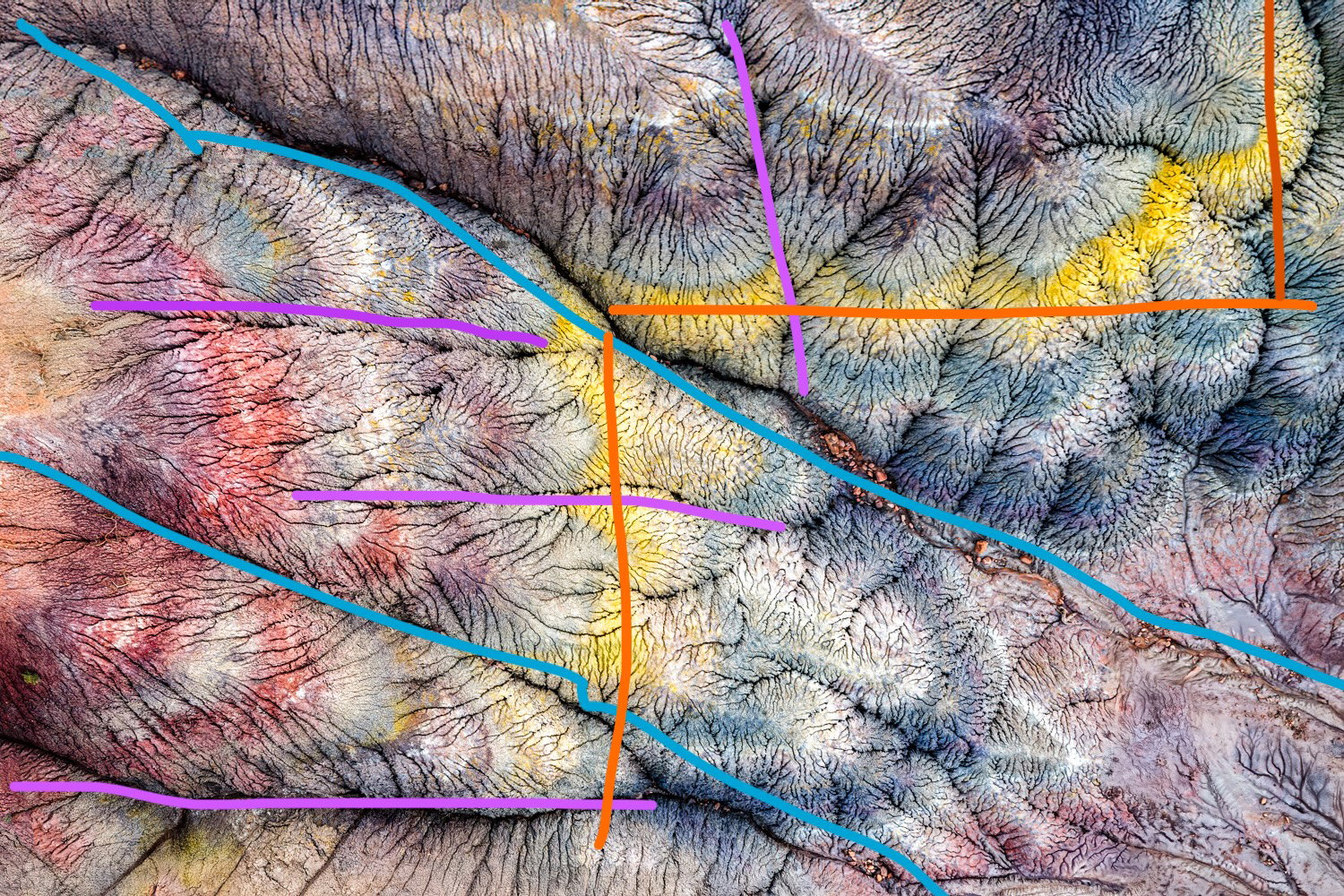
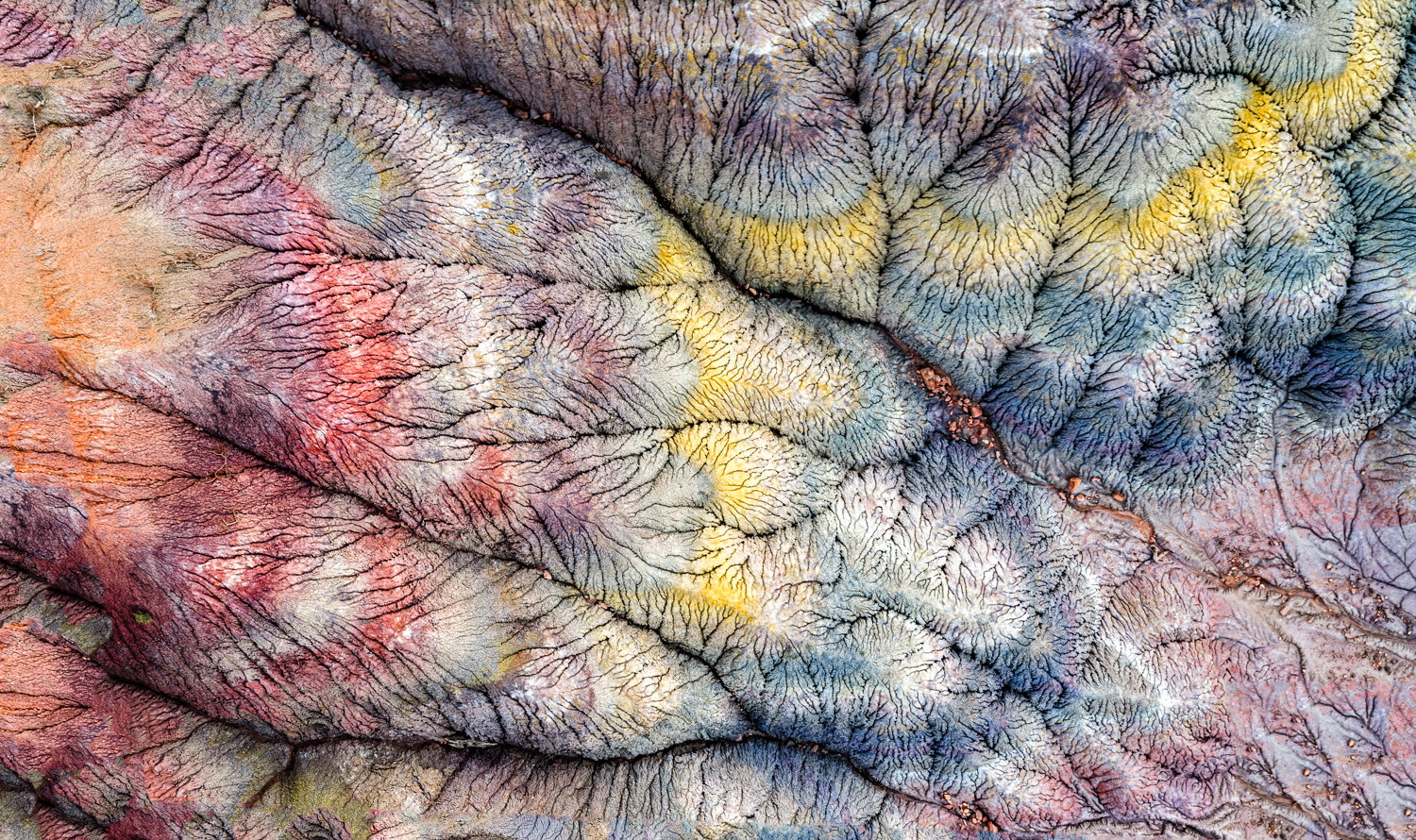
I agree with Beth in that the yellow’s can be made less prominent in the comp. The fortuitous arrangement of the yellows over the subtle blues does make the yellows appear very brilliant. Overall, an impressive abstract and the textures plus colors make this an impressive image. The out of focus areas are very minor and this should make a a very nice high-quality print…,..Jim

1 Like

A very neat image, Bill. I’ll be a bit of a contrarian and say that I like the yellow intensity. It’s possible it would still work as well toned down, but the general flow of the image and the colors tend to keep my eye in the bottom left triangle of the composition and the yellow crossing it helps pull my eye into the upper right and lets me explore that area without getting sucked back into the bottom.

This is fantastic. I love the lack of scale and the color palette. When I view it “full size” on my pc, the yellows feel more intense than looking at it at “regular” size in the thread. Since your goal is to print it (and I assume fairly large) I recommend doing some test prints on the same substrate and dialing in the saturation on that basis. My experience with yellows (and reds for that matter) is that they can turn out different than I expected when I print.

As for crops and softness, I don’t see any softness that bothers me, but that too could shift in a large print. The crop works, but as someone above said, sharing the full frame(s), we could see what the other options are.

I love how this could be anything from an aerial of a canyon system to a faux fur blanket on a sofa. That’s the beauty of abstract.

ML

Hi Beth. Thanks so much for your detailed response.
I will try toning down the yellow a bit, but I see it as counteracting the left to right downward flow of the strong 2 lines, bringing your eye back to the rest of the image, exactly as Dennis Plank said. There is a tension in having the yellow and underlying strong lines going against the main grain of the strong diagonal from the upper left. To me, that makes the image feel more dynamic. But I always have trouble critiquing my own images, especially so close in time to when I’ve captured them.

I’ve tried other crops and orientations, but I always seem to come back to this one. So I guess for me, it is the right one.

As for joy, YES! This image does bring me back to the joy and amazement I felt when out in the field. So for me, I guess that is a success. I’m just hoping that some of those feelings are elicited in the viewer as well. Part of the joy of photography is our own pleasure, but it is a plus when we can give our viewers pleasure as well.

On another note, I really enjoyed your presentation. It gave me a lot to think about. I will have to watch it again.

1 Like

Bill.

Thanks for your comments and response. I don’t remember how high I was, but it had to be no more than a few hundred feet, perhaps less. Yes, the Mavic 4 Pro is a dream machine. I do have a new one for sale.

Hi Glenys. Yes, I have a tendency to use saturated colors that I’m trying to control. I’ll try one with less saturation for comparison.

Thanks for your comments, Jim. I guess the consensus is to tone down the yellow. I will try it.

Hi Dennis. Yes, it would seem that you and I are in the minority wrt the yellow. I will try a less saturated version for comparison.

Thanks, Marylynne. I will try some prints. And post the full image as well.

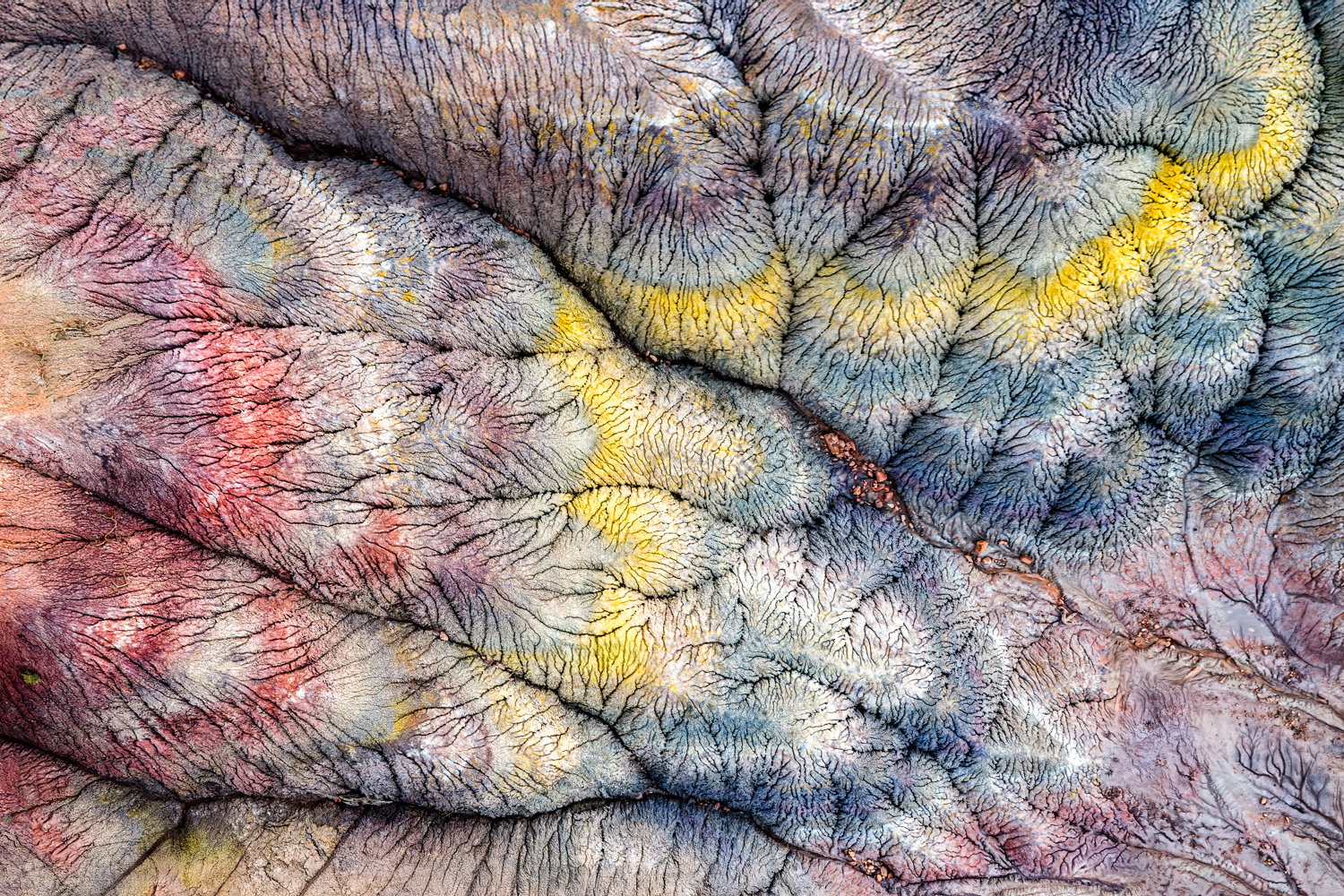
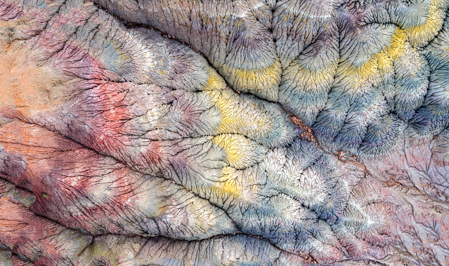
Here are 3 versions, all including the full image. Pano 3 has all the colors toned down. Pano 2 has only the yellow toned down


Oops. Filenames not listed. The bottom is the original (after editing), The middle one has only the yellow changed. The top one has all colors toned down.

I could go with any of the three, Bill but the original is still my favorite. I like the idea of cropping a bit from the left as the oranges there don’t have a lot of texture which makes them appear slightly soft, though I don’t think they are.

Thanks, Dennis. I think the original is still my favorite too. And it prints beautifully.

My vote is the original post as well. I like the toned down colors as well, but the crop is the key.
ML

Thanks, Marylynne.