The photographer is looking for generalized feedback about the aesthetic and technical qualities of their image.
Description
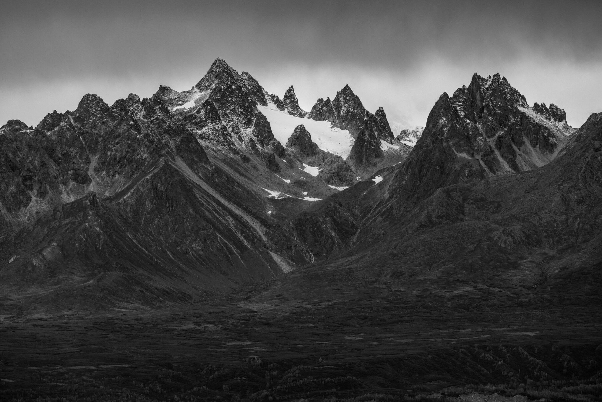
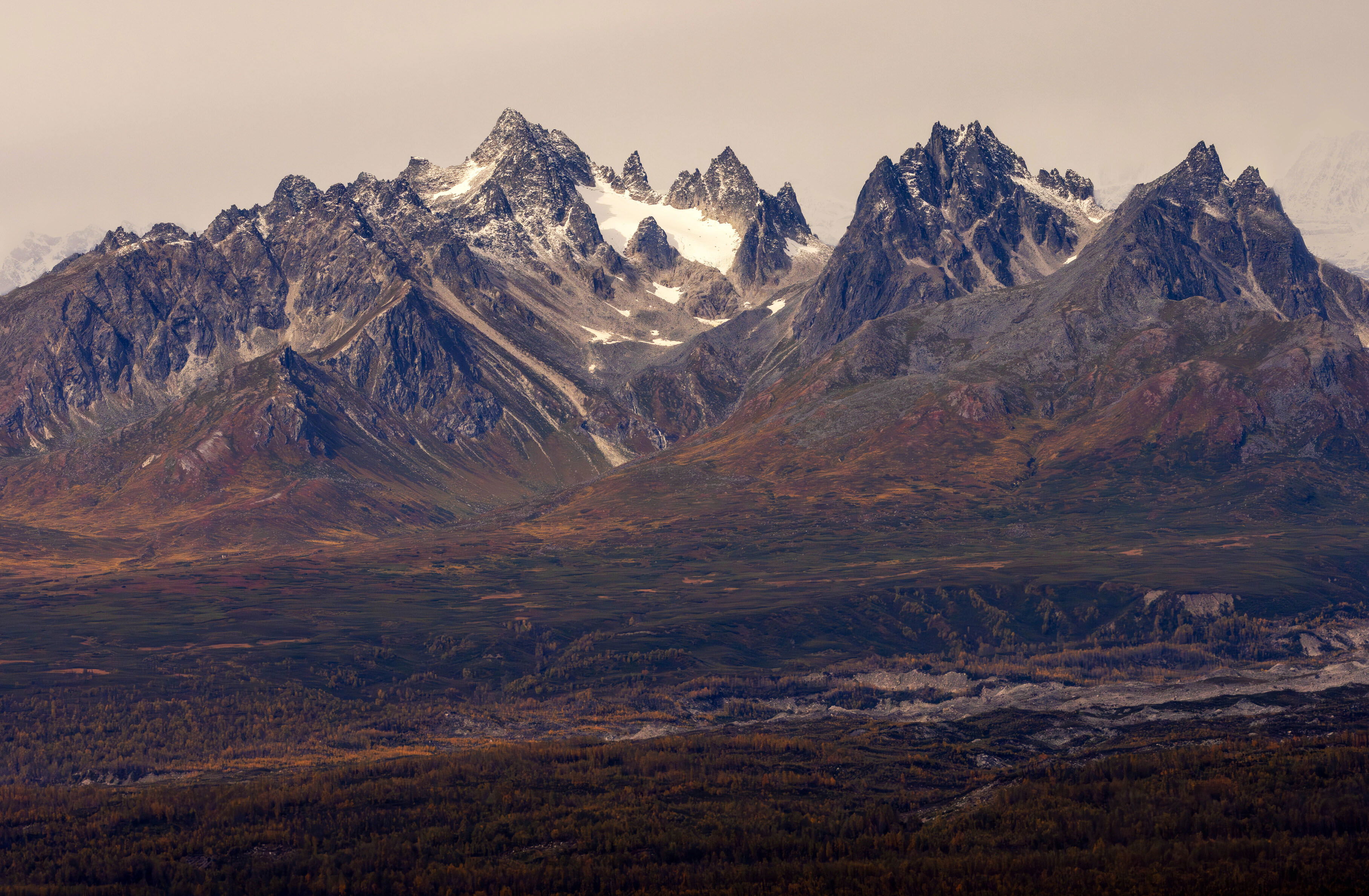
I was hiking in Denali State Park, which is across a major river valley from the National Park. The low clouds obscured Denali herself, but I was amazed at the marvelous lesser peaks. This cirque somehow conjured up Mordor with its jagged peaks.
Specific Feedback
I’m always hesitant to bump the saturation, but I feel that this image doesn’t pop as much as I want it to. Any suggestions?
Technical Details
Canon R5 + RF100-500 @167 mm
1/800s, f/11, ISO 400
Critique Template
Use of the template is optional, but it can help spark ideas.
Vision and Purpose:
Conceptual:
Emotional Impact and Mood:
Composition:
Balance and Visual Weight:
Depth and Dimension:
Color:
Lighting:
Processing:
Technical:
Hi Cathy,
I kept waiting for someone else to respond first, but I’m not very patient. There is nothing wrong with the image, but like you suggested, there is something missing to give it some pop.
I’m not entirely sure what the solution is. Maybe a bit more contrast and saturation. Maybe micro contrast (texture or clarity bump in LR). Maybe some local adjustments to bring things near to far to draw the reader?
Sometimes an image like this is just a pretty mountain, but not a lot more. Play with it and see if you can bring out some details or create some pull into the image.
I really like the subject matter and the composition. The trees really give a sense of scale. I am really weak when it comes to processing but maybe a little dehaze and clarity in LR or camera raw would help if you have those programs. The sky is the major problem. It would be nice to see some more of those snow clad peaks in the BG. I just tried a simple brightness and contrast adjustment. Don’t know if that helped any or not.
Cathy: I like what @Michael_Lowe did with the scene but if you’re looking for the Mordor look your original works better; it could even be darker and more sullen yet. A marvelous scene very nicely composed, captured and presented. >=))>
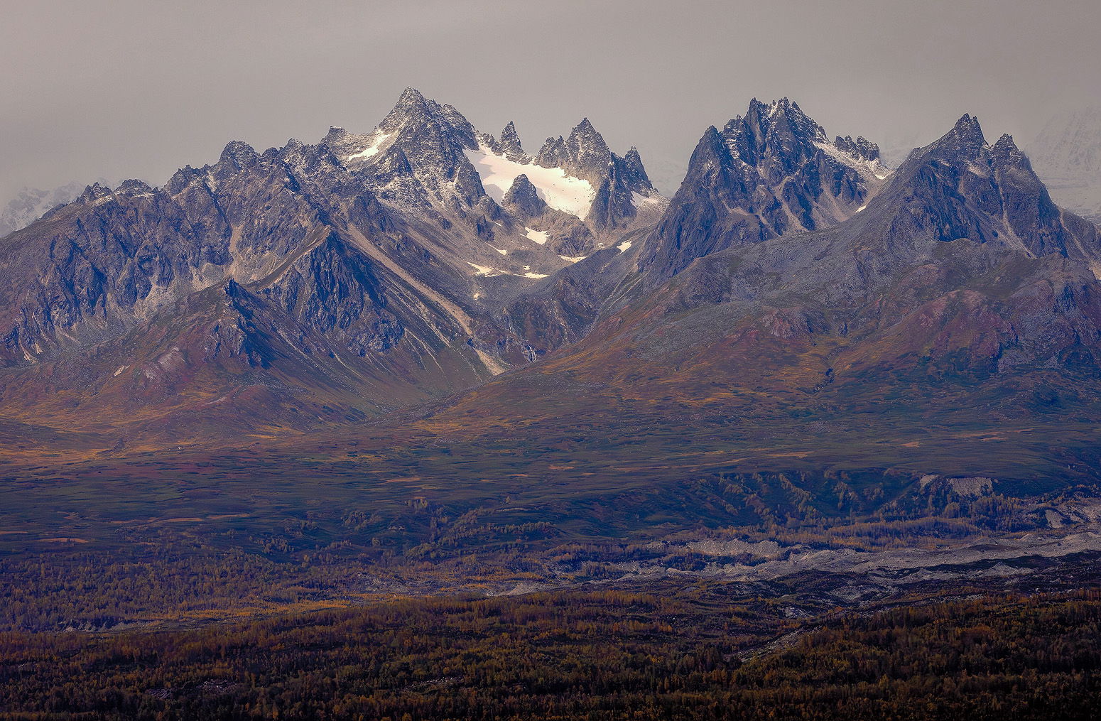
I’m not sure if this is really any better, but maybe some ideas to play with.
There may be a cast? I moved this a little cooler (maybe even too much?). I also reduced the luminosity of the sky to hopefully let the mountains stand out, also thought clarity was a good idea, and opened up the darker areas just a tad.
I think I will try two versions. One as I had been thinking with increased brightness, contrast/texture/clarity and saturation. But also a darker, more sullen one, as @Bill_Fach suggested – thanks for that thought! It was indeed the feeling I had at this scene, which I lost touch with in the processing, so maybe it’s not working the way I was pushing it because I was pushing in the wrong direction?
I really like this photograph Cathy. It has many layers of colors and a pastel like feel to it. If you don’t mind, I downloaded a copy and did some color analysis on it. There appears to be an overcast to it. I see a lot of purple, blue in the shadows
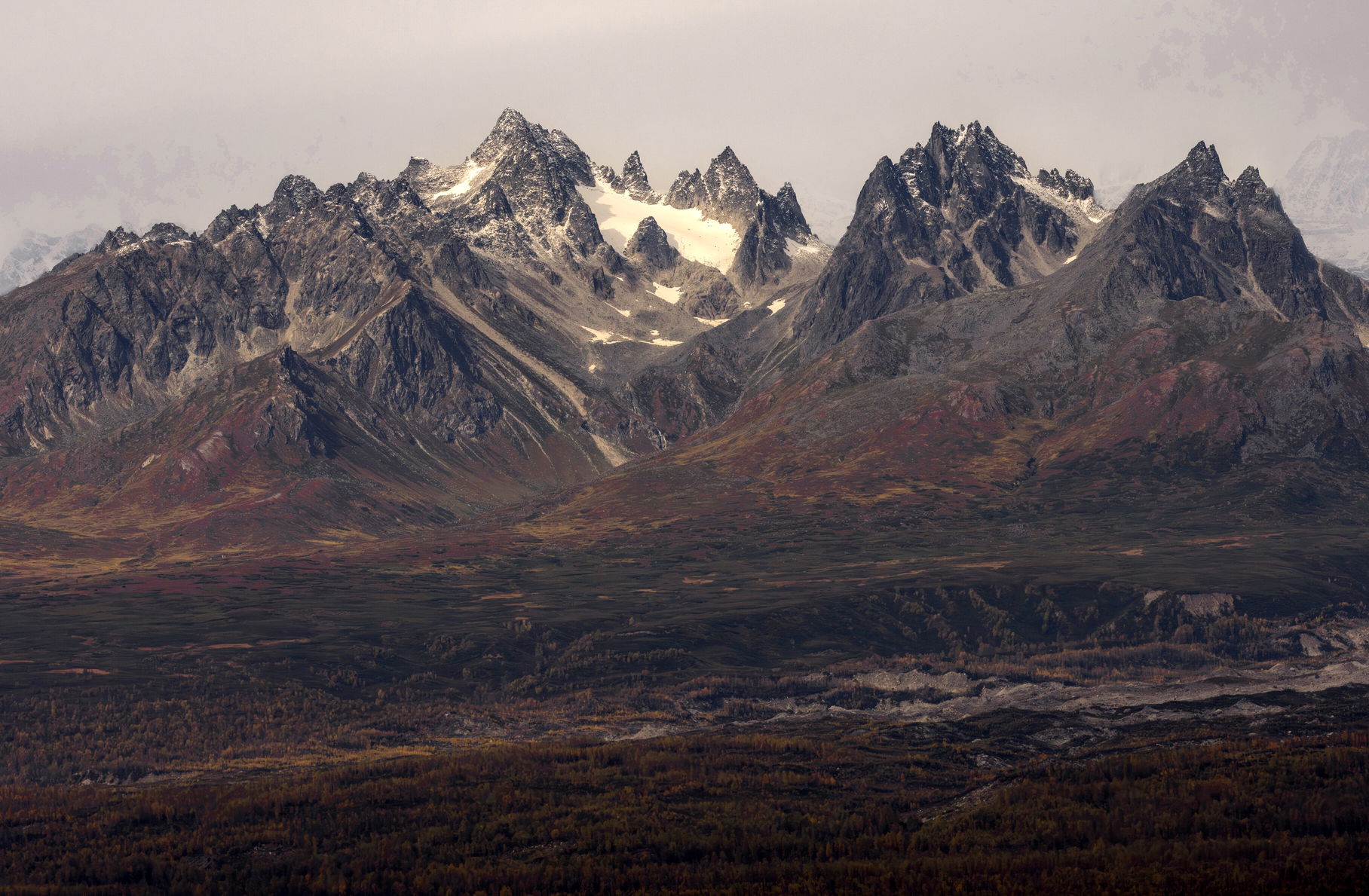
and the sky is dark / brownish. I started with correcting these but I really wanted to keep the pastel like look and the colors as they are quite beautiful. I also wanted to brighten up the sky a bit because if you look closely at the snow on the mountain, there is light shining on it - it’s just lost at the moment by the brownish color in the sky. Here is a crack… lightening up the sky, highlighting colors while keepin the darker mood in the foreground. Layers. To me, not all photographs need to have super contrast and/or be super sharp. It just may have been when you took the photograph that the light was soft and I think you want to retain that feeling.
Hi Cathy,
You have some great suggestions for directions you might want to take this wonderful scene and my thoughts pretty much mirrored those ideas. I particularly like the couple of tweaks by @John_Williams. I do like the Mordor comparison as the peaks do have that foreboding look to them. Beautifully done.
Thanks for your comments. Stephen, I like your edit a lot, thanks. I hadn’t noticed the cast that you and @John_Williams caught, and I think that helps a lot. I do want to retain the Mordor feeling I had when I took it, so I’ll work to combine all these excellent suggestions into another version.
I agree with John. I’m liking the drama of the black and white and it has me rethinking my own “lovely mountain photo” that feels underwhelming to me.
ML
Hi Cathy,
I too quite like the B&W version as it just seems to reinforce your Mordor analogy. I think a little more contrast would work as well. Nicely done.
Thanks @John_Williams@Marylynne_Diggs@Ed_Lowe for your comments on the black and white. I’m liking it more now too, as it ages a bit. Ed, I see what you’re saying about the contrast, I’ll mess with that a bit and see where it goes.
Way late to the party here but I wanted to say that the B&W steals the show here for me. Nice job! I find when I have a photo that just doesn’t feel right and I try and finagle it, it usually looks too forced. I don’t think that’s the case with the color version but there was definitely a color cast to it that was reworked by several people and it’s much better but it’s not as good as the black and white, at least to me. Nice job! I need to get there one day. It’s funny, I was in Alaska twice this past summer and never made it over to Denali. Shame on me. Next time.
David, thanks for your comments. I am grateful for all the feedback on this image that helped me realize what my initial vision was and why I wasn’t satisfied with it. So the black and white was a chance to re-think the whole approach more in line with my original intent.
This photo was actually taken from Denali State Park, looking toward Denali. But I also spend about 10 days in the national park at the peak of fall colors in early to mid September and it was amazing. A photographer’s playground. I definitely recommend it (and I’m not usually a national park kind of person).
Where did you go in Alaska this year? Every region of the state is amazing in different ways. I can’t get enough of it, I’m going back next summer too.
My wife and I along with my sister and her husband took a Lindblad National Geographic cruise for 8 days in June and then we went back a month later for a bear workshop with Jimmy Breitenstein out in the middle of the nowhere and came away with almost 50,000 images of bears and salmon. It was terrific both trips but we really need to go back again and do a couple of weeks in and around Denali. Your recent images have me salivating!