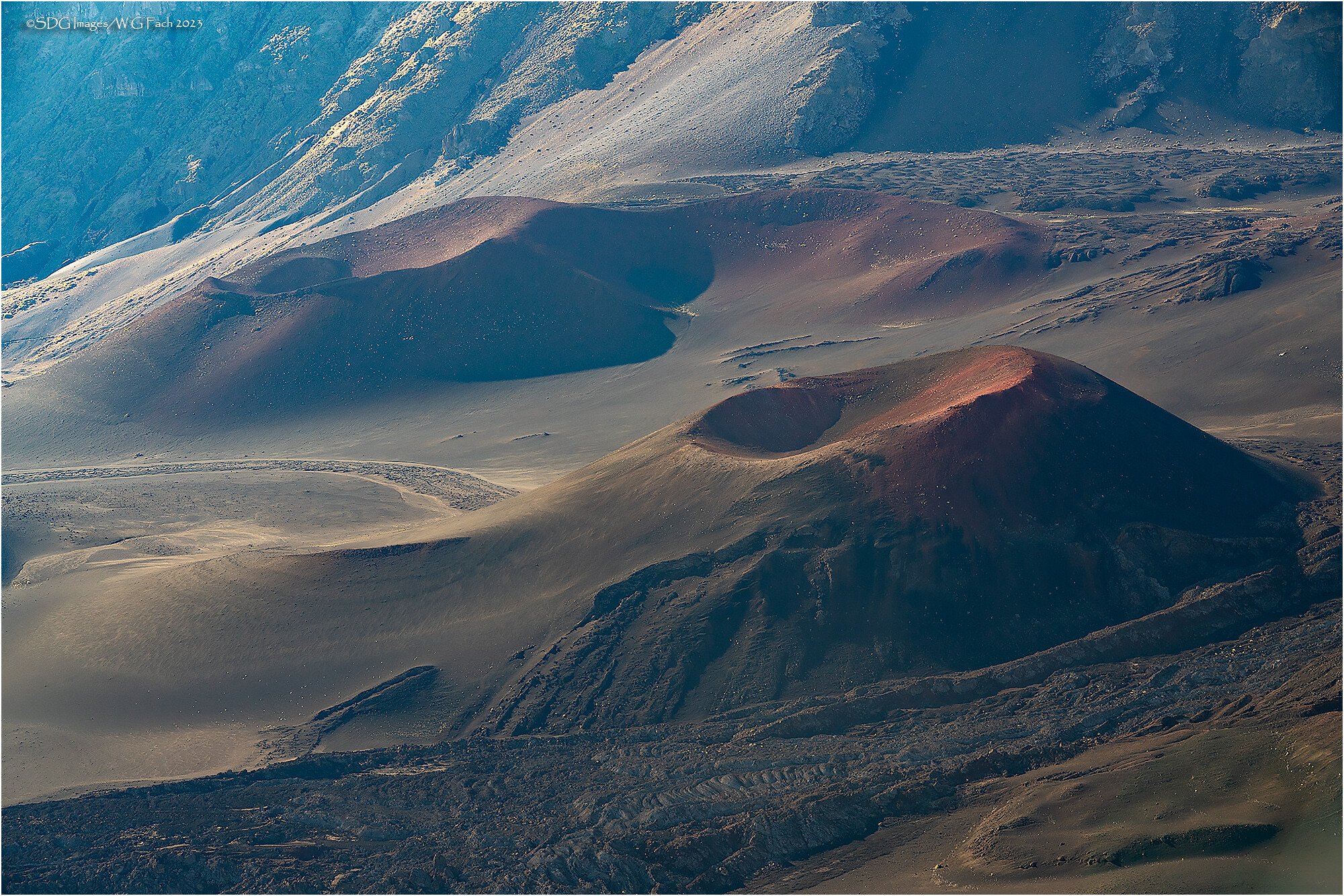
On the morning of my trip to the Haleakala summit I took a detour on the way down to the Kalahaku Overlook. The clouds kept changing the light and I had a blast extracting comps with my 70-200. This view reminded me of the mythical slopes of Mordor from The Lord of the Rings. For me it has a somewhat ominous feel and wonder if you get that sense as well. All comments welcome. >=))>
Type of Critique Requested
Aesthetic: Feedback on the overall visual appeal of the image, including its color, lighting, cropping, and composition.
Emotional: Feedback on the emotional impact and artistic value of the image.
Specific Feedback and Self-Critique
Definitely wanting to produce a foreboding mood. Does this succeed?
Technical Details
Sony A7RIII
Sony FE 70-200 f2.8 G OSS
ISO 400, 1/50 @ f11
Haleakala is such a beautiful place, and I love that you are adding some literary context to your composition. Overall I think you are on the right track for the foreboding look you are going for, but if it were me I would deepen the palate a bit and draw more attention to those beautiful reds.
Maybe a slight bit of dehazing as well, as there seems to be a bit of a washed out element to the photo. It would speak to me more emotionally if there were a bit more clear vibrance.
This is a really cool image! With a name like Slopes of Mordor I felt the need for a lot more contrast! I’ve provided an example of where I would go with an image like. this. I think warmer is important, but the contrast is key for me, you could probable even darken it down more than what I have in this example. There was also a blur in the LRC, Content Aware Fill knocked it right out. I think your subject and composition feed the theme but the processing isn’t getting it to the finish line…I wish this image were mine!
This was mostly done with curves and levels adjustments. I did some dodging with a touch of color added for the red sections and some dehaze in LR to shift the back left corner a little warmer, add some contrast, desaturate it, and darken it. I also removed some of the bright bushes, trying to remove the highlights (bushes maybe) trying to remove any sense of life.
Another beauty, Bill! Plus I had fun saying the name of the place over and over to myself. Hawaiian words have such musical lilts and rhythms.
I’m torn about the haze and the advice to add more contrast. I think that areas of prior (or maybe present in this case) volcanic activity are ashy, sooty, smoky places and so that fits to some degree. But menace and foreboding…I’m not getting that as much as I am the idea of disturbed earth and dense air. David’s noodlings are on the right track, but I wonder if a bargain can be struck?
It’s such a spectacular and seemingly other-wordly location. Strong composition and framing. There are colors here to play with, too. Rich minerals from the earth. Strange new shapes, untouched by flora (ha, see what I did there).
Hey Bill! I think you’ve nailed the composition, cropping, and all that so I want to hit on the mood you were going for. If you’re going for foreboding, you might want to darken the shadows pretty significantly. David Wallace did a good job of showing examples on that. I see the vision for sure and the title is perfect for this photo. Think back to movies and how they show a foreboding mood. It’s usually darker than normal with cool blue tones.
Hi Bill
What a beautiful landscape. That volcano is other worldly and really cool. I agree with the others…to me foreboding isn’t jumping out at me because it is too light, especially in the upper left corner. Either darkening or contrast or both would for me help capture such a mood. I wonder if simulated fog, like haze, on a really darkened image would contribute to the sense of foreboding.
You found Mordor!!!
Hi Bill,
I really like the look and feel of the flow of this image - the crater is super cool and I like how the composition is placed… no feedback there!
A few things I noticed.
One, the upper left seems overly bright and crunchy - maybe over sharpened or something?
This is terrific - and a great use and example of isolating scenes within the much larger landscape. This works beautifully.
Some good thoughts and discussions have come out - IMHO, primarily because what you expressed your impressions were of the scene, the “Slopes of Mordor.” In that light, I agree with others - darker, heavier (like the darker reads,) contrast even dropping overall illuminosity and certainly taming the highlights - all to make darker, more forboding as you asked.
But then I’m drawn to Kris’s comment here. Had your title been totally different, say "The volcanic atmosphere of Haleakala " then the viewer assumes a completely different direction and I would go the way of ahsy, hazey, reducing dehaze, etc., etc. less contrast… you get the idea.
So in the end, it’s all about what you experience and what you want to present here. And Mordor it is! Go deeper, darker, more mysterious. You can do what you want!