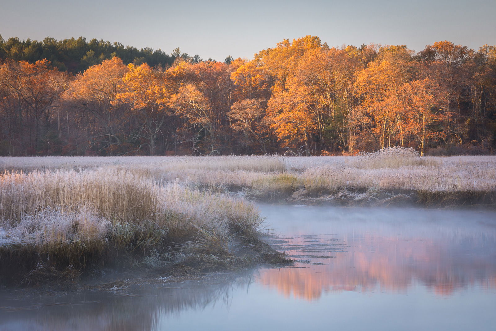
Here is a different take on fall color in New England. This scene is from November 2017 along the Parker River in Newbury, MA, a tidal river that flows into the nearby Atlantic ocean. The foliage near the coastline consists mainly of oak trees that don’t turn color until mid-November, long after the rest of foliage season has ended. This was taken on a very cold morning with frost covering the salt marsh grasses. In the next few weeks I plan to head to the coastline again and seek out late season foliage.
What technical feedback would you like if any?
I have struggled with white balance and color processing this image, and I am afraid that I am now too close to it to have an objective opinion. So I am looking for anyone’s opinions in that regard, as well as any other comments in general.
Any pertinent technical details:
Canon 5D Mkiv, Canon 70-200mm f4 lens at 173mm, ISO 100, 0.6 sec at f16
Ed, I really like the mood of this image created by the fog and frost. I wish I could offer some suggestions on processing but I have struggled with similar lighting and this type of sky at sunrise. I am curious what others may offer.
The mood and scene are quite nice. White balance looks fine to me. It might alter the mood, but I might, as an experiment, mask the colored trees and bring in the black point a bit to pop the contrast there. I realize there is mist affecting their light, but they look kind of hazy without any defined fog/mist in front of them (if that makes any sense). The sky looks fine to me. Pretty scene.
Great Image Ed. I love the fog on the water along with the frost on the grass in the foreground reminds me of fall in the north east. The only thing I would change would be to darken the trees a bit, I agree with Harley that they look a bit hazy.
What a beautiful image, Ed. Wonderful range of soft, delicate colors and atmosphere. I think the color balance, sat.look spot-on, except for the sky. I can’t put my finger on it but the sky color looks a little off (greenish?) The tonality of the sky in the reflection looks correct and what I would aim for in the sky - just a bit more luminous.
Nice mood in this one, Ed. Maybe you could try messin’ with the mid tones levels or curves to see if that brings out some more richness, without effecting the mood too much.
Ed, Hope you don’t mind me downloading and editing a bit, but I wanted to display what I was saying about adjusting the midtones. I adjusted two separate layers in PS. Each layer targets a different mid tone mask. Not necessarily better, just different. The adjustments add a touch of contrast which highlights the gorgeous light you captured.
Cheers
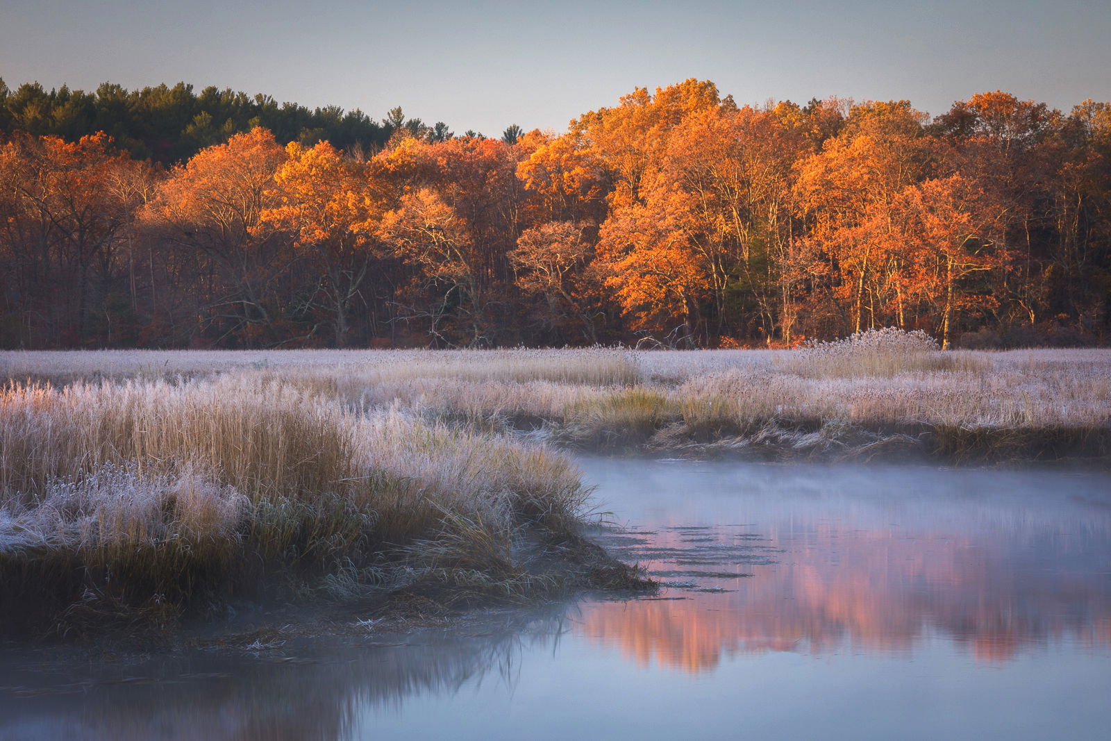
Dave, the sky was my primary concern about the image, it felt a little greenish to me too, and I agree that it needs a little more luminosity. Dan Kearl commented that adding a little blue would help too. I think the two of you have helped me to think about adjusting the sky, thank you.
Ken, thank you for taking the time to re-edit this. I like what you have done by adding luminosity to the sky, and the contrast in the trees, both of those help a lot. Your edits do a good job addressing the comments raised by a number of other posters, thank you for doing a re-work.
Thank you everyone for your comments, the suggestions offered here were all helpful. I like what Ken’s rework did, except I thought the contrast added to the grasses reduced the light, misty mood a little too much. I’m posting my own re-edit, where I added blue and luminosity to the sky, contrast in the trees, and a little less contrast in the grasses.
Ed, your second version work perfectly for me, especially because of the fine balance between the sky and its reflection. I also like the way you show the icy foreground complemented by the warming sunlight in the distance, while keeping the subtlety of the scene.