The photographer has shared comprehensive information about their intent and creative vision for this image. Please examine the details and offer feedback on how they can most effectively realize their vision.
Self Critique
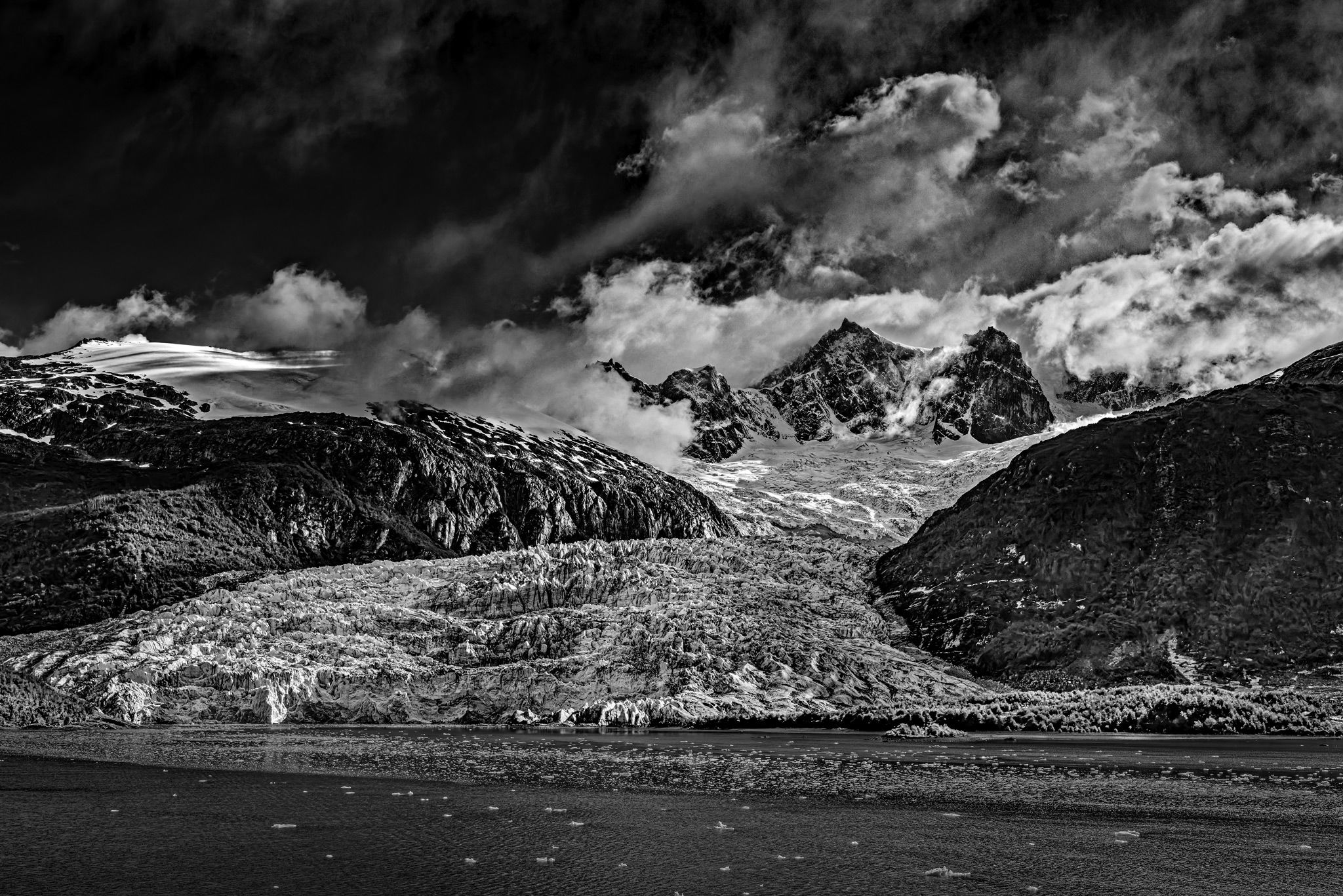
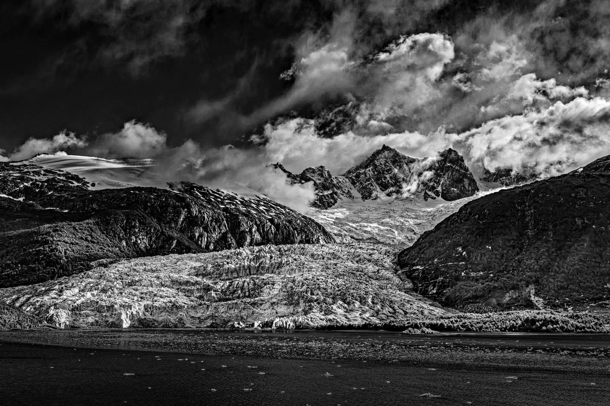
Is it too dark? Is it tilted? I almost always use the built-in camera level but it isn’t always totally accurate. I keep feeling the view should be wider but I wouldn’t want the central massifs to be any smaller.
Creative direction
The aim was to capture the awesome size and detail in this view of the glacier.
Specific Feedback
Emotional mostly but, of course, technical comments are most welcome.
Technical Details
Handheld from the deck of a ship. Canon R5, RF 14-35 @ 35mm, f/8 @ 1/6400, EC -3, ISO 100. Dark frame from an HDR bracket sequence processed in Dx0 PL 9, ACR, and Photoshop.
Description
This area is, of course, very popular for photography. The trip we were on was not specifically for photographers so I had to make the best of whatever happened. It was early morning at least so the light was not from straight overhead. The clouds were good. They obstructed the central peaks off and on while were pulling into the area. I had to wait for them to clear a bit.
Critique Template
Use of the template is optional, but it can help spark ideas.
Vision and Purpose:
Conceptual:
Emotional Impact and Mood:
Composition:
Balance and Visual Weight:
Depth and Dimension:
Color:
Lighting:
Processing:
Technical:
Hi Fred,
Not too dark for me either. Really lovely lines, exciting sky, and those peaks are dramatic and engaging. At first, I thought it needed a ccw rotation, but I think it’s an illusion. I am perpetually bedeviled by shoreline angles and curves along lakes. I need a second opinion on them pretty much every time. Hopefull someone with confidence will chime in here.
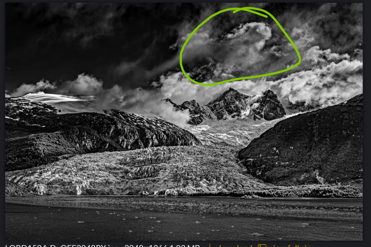
My only suggestion is related to the crop and some confusion I have about whether there is another higher peak beyond the central ones or whether that is all cloud texture and sky. The reason I ask about it is that my brain keeps trying to make out another peak up there, but I can’t, and since I remain unsure, it creates a distraction.
I could be alone in that perception problem. But in case I’m not, I wonder if there is something you can do with the clouds and sky in the area I circled below to clarify that there is no subject there. Does that make sense?
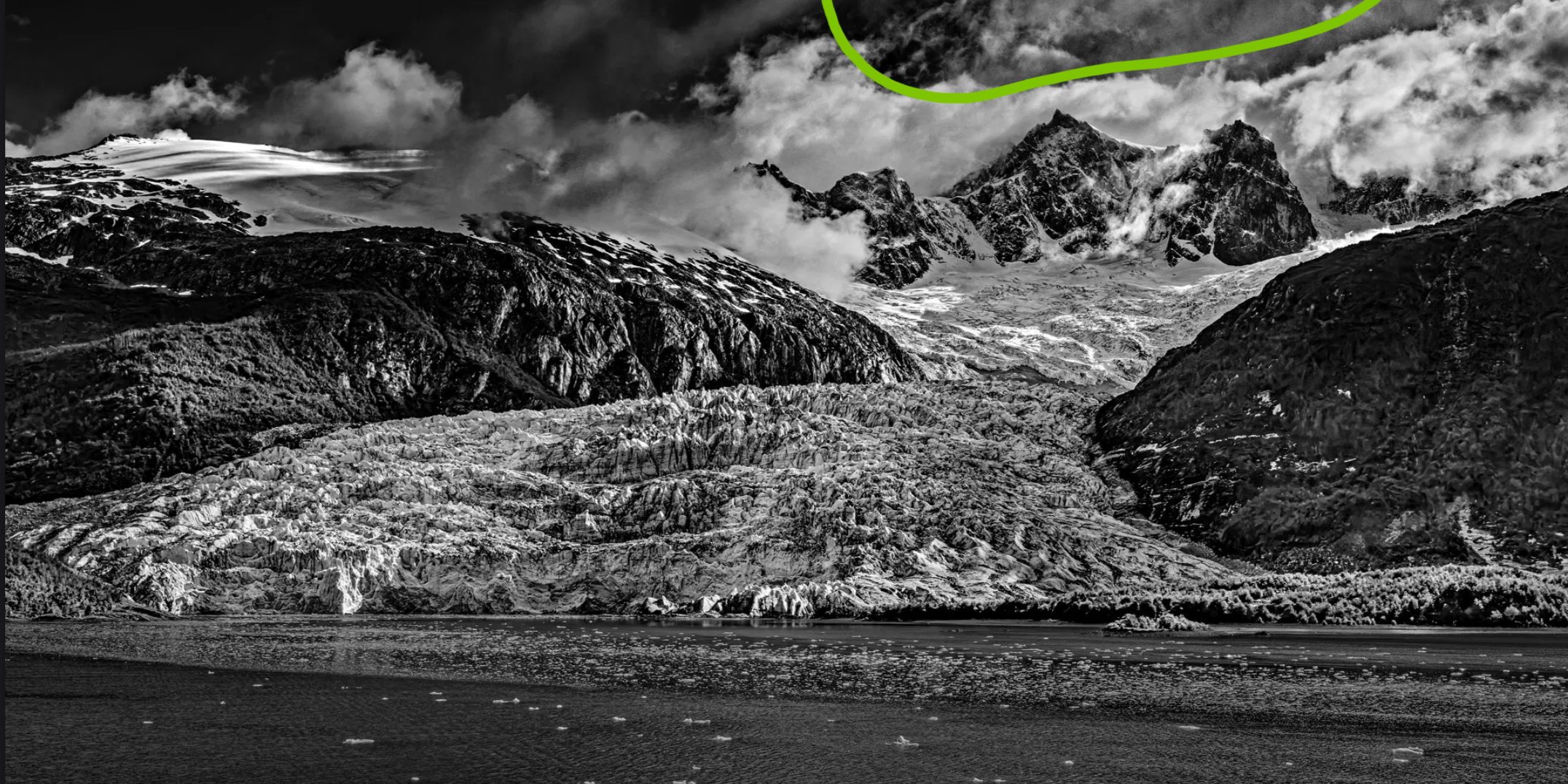
And if there is no other peak there, I wonder if a pano crop would refocus our attention. It’s hard to sacrifice that wild sky, but if keeping the massif big is a priority, something along these lines might work.
I don’t think it’s too dark either. I also like the tonal range and its richness in this image. I wonder if this image would actually look better in color. People don’t often talk about such things as the following. The snow appears to me to be dirty and therefore unattractive. I don’t know if others get this reaction. I would prefer that the glacier be whiter. One thing that’s rarely discussed is how appealing the subject is in itself. I often make images of negative subjects. But that’s not the case here. This is not meant that way. Maybe it can be improved in postprocessing by taking some of the grey out of the glacier. You could also make the water darker and the floating ice brighter. In general the upper half of the image is the better half.
@Marylynne_Diggs , @Igor_Doncov I do appreciate your suggestions. I cannot bring myself to crop, sorry. There are no mountains behind the peaks in the center. I have worked on the clouds and the glacier field in the foreground. There are several other changes as well. Hopefully the changes will help to better inform you as viewers of the presence or lack of presence of elements in the scene. As for the color version, I may post it later but I definitely feel the monochrome version is far superior. This was shot in the equivalent of mid-June in the northern hemisphere which meant there was no fresh snow on the lower glacier due to rising temperatures.
Fred, I’ve been looking at this since you posted it. The tonality reminds me of some of Ansel’s Sierra images that are very impactful, as this one is. I agree with maintaining the original framing. The details are excellent, and the composition is spot-on.
@Preston_Birdwell I am humbled. Never in my most fantastic imagination would I ever think of being compared to Ansel Adams. Thank you for that. I’ll have to sit and think about it for a time.
Fred, there are two particular Adams images that come to mind that embody the look I am referring to.
Monolith, the Face of Half Dome (1927)
Moonrise, Hernandez, New Mexico (1941)
Both images were shot using an 8x10 camera. The Half Dome image was made on a glass plate, and the Moonrise image was made on film.
He liked using a deep red filter to dramatically darken blue skies. However, it would also darken shadows lit by the blue sky, so careful development and printing were required.
-P
@Preston_Birdwell Thank you for the references. I had seen them before and probably had felt some subliminal influence from the Ansel Adams style. This particular scene was more amenable to that style for sure. I don’t really have a style yet. We’ll see what develops.
I don’t think it’s too dark as a whole. I like that the peaks are not dead center and that the flow of ice is from top right to bottom left, away from those three peaks. I would like to see the actual glacier a tad brighter overall (I know there is a ton of contrast already there but maybe raise the highlights and not the actual whites a bit. The whites on top of the mountain on the left side of the image are a bit bright and pull my eye away from the flow of the glacier so maybe tone that down a bit and I would darken the water so it more closely aligns with the darks in the sky. The water is by far the least interesting part of the image but you could make the ice floating in it stand out a bit more as it seems very dark, almost muddy looking. The scene feels a bit tilted clockwise but I’m not sure that a CCW rotation would help much because It might be an optical illusion because of the angle of the floating ice.
In any case, you have a very dramatic scene here that I think can be improved upon ever so slightly.
@David_Haynes Thank you for your help with this. I appreciate it very much. I have made what I consider to be the nearly final changes to the photograph. There are a couple more photographs from this area I need to look at. I may come back to this one if I feel my processing skills have improved. I hope they improve.
Better photographers than me have already offered some great suggestions, so I won’t comment too extensively. My main thought is DON’T crop. As to @Igor_Doncov’s comment about the glacier looking dirty. I’m always amazed at how dirty they are. The forces at work constantly abrade rock and carry it along with them.
@Michael_Lowe The lower glacier is a dirty blue. I haven’t really tried to redo this photograph as a color image. I may do that eventually just to see what might be done.