D850, ISO 560, 1/125 sec, 105 mm at f18, handheld. On a trip with a friend so this was basically a grab shot, although I may have used a very small diffuser I had tucked away in my pocket. Created BG. I know I added a blur of the original, but I also did some painting with color and some work in LR and Topaz to create the BG. I flattened this one before coming back to LR so cannot remember exactly what was done.!
(If the background has been replaced, etc. please be honest with your techniques to help others learn)
If you would like your image to be eligible for a feature on the NPN Instagram (@NaturePhotoNet), add the tag ‘ig’ and leave your Instagram username below.
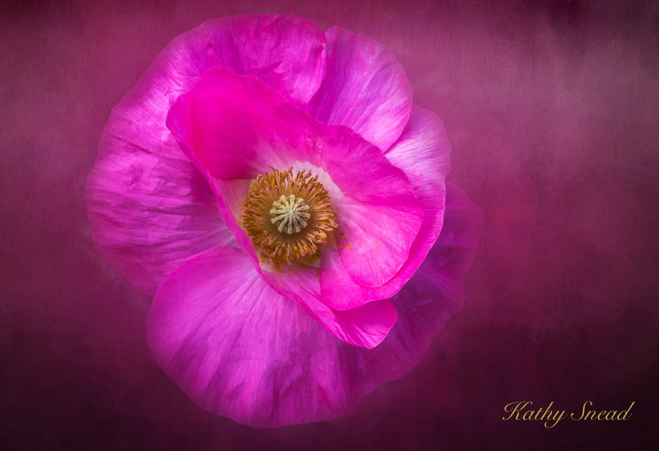
Fantastic work with this. The flower is wonderful of course and I like the details in the middle. The backgound is killer and very supportive of the flower. It appears to float - much like one would think of a Lily pad on water. Maroon is my favorite color, so I’m particularly fond of the bg.
Curious, did you leave more room on the right simply because you didn’t want to dead-center the flower? Not a critique really, but I think there are plenty of times when centering works. Again just curious as I think this is wonderful as presented.
Beautiful image, Kathy - love the mistiness from your bg leaving the flower centre and some of the petals sharp. Exquisite colouring too. Like Lon I wonder if this would not look even better in square format - personal preference really.
@Lon_Overacker@Ian_Wolfenden
Thank you both. I really had fun with this one and planned it as one I could do multiple crops of. I printed it in this format, square and 8 by 10 and had a hard time deciding which one to post . I finally decided that the one I posted was a little “edgier”. Here is the square. Am going to frame this one as I have a suitable frame on hand.
Kathy: Jaw dropping beautiful in both iterations but the different crops give the images a significantly different feel IMO. I’ll take one of each please. Superbly crafted images. >=))>
Kathy, your effort at spreading the color through the frame looks very good. I was going to suggest a square crop, but then I see that you’ve already been there. It’s interesting how different the two versions “feel”. As with Bill, I like them both.
Like the softness or glow to this image as it fades out to the edge of the frame. With all this time on our hands it is fun to revisit old and/or new techniques. Well done.